Have you ever stopped to really think about color? It’s everywhere, right? From the clothes we put on in the morning to the landscapes we admire and the art that moves us. But color isn’t just pretty; it’s a powerful tool. It can influence our moods, guide our eyes, and even make us feel certain emotions. This is where color theory comes in – it’s the science and art of using color effectively. This guide will help you unravel the secrets of color, giving you a solid understanding of the basics and providing practical ways to apply them in your everyday life. Get ready to see the world in a whole new light and understand the real impact of color.
Color theory isn’t just for artists or interior designers. It’s for everyone. Whether you’re choosing paint colors for your living room, picking out clothes, or even creating a presentation for work, understanding color theory can give you a serious advantage. It’s about more than just knowing what colors go together; it’s about understanding why they do. In this article, we’ll break down the main concepts of color theory, making it approachable and easy to understand. We’ll cover everything from the color wheel basics to how to use color to evoke specific feelings and achieve your desired effects. This will help you transform any space.
The Color Wheel: Your Best Friend
The foundation of color theory is the color wheel. It’s a visual representation of how colors relate to each other. It’s usually arranged in a circle, showing the primary, secondary, and tertiary colors.
- Primary Colors: These are the building blocks: red, yellow, and blue. You can’t make them by mixing other colors.
- Secondary Colors: Mixing two primary colors creates secondary colors: green (blue + yellow), orange (red + yellow), and violet (red + blue).
- Tertiary Colors: Mixing a primary color with a nearby secondary color creates tertiary colors like red-orange, yellow-green, and blue-violet.
Understanding the color wheel is key to understanding color harmony. It helps you see which colors naturally work well together.
Color Harmonies: Finding the Perfect Match
Color harmonies (also often called color schemes) are the different ways colors can be combined to create visually appealing results. Here are some of the most common:
- Complementary: Colors opposite each other on the color wheel (e.g., red and green). They create high contrast and can be very vibrant.
- Analogous: Colors that are next to each other on the color wheel (e.g., blue, blue-green, and green). They create a sense of harmony and are often soothing.
- Triadic: Three colors evenly spaced on the color wheel (e.g., red, yellow, and blue). They offer a balanced and lively look.
- Monochromatic: Using different shades, tones, and tints of a single color. This creates a sophisticated and cohesive look.
Experiment with these harmonies to see what suits your personal style and the effect you want to achieve.
Color Temperature: Warm vs. Cool
Colors also have a temperature, influencing the mood of a space.
- Warm Colors: Reds, oranges, and yellows often evoke feelings of warmth, energy, and excitement. They tend to advance, making objects appear closer.
- Cool Colors: Blues, greens, and violets often evoke feelings of calmness, serenity, and sophistication. They tend to recede, making objects appear further away.
Think about the feeling you want to create when choosing colors. A warm color palette can make a room feel cozy, while a cool color palette can create a sense of spaciousness and tranquility. Consider the light in the space, too – a room with a lot of natural light might benefit from cooler colors to balance the warmth.
Color Psychology: The Emotional Impact
Colors have psychological effects, which can significantly influence how we feel.
- Red: Associated with energy, passion, and excitement. Can also signal danger.
- Orange: Associated with happiness, creativity, and enthusiasm.
- Yellow: Associated with joy, optimism, and intellect.
- Green: Associated with nature, growth, and health. Often calming.
- Blue: Associated with peace, tranquility, and trust.
- Purple: Associated with luxury, creativity, and wisdom.
n
Consider the emotions you want to evoke when selecting colors. For example, blue in a bedroom can promote relaxation, while yellow in a kitchen can stimulate appetite and create a cheerful atmosphere. Knowing the psychology of colors will help you make informed choices.
Practical Application: Color Theory in Action
Okay, so how do you put all this into practice? Here are some tips:
- Start with a Base: Choose a dominant color (the base) for your space. It could be a wall color, a piece of furniture, or even a favorite accessory.
- Add Accents: Use accent colors to create interest and contrast. These can be smaller items like pillows, artwork, or decorative objects.
- Consider the Light: Natural and artificial light can change how colors appear. Test paint samples in your space before committing.
- Use the Color Wheel: Refer to the color wheel to find harmonious color combinations. Don’t be afraid to experiment.
- Trust Your Instincts (and have fun): While color theory provides guidelines, your personal preferences are important. Choose colors that make you happy!
Let’s say you’re decorating a living room. You might choose a neutral base color like gray, then add pops of color with a complementary scheme, such as orange pillows and artwork. Or perhaps your favorite color is blue, then you can use an analogous scheme with different shades of blue and green with some accents.
Common Mistakes to Avoid
Even though you’ve got all this knowledge, there are still some common pitfalls to watch out for:
- Overusing Bold Colors: Too much of a bright color can be overwhelming. Use them as accents.
- Ignoring the Existing Elements: Consider the colors already present in a space, such as flooring or fixed elements. Make sure the colors you choose work well with what’s already there.
- Not Testing Colors: Always test paint samples or fabric swatches in your space before making a final decision. Lighting can dramatically affect color perception.
- Being Afraid to Experiment: Don’t be scared to try new things. Color is a powerful tool, and the only way to learn is to experiment and see what you like.
- Forgetting About Texture: Don’t just focus on color; consider the texture of materials. Texture can add depth and visual interest to a space.
Color theory is a fascinating subject that enriches our understanding of the world around us. By grasping the fundamentals of the color wheel, color harmonies, color temperature, and color psychology, you can unlock the power of color to transform spaces and influence emotions. Remember, the most important thing is to experiment, have fun, and trust your own eye. So go forth, and embrace the vibrant and wonderful world of color. You will be surprised at how much difference it can make. And, don’t be afraid to make mistakes – it’s all part of the learning process. Happy coloring, and enjoy the journey. And don’t forget – the world is your canvas.
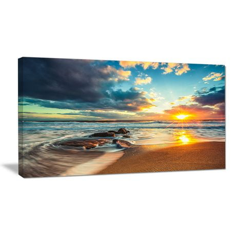
[sps_html tag=”img” src=”https://cdn.theartssection.com/wp-content/uploads/2025/05/designart-beautiful-blue-cloudscape-over-sea-modern-seashore-metal-regarding-beautiful-cloudscape-over-the-sea-modern-beach-round-wall-art-11.jpg” alt=”Designart 'Beautiful Blue Cloudscape Over Sea' Modern Seashore Metal … regarding Beautiful Cloudscape Over The Sea, Modern Beach Round Wall Art, 11"” style=”width: 100%; height: auto;”]
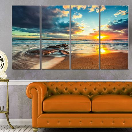
[sps_html tag=”img” src=”https://cdn.theartssection.com/wp-content/uploads/2025/05/design-art-beautiful-cloudscape-over-the-sea-modern-beach-canvas-art-regarding-beautiful-cloudscape-over-the-sea-modern-beach-round-wall-art-11.jpg” alt=”Design Art Beautiful Cloudscape Over The Sea Modern Beach Canvas Art … regarding Beautiful Cloudscape Over The Sea, Modern Beach Round Wall Art, 11"” style=”width: 100%; height: auto;”]
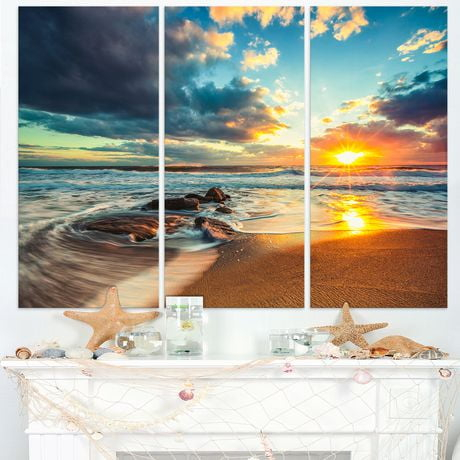
[sps_html tag=”img” src=”https://cdn.theartssection.com/wp-content/uploads/2025/05/beautiful-cloudscape-over-the-sea-photograph-by-valentin-valkov-fine-intended-for-beautiful-cloudscape-over-the-sea-modern-beach-round-wall-art-11.jpg” alt=”Beautiful Cloudscape Over The Sea Photograph By Valentin Valkov - Fine … intended for Beautiful Cloudscape Over The Sea, Modern Beach Round Wall Art, 11"” style=”width: 100%; height: auto;”]
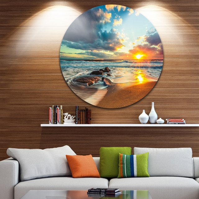
[sps_html tag=”img” src=”https://cdn.theartssection.com/wp-content/uploads/2025/05/designart-beautiful-cloudscape-over-the-sea-beach-metal-circle-wall-intended-for-beautiful-cloudscape-over-the-sea-modern-beach-round-wall-art-11.jpg” alt=”Designart - Beautiful Cloudscape Over The Sea' Beach Metal Circle Wall … intended for Beautiful Cloudscape Over The Sea, Modern Beach Round Wall Art, 11"” style=”width: 100%; height: auto;”]
[sps_html tag=”img” src=”https://cdn.theartssection.com/wp-content/uploads/2025/05/wall26-beautiful-cloudscape-over-the-sea-sunrise-shot-removable-inside-beautiful-cloudscape-over-the-sea-modern-beach-round-wall-art-11.jpeg” alt=”Wall26 - Beautiful Cloudscape Over The Sea, Sunrise Shot - Removable … inside Beautiful Cloudscape Over The Sea, Modern Beach Round Wall Art, 11"” style=”width: 100%; height: auto;”]