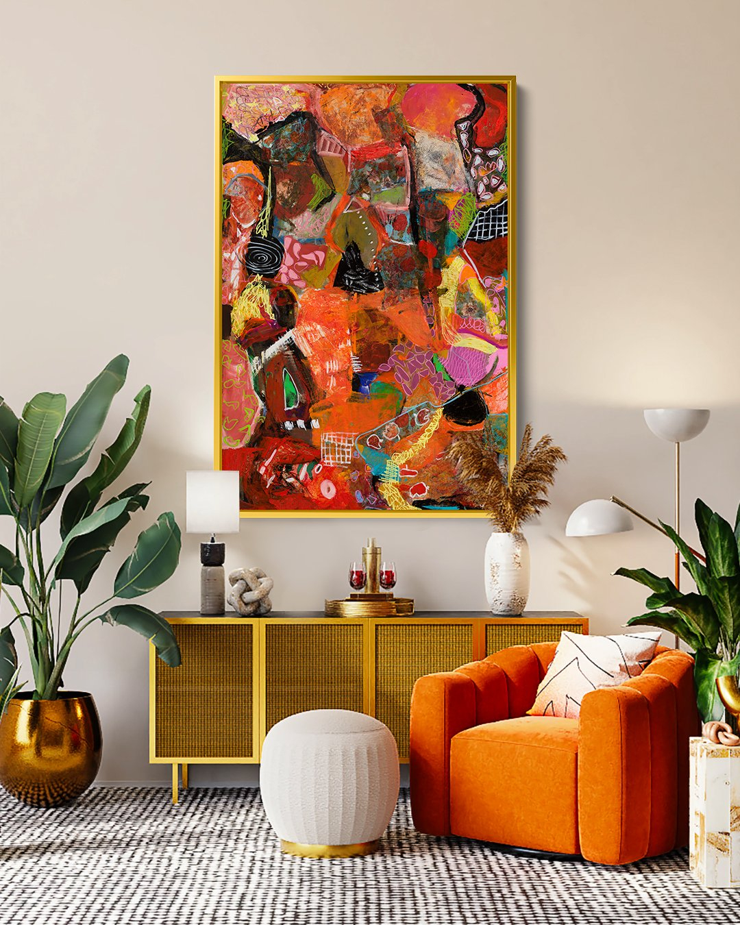
Have you ever walked into a room and instantly felt cozy and relaxed? That feeling often comes down to one thing: color. Warm palettes in home decoration don’t just look nice—they actually impact how we feel, think, and behave. Think about your favorite spots in your house. Chances are they feature warm tones like oranges, yellows, and reds. But why do these colors work so well? Let’s explore the fascinating science behind warm home decor.
When we think about decorating our homes, we often focus on furniture, textures, and layouts. But there’s something more fundamental happening when we choose warm colors for our walls and accents. These hues aren’t just visual choices—they’re psychological triggers that can transform the energy of a space. Whether you’re planning a complete renovation or just want to refresh a single room, understanding how warm colors affect us can help you create environments that truly support your well-being. It’s not magic, but it’s definitely powerful.
What Makes Colors Warm?
Warm colors are those that remind us of fire, sunlight, and cozy moments. They typically include reds, oranges, yellows, and their various shades. Unlike cool colors like blues and greens that tend to recede and make spaces feel smaller, warm colors seem to advance and fill a room with energy. This physical perception is important because it affects how we experience space. When you paint your living room in warm tones, it feels larger and more welcoming. The psychology of warmth isn’t just about temperature—it’s about creating emotional comfort through visual cues. Think about how a sunset makes you feel peaceful, or how a warm cup of tea brings comfort during cold weather. These associations carry over into our homes.
The Emotional Impact of Warm Hues
Warm colors have been scientifically linked to positive emotions and feelings of comfort. Red, for instance, stimulates excitement and passion, while orange brings enthusiasm and friendliness. Yellow evokes happiness and optimism. These emotions translate directly into how we experience our living spaces. A kitchen painted in warm yellow tones might make meal preparation feel joyful, while a bedroom with warm red accents could promote intimacy and romance. Research shows that warm environments can reduce stress levels and encourage social interaction. You might notice that people naturally gather in rooms with warm color schemes. It’s not just coincidence—the colors are encouraging connection and comfort.
Creating Comfort Through Color Psychology
One of the most appealing aspects of warm color palettes is their ability to create a sense of security and belonging. Consider how many of your happiest memories happen in warm-toned spaces. Maybe it’s the dining room where family dinners take place, or the reading nook bathed in golden afternoon light. These places feel safe and nurturing because they use warm hues that trigger our brain’s reward system. The psychology behind this is simple: warm colors activate areas of our brain associated with positive emotions and memories. This makes them ideal for spaces where you want to encourage relaxation, conversation, or simply feel good about being at home.
Practical Applications in Different Rooms
Applying warm color principles to your home doesn’t require a complete overhaul. Here are some ways to incorporate these principles effectively:
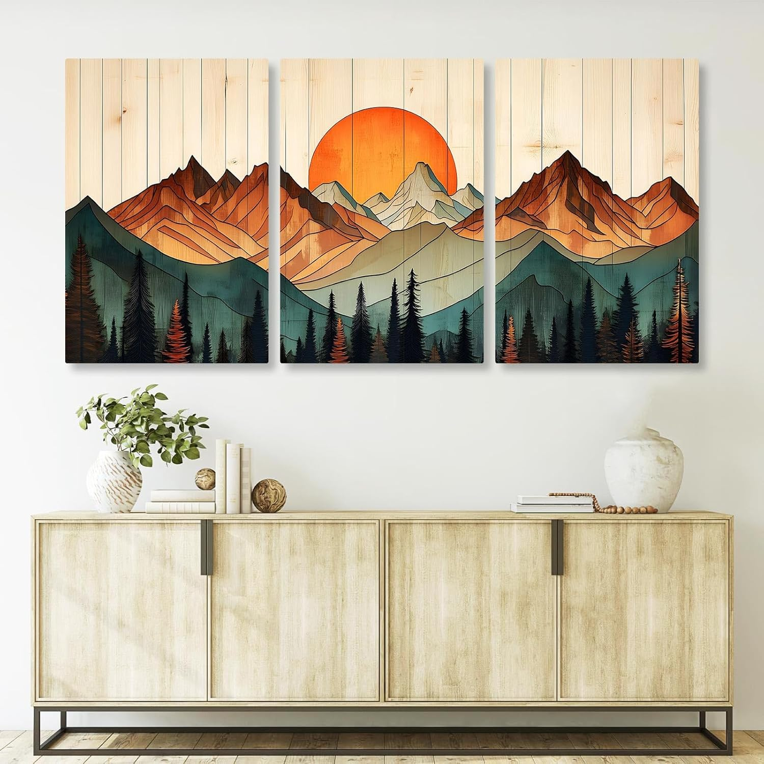
• Living rooms: Use warm reds and oranges to create conversation areas that feel inviting and energetic
• Bedrooms: Choose warm browns and soft yellows to promote restful sleep and calm energy
• Kitchens: Incorporate warm yellows and oranges to stimulate appetite and make cooking more enjoyable
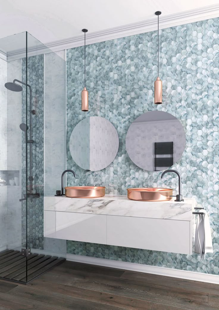
• Bathrooms: Try warm terracotta or warm beige tones for a spa-like feeling
Each room benefits differently from warm tones, but the key is balancing intensity with comfort. Too much bright red might feel overwhelming, while too little might not create the desired effect. Start small and build up gradually.
Balancing Warm and Cool Colors
While warm colors are wonderful, they don’t work in isolation. The most successful home decorations often blend warm and cool tones strategically. Think of it like a musical composition—too much of one note creates discord, but the right balance creates harmony. In practice, this means using warm colors as focal points while incorporating cooler tones for balance. For example, a warm red accent wall might be balanced with cool gray furniture or white trim. This approach prevents overwhelming the senses while still maintaining the comforting effects of warm colors. The key is understanding that every color choice affects the whole room’s atmosphere.
Cultural Perspectives on Warm Colors
Warm colors carry different meanings across cultures, which adds another layer to their psychological impact. In Western cultures, red often represents love and passion, while in Chinese culture, it symbolizes luck and prosperity. Orange can mean celebration in some cultures and caution in others. These cultural associations shape how we interpret and react to warm colors in our homes. Understanding these differences can help you create spaces that resonate with your personal values and cultural background. It also helps when entertaining guests from different backgrounds. A warm color scheme that feels perfectly comfortable to you might have different connotations for visitors, so consider these factors when choosing your palette.
Warm color palettes in home decoration offer more than just aesthetic appeal—they provide a powerful tool for shaping our emotional experiences within our living spaces. From the gentle glow of a warm yellow kitchen to the cozy embrace of a red accent wall, these hues connect directly to our deepest feelings of comfort and joy. Understanding the psychology behind warm colors helps us make intentional choices that enhance our daily lives. Remember, the best home decoration isn’t about following trends—it’s about creating spaces that truly support how you want to feel. Whether you’re starting fresh or updating existing spaces, let the power of warm colors guide you toward a more comfortable, emotionally rich home environment. Sometimes the smallest changes in color can make the biggest difference in how we experience our own homes.
[sps_html tag=”img” src=”https://cdn.theartssection.com/wp-content/uploads/2025/12/rustic-wood-wall-decor-with-regard-to-understanding-the-artistic-appeal-of-rustic-wood-wall-plaques.jpg” alt=”Rustic Wood Wall Decor with regard to Understanding the Artistic Appeal of Rustic Wood Wall Plaques” style=”width: 100%; height: auto;”]
[sps_html tag=”img” src=”https://cdn.theartssection.com/wp-content/uploads/2025/12/rustic-wood-wall-decor-inside-rustic-31-cream-white-wood-wall-art-plaque-window-arch-open-sun-burst-peaks-scaled.jpg” alt=”Rustic Wood Wall Decor inside Rustic 31" Cream White Wood Wall Art Plaque Window Arch Open Sun Burst Peaks” style=”width: 100%; height: auto;”]
[sps_html tag=”img” src=”https://cdn.theartssection.com/wp-content/uploads/2025/12/rustic-mountainwood-wall-artmodern-cabin-decor-gift-for-etsy-rustic-regarding-understanding-the-artistic-appeal-of-rustic-wood-wall-plaques.jpg” alt=”Rustic Mountainwood Wall Artmodern Cabin Decor Gift For - Etsy | Rustic … regarding Understanding the Artistic Appeal of Rustic Wood Wall Plaques” style=”width: 100%; height: auto;”]
[sps_html tag=”img” src=”https://cdn.theartssection.com/wp-content/uploads/2025/12/rustic-mountain-art-at-rose-slaughter-blog-for-understanding-the-artistic-appeal-of-rustic-wood-wall-plaques.jpg” alt=”Rustic Mountain Art At Rose Slaughter Blog for Understanding the Artistic Appeal of Rustic Wood Wall Plaques” style=”width: 100%; height: auto;”]
[sps_html tag=”img” src=”https://cdn.theartssection.com/wp-content/uploads/2025/12/rustic-wood-wall-art-work-at-kate-terry-blog-regarding-understanding-the-artistic-appeal-of-rustic-wood-wall-plaques.jpg” alt=”Rustic Wood Wall Art Work At Kate Terry Blog regarding Understanding the Artistic Appeal of Rustic Wood Wall Plaques” style=”width: 100%; height: auto;”]