In the digital art world, some color combinations just seem to work better than others. There’s something almost magical about pairing deep, rich dark reds with bright, fresh light greens. But what makes this combination so effective? It’s not just luck – there’s actual science behind why these colors work together in digital art. Let’s dive into the fascinating psychology and visual principles that make this pairing so compelling.
When you look at digital art, whether it’s website designs, mobile apps, or digital illustrations, you might notice certain color schemes that grab your attention immediately. One of the most striking combinations is dark red paired with light green. You’ll find this pairing in everything from luxury brand logos to health and wellness apps. But why does this combination feel so powerful? What’s happening in our brains when we see these colors together? The answer lies in the science of color psychology and visual perception.
The Psychology of Dark Red
Dark red isn’t just a pretty color – it carries deep psychological weight. This rich hue is associated with passion, strength, and energy. Think about how many luxury brands use deep reds in their branding. Ferrari uses crimson reds, and many high-end fashion labels choose dark burgundy tones. These colors speak to our primal senses, triggering feelings of excitement and intensity.
Dark red also has a fascinating property: it’s attention-grabbing. Our brains are wired to notice warm colors like reds and oranges more quickly than cool colors. This makes dark red particularly effective for call-to-action buttons or important elements in digital design. When you see a dark red element pop up on screen, your eyes naturally gravitate toward it.
But here’s something interesting – dark red also conveys stability and reliability. Unlike bright reds that scream for attention, dark reds suggest something more grounded and trustworthy. It’s the difference between a flashing warning sign and a well-established brand identity.
Light Green’s Calming Influence
While dark red brings energy and excitement, light green provides the perfect counterbalance. Light green, especially in digital contexts, often evokes feelings of freshness, growth, and renewal. Think about how many wellness apps use soft greens in their interfaces. Apple’s Health app, for instance, uses gentle green tones to communicate health and vitality.
This calming quality of light green isn’t accidental. In nature, light green represents life and growth. When we see these hues, our brains associate them with positive experiences like springtime, fresh leaves, and healthy plants. This connection helps reduce stress and anxiety in digital environments.
Light green also has excellent readability properties in digital design. Because it sits comfortably in the middle of the color spectrum, it creates good contrast against both dark and light backgrounds. This makes it incredibly versatile for digital art and interface design. Plus, unlike harsh blues or yellows, light green doesn’t strain the eyes during extended viewing periods.
The Visual Harmony of Contrast
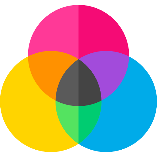
The magic happens when you combine these two colors. The contrast between dark red and light green creates visual tension that’s actually very pleasing to the eye. This isn’t random – it’s based on how our visual system processes different wavelengths of light.
Dark red sits in the warm end of the color spectrum, while light green is positioned more toward the cool side. This natural opposition creates a dynamic balance that keeps viewers engaged. It’s similar to how a black and white photograph creates visual interest through stark contrast.
What’s particularly interesting is how this contrast works differently depending on the saturation levels. A highly saturated dark red paired with a muted light green can create a sophisticated, elegant feel. Meanwhile, a more desaturated version of both colors can produce a softer, more approachable aesthetic.
This contrast principle explains why this combination works so well in digital art. It provides enough visual distinction to make elements stand out, yet maintains enough harmony to prevent visual chaos.
Cultural and Contextual Meanings
Color meanings aren’t universal – they vary across cultures and contexts. In Western cultures, dark red often symbolizes love, power, and luxury. Light green typically represents health, growth, and environmental consciousness. These associations have been shaped by centuries of cultural interpretation.
However, the beauty of this color scheme lies in its versatility. In a health and fitness app, dark red might represent energy and determination, while light green suggests progress and wellness. In a luxury lifestyle brand, dark red could denote sophistication and exclusivity, and light green might imply natural ingredients or organic values.
This adaptability makes dark red and light green particularly useful in digital art where context matters. A single color combination can shift meaning entirely depending on the application. For example, the same colors might signal danger in one context and growth in another, simply through careful arrangement and accompanying imagery.
Practical Applications in Digital Art
So how do artists and designers actually use this combination in practice? Let’s look at some real-world examples. Many successful digital products use this palette strategically:
• Fitness applications often pair dark red accents with light green backgrounds to suggest energy and progress
• Health-focused websites use this combination to create a sense of trust and natural healing
• Luxury brands employ dark red for premium branding while using light green for eco-friendly product lines
• Gaming interfaces sometimes utilize this contrast to create dramatic visual impact
The key is understanding how to layer these colors effectively. Using dark red for headers or important buttons while keeping light green for backgrounds or secondary elements creates a natural hierarchy. This approach guides the viewer’s eye through the digital experience in a logical way.
Many digital artists also experiment with varying intensities of these colors. A deep maroon might work well with a pale mint green, or a rich wine red with a fresh lime green. The variations allow for creative expression while maintaining the fundamental color relationship.
Scientific Research Supporting the Combination
There’s actual research backing up why this color combination works so well. Studies in color psychology show that warm-cool color contrasts are among the most visually stimulating arrangements for human perception. The brain processes these combinations faster than neutral tones, creating a more engaging visual experience.
Research also indicates that people tend to remember images with strong color contrasts more easily. This has huge implications for digital art marketing and user engagement. When a digital artwork or interface uses dark red and light green effectively, it’s more likely to leave a lasting impression.
Neuroscientists have found that certain color combinations activate different areas of the brain related to emotion and memory. The combination of dark red and light green seems to stimulate both the limbic system (responsible for emotions) and the visual cortex simultaneously. This dual activation creates a more immersive and memorable viewing experience.
Additionally, studies on color therapy suggest that this particular combination can promote a sense of balance and harmony. The warmth of red combined with the coolness of green creates a balanced chromatic experience that feels both energizing and soothing.
The science behind dark red and light green color schemes in digital art reveals a fascinating interplay of psychology, visual perception, and cultural meaning. This combination works because it taps into our deepest visual instincts while providing practical benefits for digital design. The warm energy of dark red meets the cool serenity of light green, creating a dynamic balance that’s both attention-grabbing and emotionally satisfying.
Whether you’re a digital artist, designer, or simply someone who appreciates great visual communication, understanding why this color pairing resonates so strongly can help you create more impactful work. The key isn’t just choosing these colors – it’s understanding how to use them thoughtfully and purposefully. When you apply this knowledge, you’re not just creating beautiful art; you’re creating experiences that connect with people on a fundamental human level. The next time you encounter this striking combination, remember that there’s more going on than meets the eye – there’s science, psychology, and a whole lot of human understanding behind those colors.
[sps_html tag=”img” src=”https://cdn.theartssection.com/wp-content/uploads/2025/12/how-to-make-art-with-mathematics-fractal-art-senarius-regarding-creating-harmony-through-fractal-geometry-in-contemporary-digital-art.jpg” alt=”How To Make Art With Mathematics - Fractal Art - Senarius regarding Creating Harmony Through Fractal Geometry in Contemporary Digital Art” style=”width: 100%; height: auto;”]
[sps_html tag=”img” src=”https://cdn.theartssection.com/wp-content/uploads/2025/12/fractal-harmony-1e-digital-art-by-walter-neal-fine-art-america-throughout-dark-red-and-light-green-fractal-flowers-digital-wall-art-4-panels.jpg” alt=”Fractal Harmony 1E Digital Art By Walter Neal - Fine Art America throughout "Dark Red And Light Green Fractal Flowers" Digital Wall Art, 4 Panels” style=”width: 100%; height: auto;”]
[sps_html tag=”img” src=”https://cdn.theartssection.com/wp-content/uploads/2025/12/premium-photo-a-mesmerizing-composition-of-shimmering-fractal-for-dark-red-and-light-green-fractal-flowers-digital-wall-art-4-panels.jpg” alt=”Premium Photo | A Mesmerizing Composition Of Shimmering Fractal … for "Dark Red And Light Green Fractal Flowers" Digital Wall Art, 4 Panels” style=”width: 100%; height: auto;”]
[sps_html tag=”img” src=”https://cdn.theartssection.com/wp-content/uploads/2025/12/pin-by-seth-osmun-on-fractals-beautiful-abstract-art-sacred-geometry-with-dark-red-and-light-green-fractal-flowers-digital-wall-art-4-panels.jpg” alt=”Pin By Seth Osmun On Fractals | Beautiful Abstract Art, Sacred Geometry … with "Dark Red And Light Green Fractal Flowers" Digital Wall Art, 4 Panels” style=”width: 100%; height: auto;”]
[sps_html tag=”img” src=”https://cdn.theartssection.com/wp-content/uploads/2025/12/pin-by-metafractals-on-fractals-digital-art-in-2020-fractal-art-inside-dark-red-and-light-green-fractal-flowers-digital-wall-art-4-panels.jpg” alt=”Pin By Metafractals On Fractals - Digital Art In 2020 | Fractal Art … inside "Dark Red And Light Green Fractal Flowers" Digital Wall Art, 4 Panels” style=”width: 100%; height: auto;”]