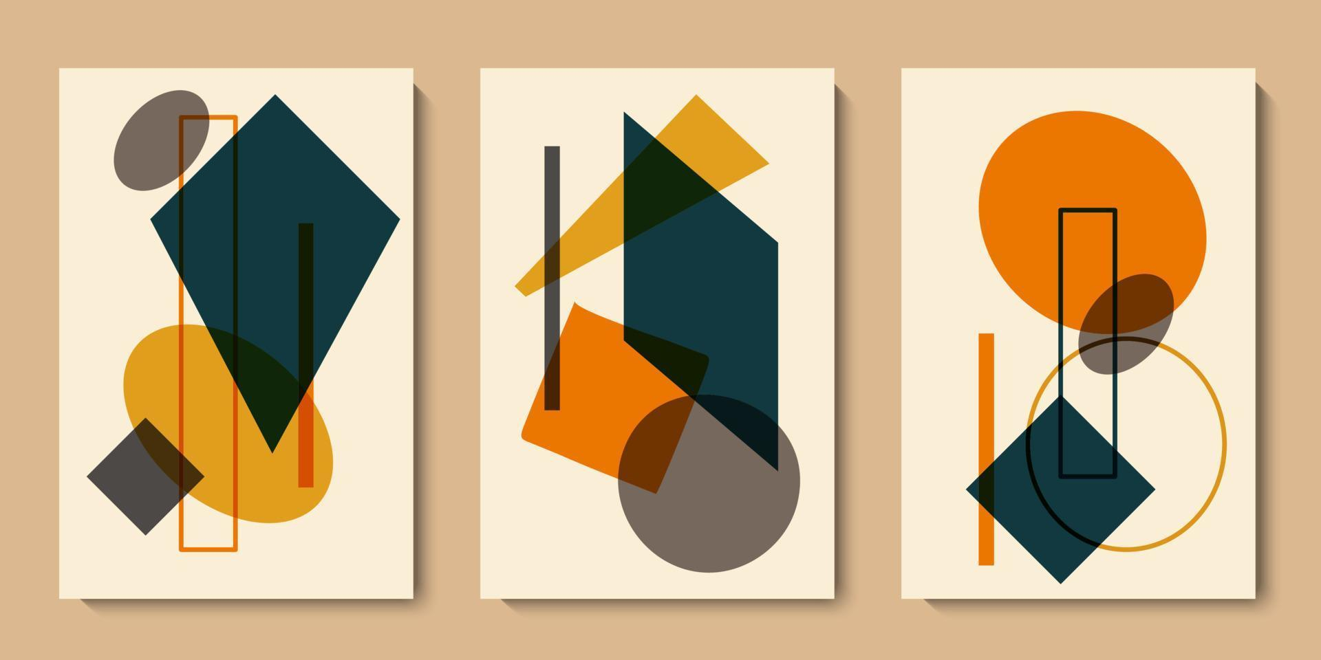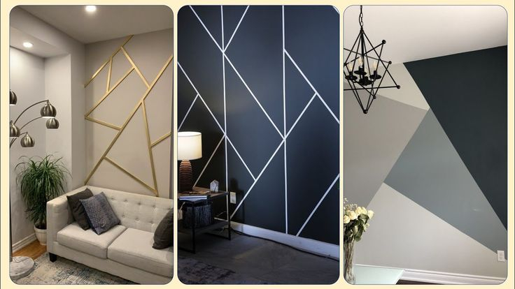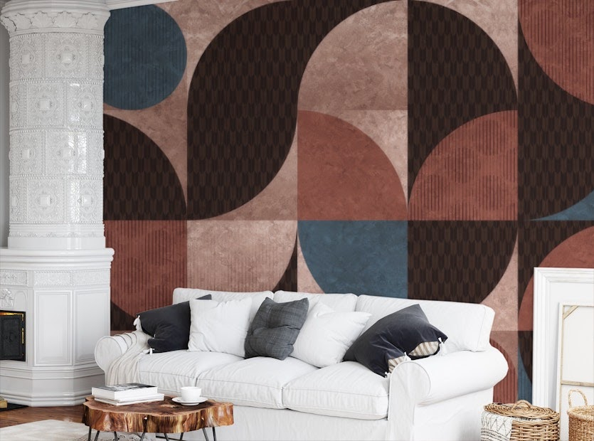
Have you ever walked into a room and instantly felt your shoulders drop, your breathing slow right down, and your mind clear out all the static. It is funny how a simple palette can do that. In a world full of loud colors and constant digital noise, stepping into a space stripped down to its barest essentials feels like taking a deep, cool breath of fresh air.
Design trends come and go with every passing season, yet the pull of monochromatic palettes remains entirely steady. As we navigate our homes in 2026, the fascination with ink tones and chalky hues goes far deeper than mere aesthetics. It touches how we feel, how we rest, and how we process the chaos of daily life. Let us unpack what makes this stark contrast so deeply grounding to our human spirit.
The Science of Visual Clarity
Our brains are constantly working overtime to process millions of visual bits every single day. When a room is bursting with clashing patterns and a rainbow of competing shades, the mind has to labor harder to make sense of it all. Stripping things back to stark contrasts provides an immediate visual relief that researchers call cognitive ease.
By removing distracting chromatic clutter, a room tells a clear, uninterrupted story. You can think of it like reading a well-formatted book instead of a messy billboard. This natural clarity helps lower everyday stress levels and lets your eyes rest without constantly hunting for the next bright thing.
Finding Comfort in Absolute Boundaries
Black and white represent the ultimate extremes, yet together they create a surprising sense of balance. In psychology, sharp boundaries help people feel safe and anchored. When a wall wears a crisp coat of chalky paint and sits next to a heavy jet-colored frame, it sets a clear boundary for the room.
This structural honesty gives people a subconscious sense of order. In an era where work, rest, and play all happen under the exact same roof, having clear visual anchors helps our brains switch gears from busy productivity to peaceful unwinding.
Textures Take Center Stage
When you take away a wide spectrum of colors, something fascinating happens to your sense of touch. Without bright hues to grab your attention, your eyes start noticing the tiny details of the materials around you. A coarse woolen throw, a smooth matte ceramic vase, and rough exposed brick suddenly come alive.
This shift deepens our connection to the physical environment. Instead of relying on flashy paint jobs to create interest, designers use tactile richness. Touching different surfaces grounds us in the present moment, turning a quiet living room into a multisensory sanctuary.
The Illusion of Space and Light
Light behaves in wonderful ways when played against deep dark shades. A bright ivory wall bounces natural sunlight around a room, making small corners feel wide open and airy. Meanwhile, a touch of deep charcoal adds depth and keeps the room from feeling like a sterile hospital.
This dynamic interplay tricks the eye into seeing more volume than actually exists. Homeowners living in tighter urban apartments find that this smart contrast stretches their living spaces, making cozy quarters feel intentional rather than cramped.
Emotional Control and Mindfulness
Your home environment acts as a silent partner in shaping your daily moods. A room draped in stark shades acts almost like a blank canvas for your thoughts. Because the background is neutral, it stops external distractions from flooding your emotional state.
Many people find that practicing daily mindfulness becomes much easier in a streamlined setting. Without bright reds or frantic yellows pulling at your focus, meditation, reading, or just sitting quietly with a warm cup of tea feels much more intentional and restorative.
Some folks worry that a high-contrast palette might feel too cold or uninviting, like a luxury hotel lobby where you are afraid to touch anything. But the real magic happens when you layer your own story into the mix. A worn leather chair, a stack of colorful books, or a lively green houseplant pops brilliantly against a neutral backdrop.
You do not have to live in a strict museum exhibit to enjoy the benefits of this design style. Adding personal treasures warms up the sharp edges, ensuring your home feels deeply lived-in, loved, and entirely yours.
Creating a harmonious home is ultimately about building a space that heals your mind at the end of a long day. Whether you lean toward deep charcoal or crisp ivory, understanding the psychology behind these choices helps you craft a refuge that supports your well-being.
Take a look around your own living space today. Notice how the interplay of light, shadow, and simple hues might be quietly shaping your mood, and do not be afraid to strip away the noise to find your own version of peace.