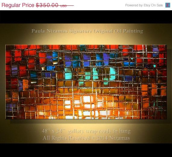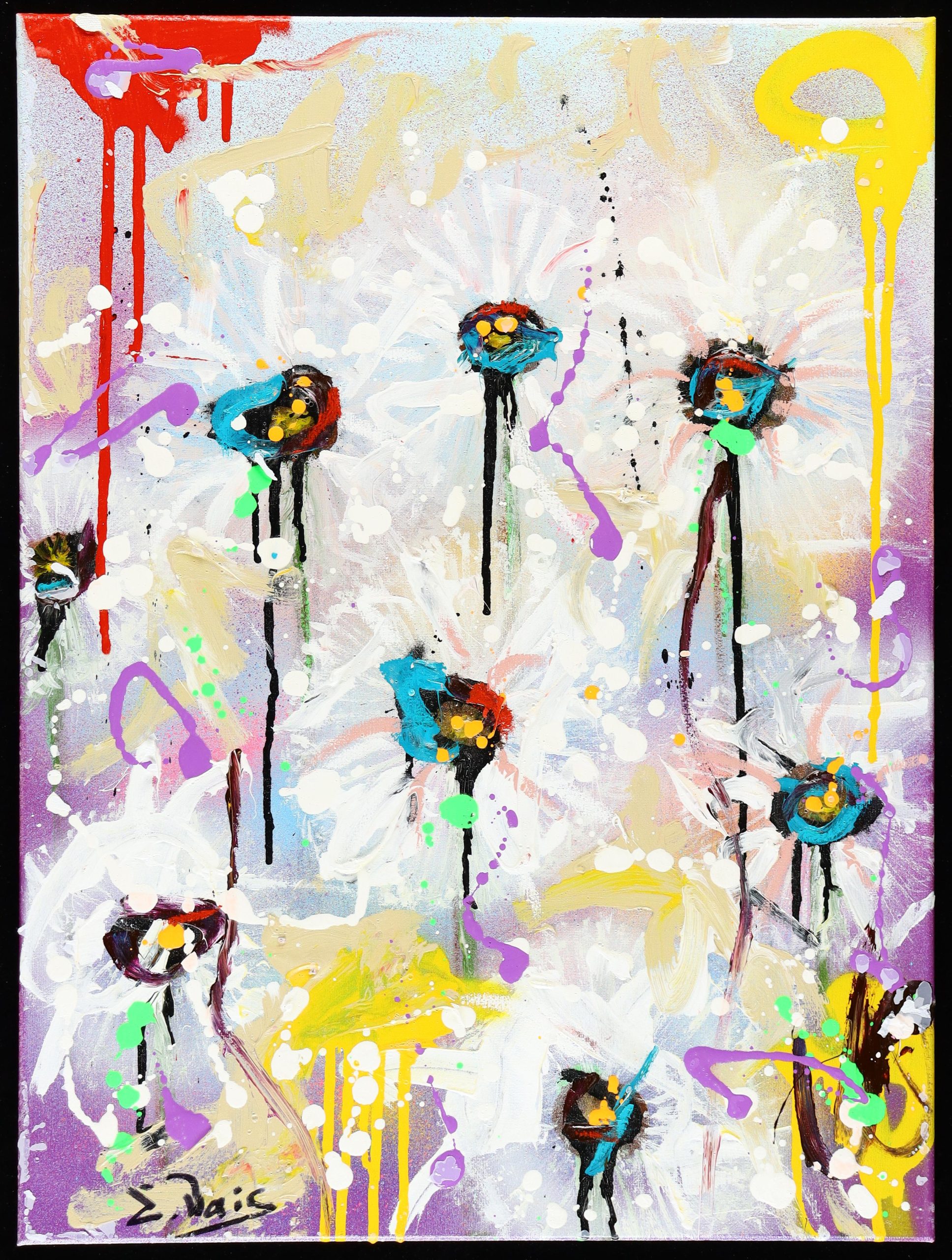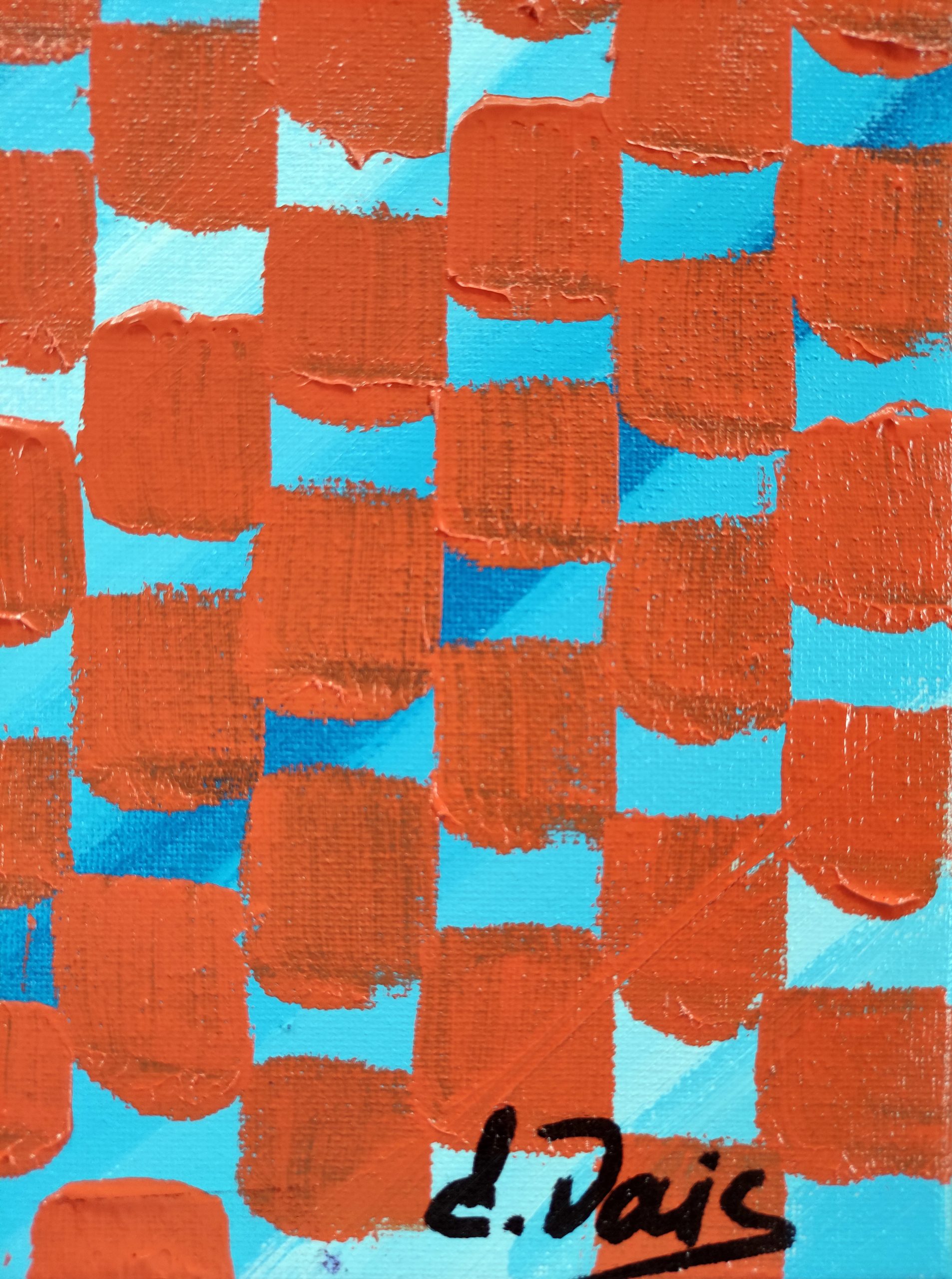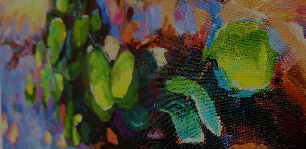
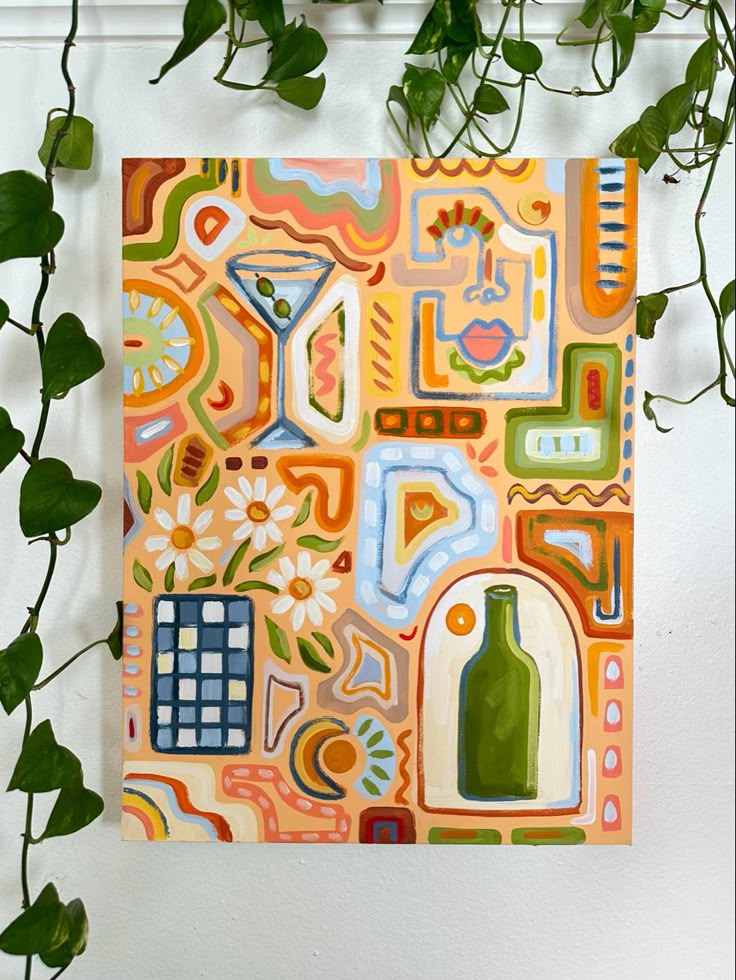
The mid-afternoon sun cuts horizontally across a whitewashed gallery wall, illuminating a square-inch expanse of heavy cotton duck fabric. Pigment—dense, cadmium-heavy, and unapologetically saturated—clings to the weave, catching the grain of the stretcher bars beneath. Standing five feet away, a seasoned collector tilts their chin, studying the interplay between the hard geometric bounds of the frame and the bleeding, vibrant warmth of the orange hue. It is not merely a splash of color; it is an anchor point in a room otherwise dominated by neutral greys, charcoal accents, and architectural concrete.
In contemporary living spaces, art procurement has evolved past the era of generic mass-produced prints tucked behind shiny glass. Today’s buyers look for tactile authenticity, a deliberate collision of scale, color theory, and physical texture that feels both grounded and daring. The 18×24-inch canvas sits precisely at the sweet spot of this aesthetic movement. It is intimate enough for a tight hallway alcove yet commanding enough to anchor a curated salon wall. When rendered in fields of brilliant orange—a color carrying centuries of psychological weight and avant-garde history—this specific dimension transforms from a standard craft size into a coveted object of modern desire.
Understanding why this specific piece commands such intense attention requires peeling back layers of interior design philosophy, color psychology, and the changing mechanics of art acquisition. This examination looks closely at why a medium-format orange canvas has quietly become the ultimate litmus test for sophisticated residential curation.
The lineage of orange in modern visual culture stretches back directly through the Fauvist experiments of Henri Matisse and the abstract expressionist canvases of Mark Rothko and Hans Hofmann. When artists deliberately pushed orange to the forefront of the compositional plane, they were not just applying paint; they were weaponizing warmth. Orange occupies a unique neurological territory—it stimulates conversation, accelerates spatial perception, and injects vitality into static environments without the aggressive hostility of pure red. For modern collectors, acquiring an orange canvas is a nod to this historical rebellion against muted academic palettes.
Simultaneously, the physical properties of stretched canvas alter how this color registers in a home. Unlike a glossy poster behind reflection-prone glass, a gesso-primed canvas absorbs ambient light. The minute peaks and valleys of the fabric weave diffuse illumination, giving the orange pigment a living, breathing quality that shifts as the day progresses from dawn to dusk. This dynamic behavior satisfies the modern collector’s craving for interactivity. Art is no longer a static museum artifact viewed from a distance; it is a sensory participant in daily domestic life.
The Geometry of Scale: Why Eighteen by Twenty-Four Inches Dominates Contemporary Walls
The dimensions of eighteen by twenty-four inches are deceptively powerful. In the architecture of interior layout, scale dictates human emotion. Too large, and a piece overwhelms a standard residential ceiling height; too small, and it dissolves into visual noise among bookshelves and furniture groupings. An 18×24 canvas hits a golden ratio of usability. It allows for vertical or horizontal orientation without forcing the owner to reconfigure an entire room’s layout to accommodate its footprint. It can float comfortably above a mid-century modern credenza, anchor a reading nook, or serve as the geometric center of a multi-piece gallery wall.
Furthermore, this specific size aligns with standard framing and stretching protocols, making it accessible for custom framing while retaining a bespoke feel. When collectors evaluate wall space, they often encounter the "dead zone" problem—areas too wide for a single vignette yet too narrow for a massive statement piece. An 18×24 canvas bridges this gap effortlessly. It commands attention through chromatic intensity rather than physical mass. By relying on a high-impact color like orange rather than sprawling square footage, the piece achieves maximum visual yield with minimal spatial intrusion.
The tactile reality of stretched canvas at this scale cannot be overstated. Standard paper prints demand protective barriers, whereas an 18×24 canvas offers an exposed, organic edge that appeals to collectors who value craftsmanship. The folded corners, the visible tension of the fabric against the pine or fir stretcher bars, and the heavy-body texture of the paint all communicate a sense of handmade integrity. In an increasingly digital world where our eyes are constantly strained by flat glass screens, looking at a physical, textured canvas provides genuine cognitive relief.
Chromatic Psychology: Harnessing the Warmth of Orange in Minimalist Interiors
Minimalism for the sake of minimalism often risks feeling cold, sterile, and unwelcoming. As monochromatic palettes of stark white, black, and industrial steel dominated architectural design over the past decade, a quiet counter-revolution emerged. Interiors required soul, and soul is introduced through calculated doses of warmth. Orange serves as the ultimate corrective color. It cuts through the chill of concrete and cool-toned marbles, introducing an inviting energy that transforms a house into a home.
When applied to an 18×24 canvas, orange acts as a visual anchor. It draws the eye instantly, serving as a focal point that organizes the surrounding furniture and decor. A collector does not need a room painted in loud hues to appreciate this piece; in fact, the canvas shines brightest against a backdrop of muted earth tones, warm oak floors, and textured linens. The contrast creates a visual dialogue where the neutrality of the room amplifies the radiance of the artwork, and the artwork grounds the room’s expansive negative space.
Color theorists often note that orange stimulates appetite, creativity, and social interaction. Placing an 18×24 orange canvas in a dining area, a creative studio, or a living room naturally alters the emotional temperature of the space. It invites lingering, conversation, and a sense of coziness that cooler colors like blue or green struggle to replicate. Modern collectors are increasingly curating their living environments for emotional wellness, choosing art not just for its pedigree, but for how it makes them feel the moment they walk through the door.
Sourcing and Curating: A Practical Framework for Acquiring and Displaying Medium-Format Canvas Art
Bringing a high-impact piece like an 18×24 orange canvas into a curated collection requires a deliberate methodology. Haphazard hanging or poor lighting can diminish the impact of even the finest work. Collectors must approach the acquisition and installation process with structural care, treating the piece as both a standalone visual anchor and part of a larger spatial narrative.
- Step 1 (Assessing Spatial Lighting): Evaluate the natural and artificial light sources in the intended room, ensuring the canvas receives glancing light to highlight its texture rather than direct glare that washes out the pigment.
- Step 2 (Determining Orientation & Height): Decide whether the vertical 18×24 orientation or the horizontal 24×18 layout best serves the wall architecture, aligning the vertical center of the canvas precisely at eye level (roughly 57 to 60 inches from the floor).
- Step 3 (Selecting Framing or Edge Treatment): Determine if the piece will remain unframed with finished gallery-wrapped edges for a contemporary look, or if a floating wooden frame will be added to create architectural separation from the wall.
- Step 4 (Establishing Chromatic Echoes): Integrate subtle secondary elements in the room—such as a throw pillow, a ceramic vase, or a book spine—that pick up the orange undertones without matching the canvas identically.
- Step 5 (Balancing Negative Space): Ensure the surrounding wall area remains uncluttered, allowing the intense color field of the 18×24 canvas room to breathe and command the visual field undisturbed.
Navigating the Traps: Common Missteps in Displaying and Preserving Bold Canvas Art
Even experienced interior enthusiasts occasionally stumble when integrating high-saturation art into their homes. The most common errors usually stem from either over-coordinating the space or failing to account for the physical vulnerabilities of the canvas medium over time. Recognizing these potential pitfalls ensures that the artwork retains its pristine condition and aesthetic authority for decades.
- Pitfall 1 (Color Over-Matching): Painting accent walls in the exact same shade of orange or populating the room with too many matching textiles, which flattens the space and turns sophisticated art into a tacky coordinated theme; the workaround is to let the canvas stand out as the sole vibrant focal point against neutral surroundings.
- Pitfall 2 (Neglecting Environmental Controls): Hanging the canvas in direct, unshaded sunlight or high-humidity areas like poorly ventilated bathrooms, causing pigment fading or wood warping; the workaround is to use UV-filtering glass if framed, or keep the canvas away from direct solar paths and moisture-prone zones.
- Pitfall 3 (Ignoring Proper Hanging Hardware): Using lightweight adhesive strips or single unanchored nails for a stretched canvas, risking structural sag or accidental falls; the workaround is to use heavy-duty wall anchors, dual picture hooks, and leveling tools matched to the exact weight of the stretcher bars.
- Pitfall 4 (Improper Dusting and Maintenance): Wiping textured acrylic or oil surfaces with damp cloths or harsh chemical cleaners, which can strip the gesso or smear embedded dust; the workaround is to use a dry, ultra-soft artist’s brush or a feather duster held lightly against the canvas surface.
- Pitfall 5 (Disregarding Scale Context): Floating an 18×24 piece alone on a massive, double-height great room wall where it looks lost and insignificant; the workaround is to either anchor it within a deliberate gallery wall arrangement or place it in a more intimately scaled room like a study or bedroom.
The Broader Aesthetic Shift: Why Tactile Art Outlasts Digital Trends
Interior design trends come and go with alarming velocity, fueled by social media algorithms that churn out aesthetic micro-trends every few months. Yet, the enduring appeal of physical canvas art points to a deeper cultural pushback against disposability. Collectors are tired of digital wallpapers, disposable posters, and sterile minimalism that lacks a human fingerprint. They are investing in objects that carry physical presence, weight, and history.
An 18×24 orange canvas sits at the intersection of this shift. It is small enough to be accessible yet substantial enough to demand respect. The resurgence of interest in mid-format canvas prints and original paintings reflects a maturity in modern collecting. Buyers are no longer purchasing art purely to fill empty white walls; they are curating environments that tell a personal story. The rich, enveloping warmth of orange acts as a visual manifestation of personality, refusing to blend into the background of safe, uninspired decor.
Furthermore, the economic and emotional value of such pieces is shifting. Collectors recognize that physical art appreciates not just in financial terms, but in sentimental resonance. As homes become sanctuaries from an increasingly loud and digital external world, the quiet gravity of a well-crafted, textured canvas provides an essential grounding force. It is an investment in daily well-being, an aesthetic anchor that transforms physical space into a deeply personal refuge.
Curating Your Space: Practical Frameworks for Modern Art Integration
For those ready to incorporate a statement piece like an 18×24 orange canvas into their home, success lies in intentionality. Start by auditing your current spatial palette. Identify where your rooms feel flat, cold, or overly dependent on neutral tones. Instead of overhauling furniture layouts or investing in major renovations, introduce the canvas as a strategic pivot point. Let the warmth of the orange dictate the emotional tone of the space, allowing it to draw out subtle warmth in your existing woodwork, textiles, and lighting.
When placing the piece, remember that art should engage the eye at unexpected moments. Do not reserve art solely for the living room sofa wall. An 18×24 canvas can redefine a transitional space—a narrow hallway, the landing of a staircase, or an entryway where guests pause upon arrival. By positioning the canvas where natural sightlines intersect, you maximize its psychological impact, turning a functional walkthrough into an engaging gallery experience.
Ultimately, modern collecting is an exercise in self-definition. Choosing an 18×24 orange canvas is a deliberate choice to embrace warmth, texture, and historical artistic lineage over fleeting interior fads. It is a declaration that your living space is not a showroom, but a living, breathing canvas of your own design.
The enduring fascination with an 18×24 orange canvas reveals a great deal about where modern interior design and collecting are heading. We have moved past the sterile perfection of pure minimalism and the chaotic clutter of maximalism, landing in a thoughtful middle ground. This aesthetic values curation over consumption, tactile authenticity over digital sheen, and emotional warmth over cold perfection.
As you look at your own walls and consider how to shape your living environment, remember that art does not need to shout to be heard. Sometimes, all it takes is eighteen by twenty-four inches of brilliant, textured orange to completely shift the gravity of a room. Embrace the warmth, respect the craft, and let your walls tell a story that feels genuinely your own.