Ever wondered why certain colors just feel right together, while others clash like a bad pop song? It’s all thanks to color theory, a set of guidelines and principles that govern how we perceive and interact with colors. It’s not just for artists; understanding color theory can help you in everything, from choosing the perfect outfit to designing a website, and even improving your home decor. Let’s break down the basics and explore how you can use these principles to create visually appealing and impactful designs.
Color is a powerful language. It speaks to us on a subconscious level, evoking feelings, creating moods, and influencing our perceptions. But color isn’t random; it’s governed by a fascinating set of rules known as color theory. This isn’t some kind of secret society, though. Color theory is a set of rules and guidelines that help us understand how colors work together. It is a toolbox that anyone can use, not just painters and designers, to create more visually engaging and effective creations. This guide will help you master the key concepts of color theory and show you how to apply them to your everyday life.
The Color Wheel: Your Starting Point
The color wheel is the foundation of color theory. It’s a circular diagram that shows the relationships between colors. There are three main types of colors on the wheel:
- Primary Colors: Red, yellow, and blue. These are the building blocks; you cannot create them by mixing other colors.
- Secondary Colors: Green, orange, and purple. These are created by mixing two primary colors (e.g., red and yellow make orange).
- Tertiary Colors: These are created by mixing a primary color with a neighboring secondary color (e.g., red-orange, yellow-green).
Think of the color wheel as your color-mixing guide. It shows you how colors interact and how to create new ones. Understanding the wheel is critical to understanding color harmony.
Color Harmonies: Finding the Perfect Match
Color harmonies are color combinations that are pleasing to the eye. There are several types of color harmonies, each with its own unique feel:
- Complementary: Colors that are opposite each other on the color wheel (e.g., red and green). They create high contrast and vibrancy. Think of the classic Christmas color scheme.
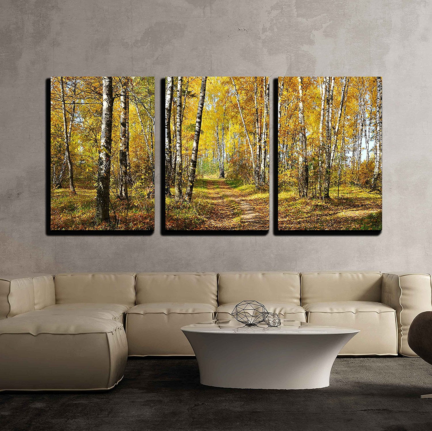
- Analogous: Colors that are next to each other on the color wheel (e.g., blue, blue-green, and green). They create a sense of harmony and unity. This is like a calming, natural landscape.
- Triadic: Three colors evenly spaced on the color wheel (e.g., red, yellow, and blue). They offer a balanced and dynamic composition. Think of the primary colors used in children’s art.
- Monochromatic: Using different shades, tones, and tints of a single color. It creates a unified and sophisticated look. A room decorated in various shades of blue, for example.
Experiment with these harmonies to see how they affect the mood of your work.
Understanding Color Properties: Hue, Saturation, and Value
Beyond the color wheel, understanding the properties of color is also essential.
- Hue: This is simply the name of the color (e.g., red, blue, green).
- Saturation: This refers to the intensity or purity of a color. A highly saturated color is vivid and intense, while a desaturated color is more muted and grayed out. Think of a vibrant sunset versus a foggy day.
- Value: This is the lightness or darkness of a color. Adding white to a color creates a tint (lighter value), and adding black creates a shade (darker value). Consider a light blue sky versus a navy blue night sky.
By manipulating these properties, you can create a wide range of effects.
The Psychology of Color: How Colors Affect Emotions
Colors have a powerful psychological impact on us. They can evoke specific emotions and associations. While personal preferences vary, some general associations exist:
- Red: Often associated with energy, passion, and excitement, and also danger. It’s like a fire alarm.
- Orange: Represents enthusiasm, creativity, and warmth. Think of a cozy fireplace.
- Yellow: Linked to happiness, optimism, and sunshine. A bright, cheerful room.
- Green: Symbolizes nature, growth, and tranquility. A peaceful forest scene.
- Blue: Associated with calmness, trust, and serenity. The vast ocean.
- Purple: Represents royalty, creativity, and mystery. A luxurious velvet curtain.
Consider the emotional impact of your color choices when designing anything.
Applying Color Theory: Practical Tips and Examples
Okay, so how do you put this all into practice? Here are some tips:
- Start with a Color Palette: Choose a few colors that you want to use. Use a color harmony to guide your selection.
- Consider Your Audience: Who are you designing for? What colors will resonate with them?
- Use Contrast Wisely: High contrast can grab attention, but too much can be overwhelming. Balance it with areas of lower contrast.
- Think About Balance: Don’t let one color dominate. Distribute colors evenly throughout your design.
- Experiment and Play: Don’t be afraid to try new things. The more you experiment, the better you’ll understand color.
For example, if you’re designing a website for a health food store, you might use a palette of greens, browns, and oranges to create a sense of naturalness and health. If you’re designing a logo for a tech company, you might use blues and grays to convey a sense of professionalism and trustworthiness.
Mistakes to Avoid (and How to Fix Them)
Even the most experienced designers make mistakes. Here are some common pitfalls, and how to avoid them:
- Too Many Colors: Overusing colors can make your design look cluttered and confusing. Stick to a limited palette.
- Poor Contrast: Insufficient contrast can make text difficult to read. Ensure there’s enough difference between your background and text colors.
- Ignoring the Psychology of Color: Be mindful of the emotions your colors evoke. Don’t use a color that clashes with your intended message.
- Copying Without Understanding: Don’t just copy color schemes. Understand why they work, so you can adapt them to your own needs.
- Not Testing Your Designs: Always test your designs on different devices and with different people to get feedback. This can help you identify any issues that you might have missed.
By being aware of these common errors, you can improve your color choices and create more effective designs.
Color theory is a powerful tool for anyone who wants to create visually appealing and effective designs. By understanding the color wheel, color harmonies, and the psychology of color, you can make informed choices that will elevate your work. Remember, color is a language; learn to speak it fluently, and you’ll be able to communicate your ideas with clarity and impact. So, go forth, experiment, and have fun with color. The world is your canvas, and the possibilities are endless.
[sps_html tag=”img” src=”https://cdn.theartssection.com/wp-content/uploads/2025/05/wall-art-set-of-3-canvas-at-francesca-barrentine-blog-within-triple-play-canvas-wall-art-panels-set-of-3-12×59-1.jpg” alt=”Wall Art Set Of 3 Canvas At Francesca Barrentine Blog within "Triple Play" Canvas Wall Art Panels, Set Of 3, 12"X59"” style=”width: 100%; height: auto;”]
[sps_html tag=”img” src=”https://cdn.theartssection.com/wp-content/uploads/2025/05/wall26-3-piece-canvas-wall-art-birch-grove-in-autumn-forest-modern-for-color-texture-and-dimension-exploring-the-artistic-potential-of-canvas-wall-panels.jpeg” alt=”Wall26 3 Piece Canvas Wall Art - Birch Grove In Autumn Forest - Modern … for Color, Texture, and Dimension Exploring the Artistic Potential of Canvas Wall Panels” style=”width: 100%; height: auto;”]
[sps_html tag=”img” src=”https://cdn.theartssection.com/wp-content/uploads/2025/05/wall26-3-piece-canvas-wall-art-amazing-mountain-landscape-with-fog-within-color-texture-and-dimension-exploring-the-artistic-potential-of-canvas-wall-panels.jpeg” alt=”Wall26 - 3 Piece Canvas Wall Art - Amazing Mountain Landscape With Fog … within Color, Texture, and Dimension Exploring the Artistic Potential of Canvas Wall Panels” style=”width: 100%; height: auto;”]
[sps_html tag=”img” src=”https://cdn.theartssection.com/wp-content/uploads/2025/05/3-panels-set-tutubeer-3-panels-nyc-art-nyc-prints-nyc-picture-manhattan-with-color-texture-and-dimension-exploring-the-artistic-potential-of-canvas-wall-panels.jpg” alt=”3 Panels/Set Tutubeer 3 Panels Nyc Art Nyc Prints Nyc Picture Manhattan … with Color, Texture, and Dimension Exploring the Artistic Potential of Canvas Wall Panels” style=”width: 100%; height: auto;”]
[sps_html tag=”img” src=”https://cdn.theartssection.com/wp-content/uploads/2025/05/paintings-home-decor-home-decor-intended-for-triple-play-canvas-wall-art-panels-set-of-3-12×59-1.jpeg” alt=”Paintings Home Decor - Home Decor intended for "Triple Play" Canvas Wall Art Panels, Set Of 3, 12"X59"” style=”width: 100%; height: auto;”]