What happens when you strip away everything unnecessary and still manage to make people stop and stare? That’s the magic we’re chasing in this exploration of simplicity versus visual impact. It’s like trying to make a perfect cup of coffee with just the right amount of grounds – too little and it’s weak, too much and it’s bitter. The same applies to art.
Art has always been about communication. Whether it’s a painting that makes you feel something deep inside, or a design that catches your eye instantly, great art finds a way to speak clearly while leaving room for interpretation. But there’s a tricky dance happening behind the scenes – the eternal tug-of-war between keeping things simple and ensuring they pack a punch. This balance isn’t just about looking good; it’s about creating work that resonates, that sticks with viewers long after they’ve looked away. Think about some of the most memorable artworks you’ve seen. What made them unforgettable wasn’t necessarily complexity, but rather how they managed to say something powerful with remarkable clarity.
Understanding the Core Conflict
The tension between simplicity and visual impact is one of the most fundamental challenges artists face. On one side, simplicity offers clarity, focus, and elegance. It removes distractions and allows the core message to shine. On the other side, visual impact demands attention-grabbing elements that can make an artwork memorable. This conflict isn’t something to avoid – it’s something to embrace and master. Consider how a black and white photograph of a single person can be incredibly powerful. The simplicity comes from removing colors, backgrounds, and additional elements. Yet, the visual impact emerges from the emotional expression, lighting, and composition choices that make the viewer feel something profound. The key lies in understanding that these aren’t opposing forces but complementary aspects of great art. Sometimes, less really does mean more. Other times, the most visually striking works are those that carefully layer elements to create maximum effect. The challenge is knowing when to lean into each approach and how to blend them seamlessly.
The Psychology Behind Visual Appeal
Why do certain artworks grab us immediately while others fade into the background? Our brains are wired to process visual information quickly and efficiently. We have a natural preference for patterns, symmetry, and clear focal points. When an artwork successfully balances simplicity with visual impact, it speaks directly to our brain’s preference for order and meaning. Research shows that people spend less time looking at complex images but are more likely to remember simple, well-designed visuals. This isn’t just about aesthetics – it’s about cognitive ease. When something is easy to process, we’re more likely to engage with it. Take the iconic Coca-Cola logo. It’s simple, recognizable, and instantly impactful. The design uses minimal elements – a distinctive font and red color – yet it creates tremendous visual impact. It’s a perfect example of how simplicity and impact can work together to create lasting impressions. The psychology tells us that our brains naturally gravitate toward designs that offer quick recognition and clear meaning. This means artists who master this balance are essentially speaking our visual language.
Practical Techniques for Achieving Balance
So how do you actually achieve this delicate balance in your own work? Start with the fundamentals. First, identify your core message or emotion. What do you want viewers to feel or understand? Once you know that, everything else becomes a question of support rather than distraction. Consider using negative space strategically. This isn’t just empty room – it’s purposeful breathing room that helps elements stand out. Think of how a single flower in a vast field creates both simplicity and visual interest. Next, focus on contrast. This doesn’t just mean light vs. dark. It includes size, texture, shape, and even conceptual contrast. A small element against a large background, or a rough texture next to a smooth one, can create powerful visual impact. Color plays a crucial role too. Using fewer colors can make each one more impactful. A single vibrant hue in an otherwise muted palette often commands attention. Finally, don’t underestimate the power of repetition and rhythm. When elements repeat in a thoughtful way, they create structure and visual harmony that supports both simplicity and impact. These techniques work best when applied thoughtfully rather than randomly.
Real-World Examples of Success
Let’s look at some real-world examples that demonstrate this balance beautifully. The minimalist paintings of Agnes Martin show how few elements can create immense emotional impact. Her soft, subtle lines and muted colors create a sense of calm and contemplation that’s both simple and deeply moving. In advertising, the Apple product photos exemplify how stripping away everything except the product itself creates visual impact while maintaining simplicity. The stark backgrounds and clean compositions make the products stand out with maximum clarity. Fashion photography often uses this principle too – a model wearing one stunning outfit in a simple setting creates both simplicity and strong visual impact. The contrast between the person and their environment draws attention to the design details. Even in architecture, buildings like the Guggenheim Museum in New York demonstrate how simple forms can create powerful visual experiences. The flowing curves and open spaces create both simplicity and dramatic impact. These examples show that the balance works across all mediums and styles.
Common Mistakes to Avoid
Even experienced artists sometimes stumble when trying to balance simplicity with impact. One common error is thinking that simpler always means better. Sometimes, adding elements strategically can enhance the overall impact without overwhelming the composition. Another mistake is confusing simplicity with emptiness. True simplicity involves deliberate choices about what to include and what to exclude. Empty space isn’t the same as intentional absence. Many artists also struggle with overthinking their choices. They get caught up in trying to make everything perfect instead of focusing on whether their work communicates effectively. This leads to what we might call ‘analysis paralysis’ – where the desire to get everything right prevents progress. Some artists fall into the trap of thinking that anything complex must be impactful. This is simply not true. The most powerful work often achieves its impact through restraint and focused intention. Another pitfall is ignoring the audience’s perspective. What seems simple and clear to the artist might not translate the same way to viewers. Always consider how someone unfamiliar with your work will interpret it.
Developing Your Own Style
Finding your own sweet spot between simplicity and visual impact is part of developing your unique artistic voice. Start by studying works that resonate with you. Notice what makes them successful. Is it the clarity of form? The bold use of color? The effective use of negative space? Then practice applying these principles to your own work. Try creating multiple versions of the same concept – one highly simplified and another more detailed. Compare how each version affects the viewer’s experience. Experiment with different levels of complexity and see what works best for your particular message or style. Pay attention to feedback from others – they’ll often notice what you miss. Don’t be afraid to take risks and try new approaches. Some of the most innovative art comes from pushing boundaries while maintaining that essential balance. Remember, mastery isn’t about perfection – it’s about consistent practice and thoughtful evolution. Your personal style will emerge naturally as you continue experimenting with these concepts and finding what feels authentic to your vision.
The journey toward mastering the balance between simplicity and visual impact isn’t a destination but a continuous practice. Every brushstroke, every design choice, every moment of creative doubt is part of the process. The beauty of this balance lies in its universality – it applies whether you’re painting, designing, photographing, or crafting any form of visual art. The key insight is that these two elements aren’t enemies but partners. When they work together harmoniously, they create art that doesn’t just exist in the moment but lives on in the memory. So the next time you’re working on a piece, ask yourself: what’s the essential truth I’m trying to communicate? What elements truly matter? And how can I present them in a way that’s both clear and compelling? The answer to those questions often reveals the path to truly powerful art. Remember, the greatest works aren’t necessarily the most complex – they’re the ones that make us pause, reflect, and feel something meaningful.
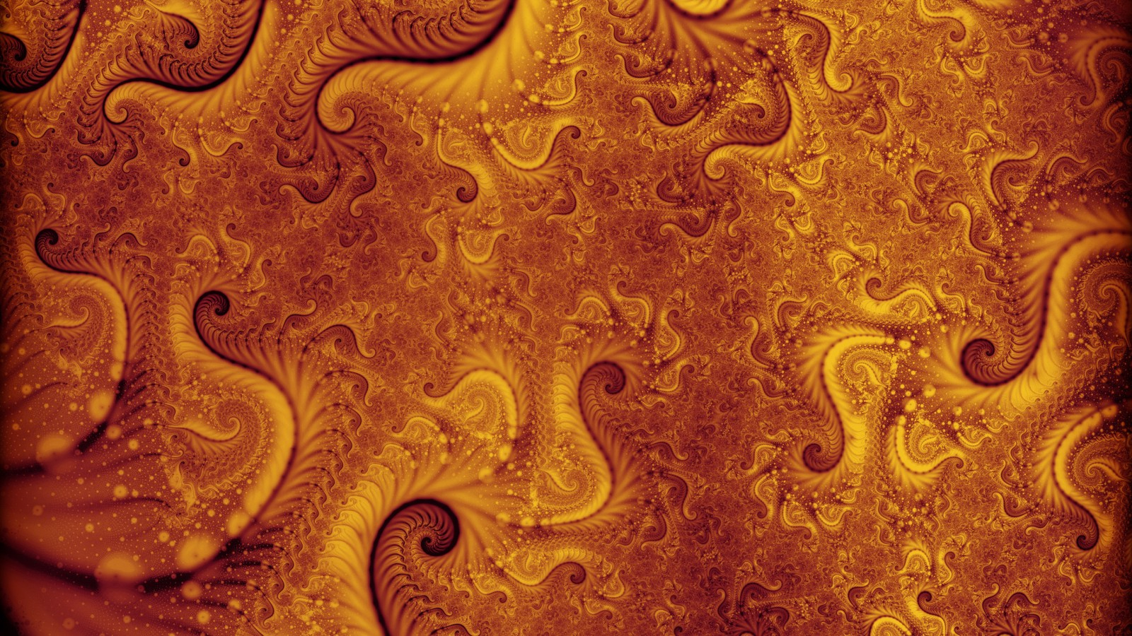
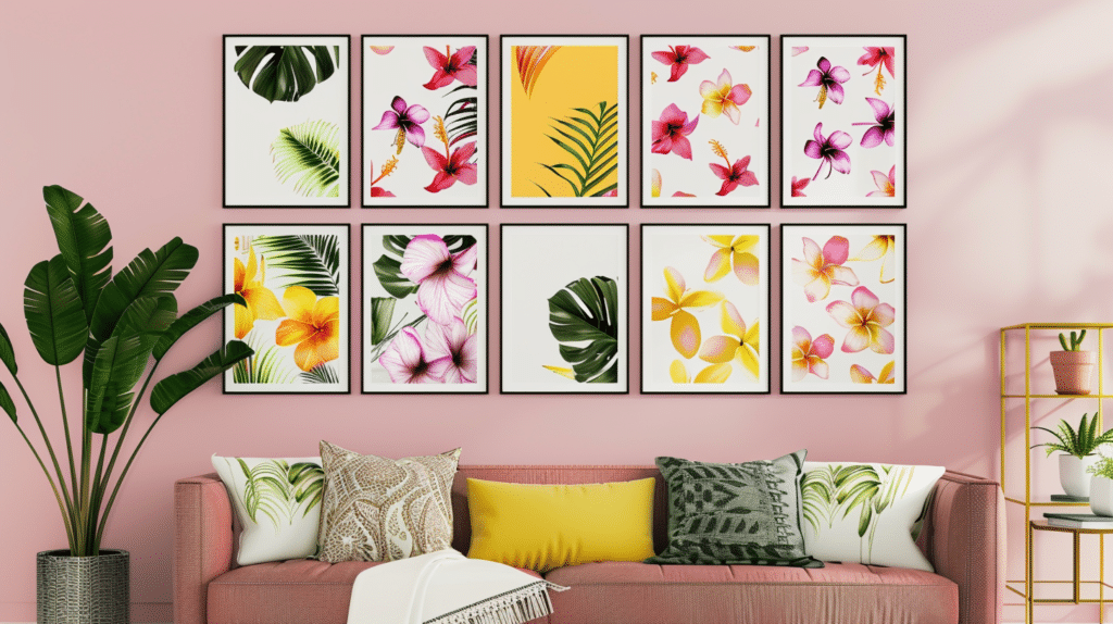
[sps_html tag=”img” src=”https://cdn.theartssection.com/wp-content/uploads/2025/12/7-trending-modern-wall-art-pieces-for-your-living-room-333k-pertaining-to-exploring-the-design-psychology-behind-contemporary-wall-art-selection.jpg” alt=”7+ Trending Modern Wall Art Pieces For Your Living Room • 333K … pertaining to Exploring the Design Psychology Behind Contemporary Wall Art Selection” style=”width: 100%; height: auto;”]
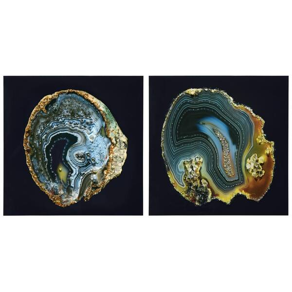
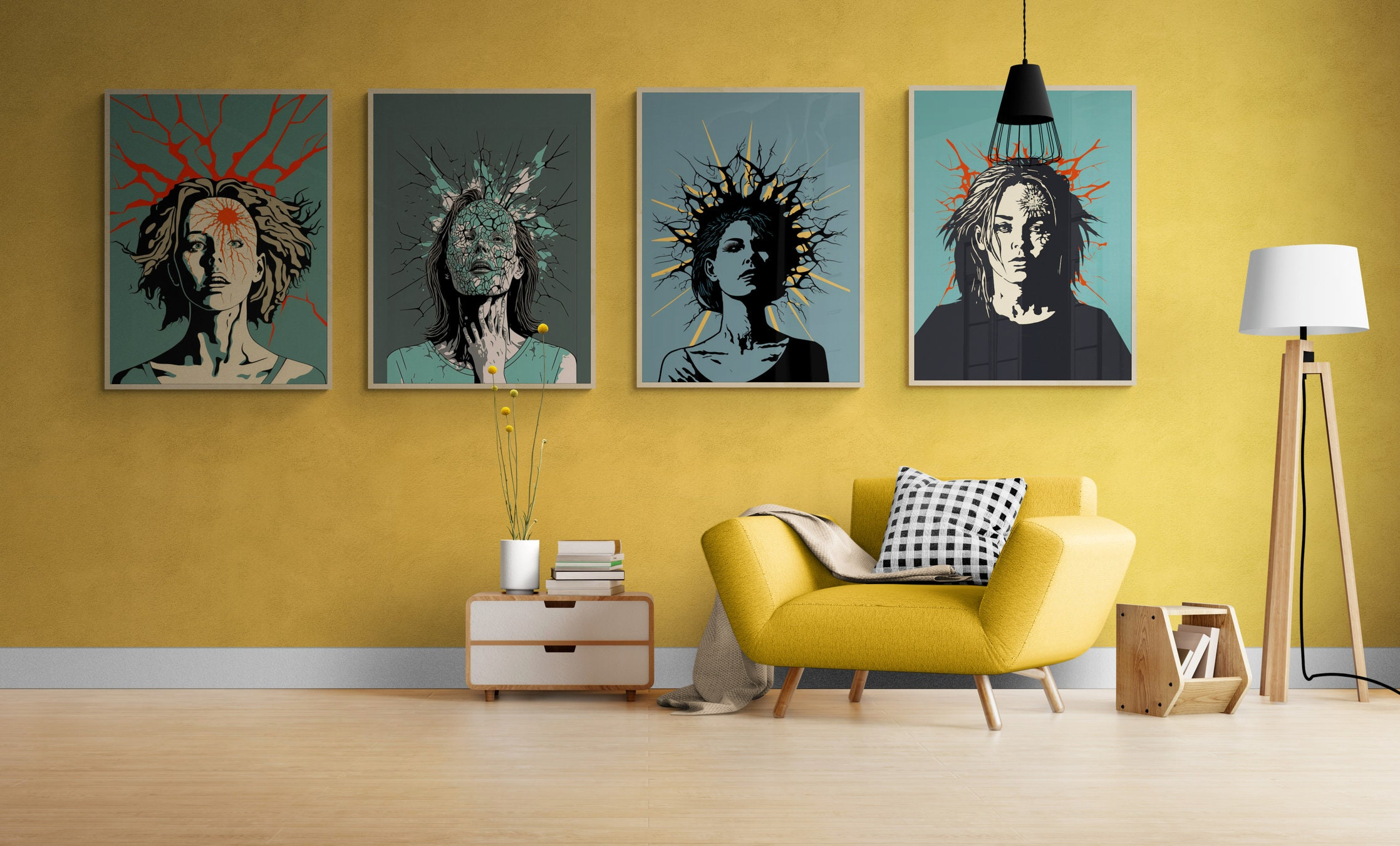
[sps_html tag=”img” src=”https://cdn.theartssection.com/wp-content/uploads/2025/12/mental-health-wall-art-set-of-4-prints-psychology-minimalist-abstract-pertaining-to-abstract-neutral-clxiv-2-piece-wrapped-canvas-wall-art-by-chichi-decor.jpg” alt=”Mental Health Wall Art Set Of 4 Prints, Psychology Minimalist Abstract … pertaining to Abstract Neutral Clxiv' 2-Piece Wrapped Canvas Wall Art By Chichi Decor” style=”width: 100%; height: auto;”]
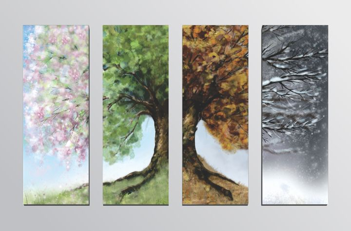
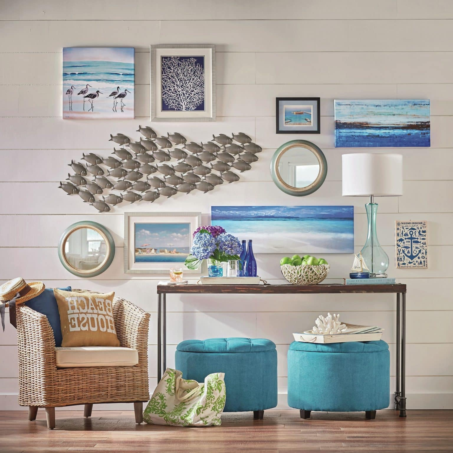
[sps_html tag=”img” src=”https://cdn.theartssection.com/wp-content/uploads/2025/12/dreamy-yet-colorful-contemporary-wall-decorations-home-wall-art-decor-for-exploring-the-design-psychology-behind-contemporary-wall-art-selection.jpg” alt=”Dreamy Yet Colorful Contemporary Wall Decorations - Home Wall Art Decor for Exploring the Design Psychology Behind Contemporary Wall Art Selection” style=”width: 100%; height: auto;”]
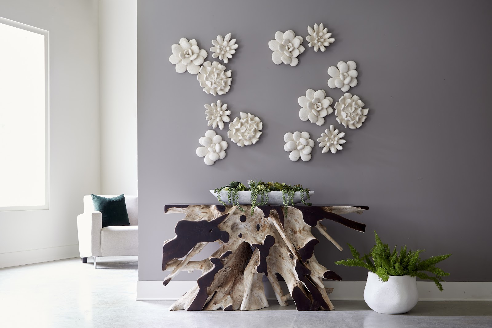
[sps_html tag=”img” src=”https://cdn.theartssection.com/wp-content/uploads/2025/12/15-photos-contemporary-wall-art-regarding-abstract-neutral-clxiv-2-piece-wrapped-canvas-wall-art-by-chichi-decor.jpg” alt=”15 Photos Contemporary Wall Art regarding Abstract Neutral Clxiv' 2-Piece Wrapped Canvas Wall Art By Chichi Decor” style=”width: 100%; height: auto;”]
[sps_html tag=”img” src=”https://cdn.theartssection.com/wp-content/uploads/2025/12/50-modern-wall-art-ideas-for-a-moment-of-creativity-for-exploring-the-design-psychology-behind-contemporary-wall-art-selection.jpg” alt=”50 Modern Wall Art Ideas For A Moment Of Creativity for Exploring the Design Psychology Behind Contemporary Wall Art Selection” style=”width: 100%; height: auto;”]