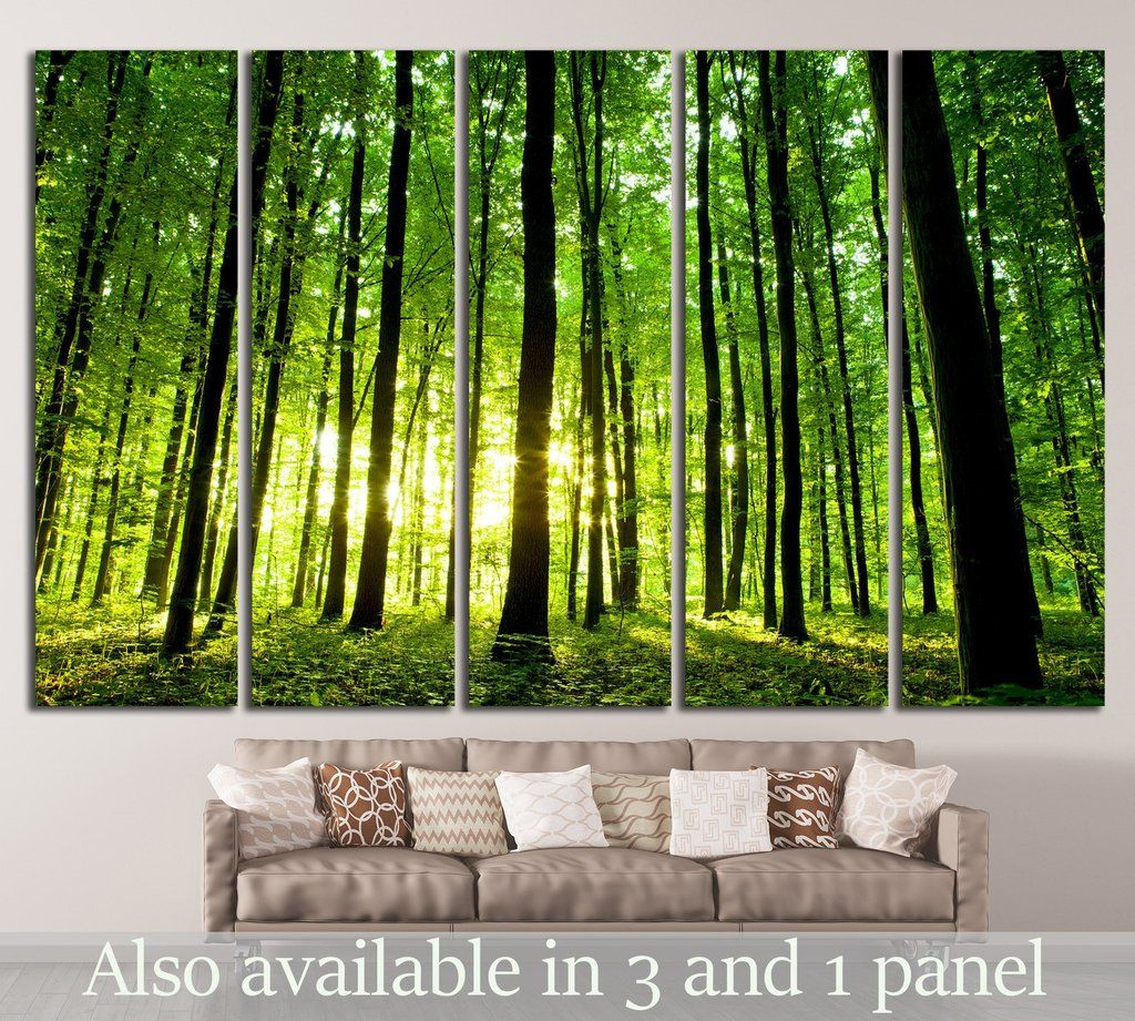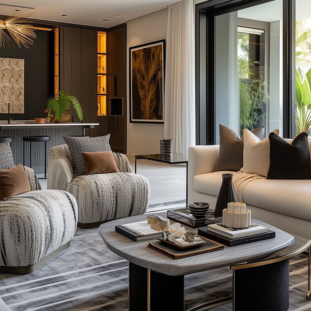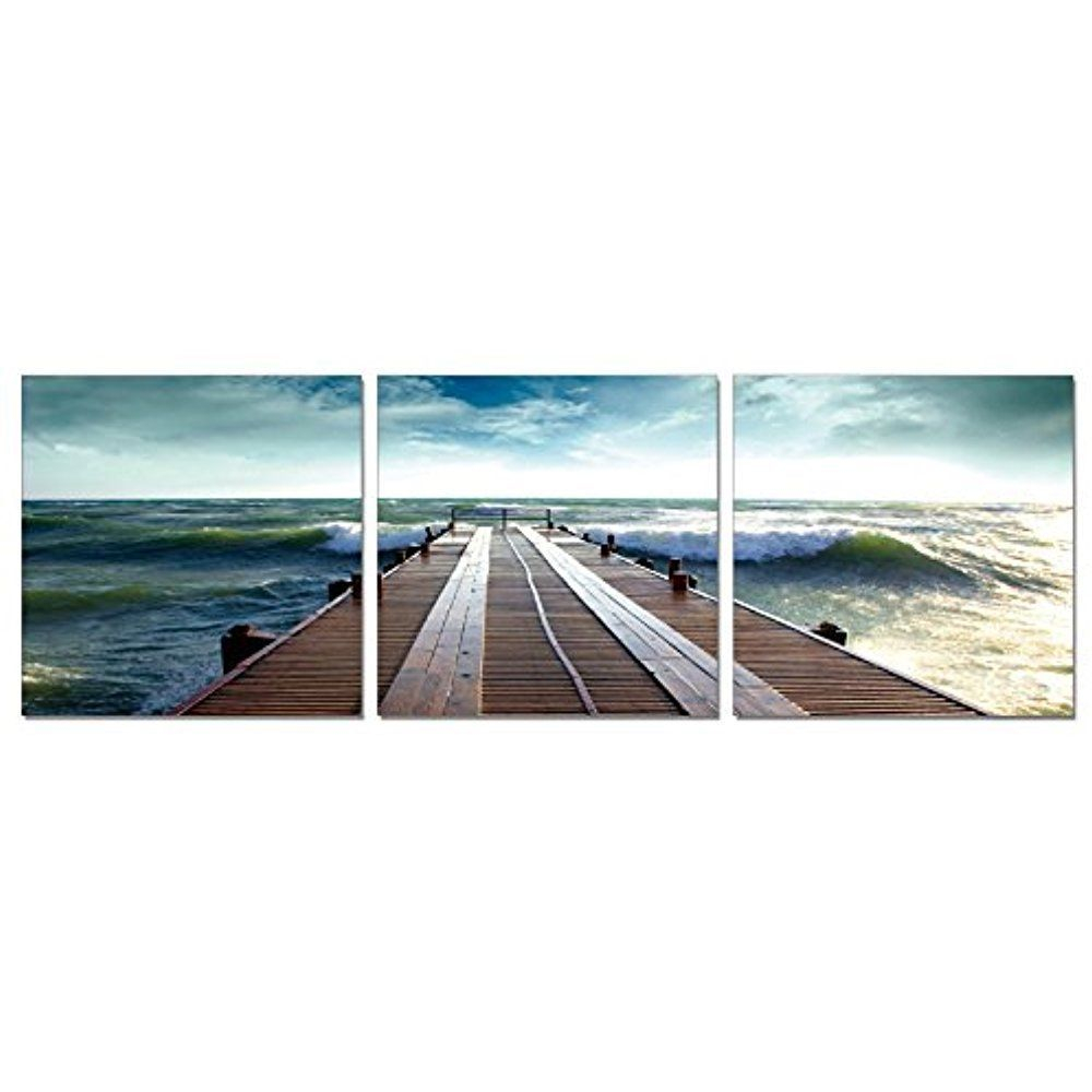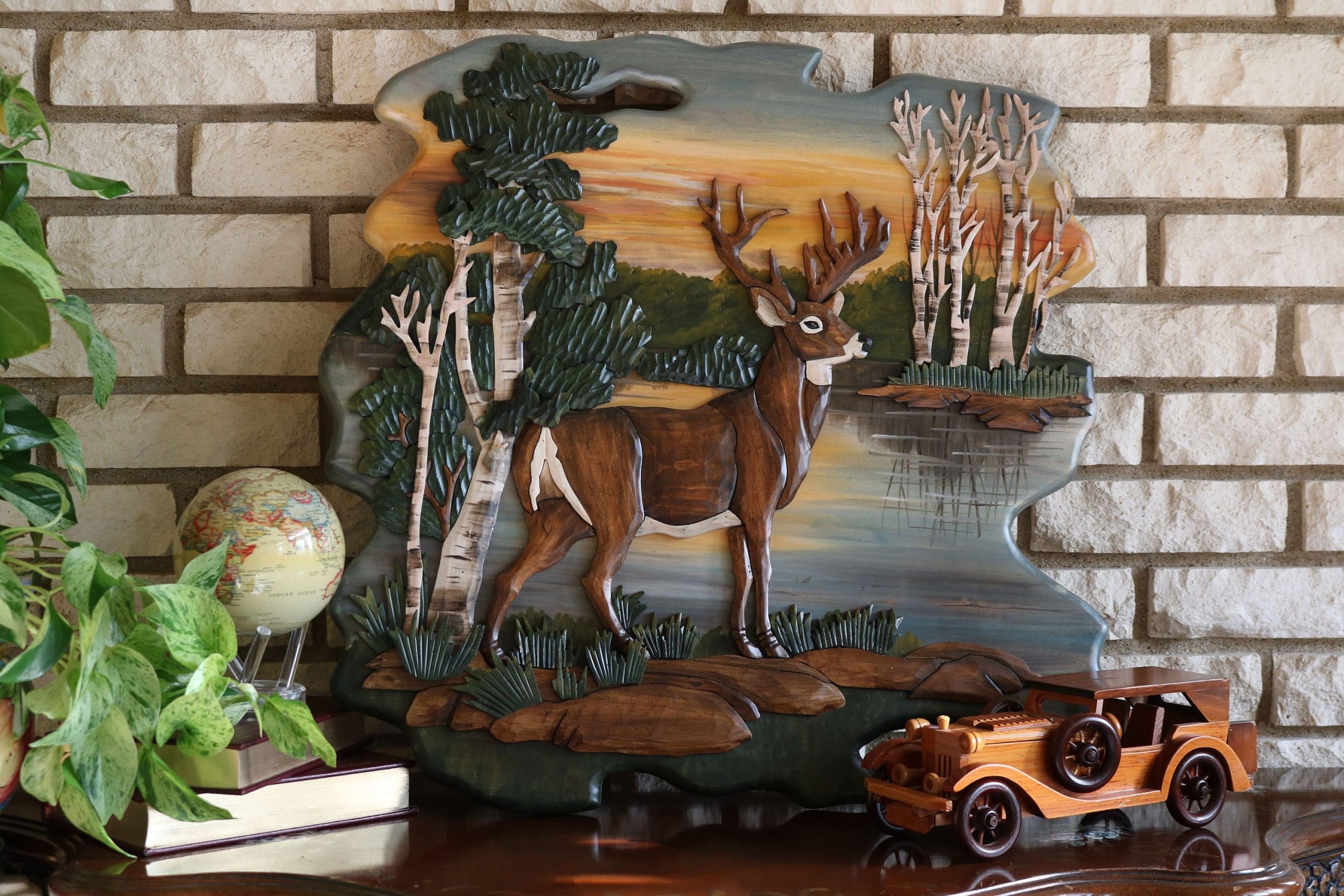
What if your walls could tell a story? What if they could transport you to a forest, a meadow, or a mountain stream? The art of bringing nature’s color palette indoors isn’t just about pretty pictures on the wall. It’s about creating a deeper connection between your living space and the natural world around you. Imagine walking into a room where the colors seem to breathe, where each hue whispers tales of earth, sky, and growing things.
Have you ever noticed how certain colors make you feel instantly calm or energized? The way a deep forest green can make you feel grounded, or how a soft sky blue brings a sense of peace? These aren’t just random feelings – they’re deeply rooted in our connection to the natural world. When we bring nature’s colors directly onto our walls, we’re not just decorating. We’re creating a bridge between our indoor lives and the outdoor beauty that surrounds us. This isn’t just about matching paint colors or choosing trendy hues. It’s about understanding how colors work with our psychology, our moods, and our well-being. Think about it – when was the last time you felt truly relaxed? Wasn’t it often in a place surrounded by trees, water, or open sky? Nature’s palette isn’t just beautiful; it’s healing.
The Psychology Behind Natural Colors
Colors have a powerful effect on our minds and emotions. Scientists have studied how different hues influence our mood, energy levels, and even our decision-making processes. When we look at natural colors like moss green, sunset orange, or twilight purple, our brains recognize them as familiar elements from the natural world. This recognition triggers positive responses. Green, for instance, is associated with growth, renewal, and balance. It’s the color of leaves, grass, and forests. Studies show that exposure to green environments can reduce stress, improve focus, and even lower blood pressure. Blue represents water and sky – elements that naturally evoke feelings of tranquility and peace. Yellow reminds us of sunshine and warmth, while earth tones like browns and ochres connect us to soil and stone. These colors aren’t just visually pleasing – they’re psychologically beneficial. They create a sense of harmony and well-being in our homes. Consider this: when you enter a room painted in warm terracotta or deep forest green, do you feel more centered than in a stark white or overly bright space? The answer is often yes. Our ancestors lived with these colors every day. They weren’t just decorations; they were part of our survival and comfort.
Understanding Color Temperature in Nature
Natural colors come in varying temperatures – some feel warm and cozy, others cool and refreshing. Understanding these temperature differences helps create the right atmosphere in your space. Warm colors from nature include rust reds, golden yellows, and burnt oranges. These colors are reminiscent of autumn leaves, sunsets, and firelight. They create a welcoming, intimate feeling in rooms. Cool colors from nature encompass blues, greens, and purples. These hues remind us of clear skies, mountain lakes, and evening shadows. They provide a sense of calm and clarity. Neutral tones like beige, cream, and soft gray often appear in natural settings too. These colors serve as backgrounds that let other colors pop while maintaining balance. When choosing colors for your walls, consider the season and the function of the room. A bedroom might benefit from cooler, calming blues or soft greens. A living room could use warmer tones like amber or terracotta to encourage conversation. Kitchen spaces often do well with crisp whites mixed with natural wood tones. The key is matching the color temperature to the mood you want to create. It’s not just about aesthetics; it’s about creating environments that support your daily life and emotional needs. Try mixing warm and cool tones in one space – the contrast can make the room feel dynamic and interesting.
Creating Harmony Through Color Groupings
Just like musical notes, natural colors work best when they’re arranged thoughtfully. Creating color groupings means selecting a few colors that complement each other and form a cohesive visual story. Start with one dominant natural color – perhaps a deep sage green or a rich forest blue. Then add two or three supporting colors that either match or contrast beautifully with your main choice. For example, if you choose a soft olive green, you might pair it with warm beige and muted terracotta. Or if you go with a sky blue, consider adding touches of sandy beige and pale lavender. The secret is to keep one color dominant and allow the others to play supporting roles. You can see this principle in nature itself – a forest doesn’t have just one color, but rather layers of greens, browns, and earth tones working together. In your home, this might mean painting your main wall a deep forest green while using lighter green accents on furniture and artwork. Let your chosen color family guide your selections for everything from textiles to decorative objects. This creates a sense of unity and purpose in your design. Don’t feel limited to traditional combinations. Sometimes unexpected pairings work better than expected. A deep burgundy can pair beautifully with soft mint green, or a rich burgundy with creamy white. Experiment with small samples first before committing to larger areas.
Natural Materials That Enhance Wall Colors
The magic of nature’s palette isn’t just in the colors themselves – it’s also in the textures and materials that bring those colors to life. Natural materials like wood, stone, and plants add depth and dimension that painted walls alone cannot provide. Wood grain adds warmth and organic movement to any space. Whether it’s the smooth texture of oak, the bold pattern of bamboo, or the subtle variation of reclaimed wood, these materials make painted walls feel more alive. Stone elements – whether it’s a stone accent wall, natural slate tiles, or even a small stone sculpture – bring earthiness and grounding to your color scheme. Plants are perhaps the most dynamic element in nature’s palette. They add movement, color variation, and life to any room. A single plant can change how you perceive a color – the green of a leaf might appear different depending on its lighting and surroundings. Consider how your plants’ colors interact with your wall colors. A bright yellow plant against a soft green wall creates a vibrant contrast, while a silver-leaved plant beside a warm brown wall offers a more subtle interplay. Natural fabrics like linen, cotton, and wool also enhance wall colors. Their textures reflect light differently and create visual interest. Don’t overlook the importance of natural fiber rugs, curtains, and throw pillows. These elements tie all your colors together and add tactile pleasure to your space. The combination of materials creates a multi-sensory experience that goes far beyond simple color.
Seasonal Shifts in Natural Wall Colors
Nature changes with the seasons, and so should your wall colors to some degree. While you don’t need to repaint every season, paying attention to seasonal shifts can make your home feel more connected to the natural rhythms around you. Spring brings fresh greens, pastel yellows, and delicate pinks. These colors can make a space feel renewed and energized. Think of the way new leaves emerge in springtime – they’re often a soft, almost translucent green. Painting your walls in similar shades can bring that fresh feeling indoors. Summer colors are often bolder and more vibrant. Deep blues, bright yellows, and rich oranges can capture the energy of summer days. They’re perfect for spaces where you want to feel invigorated and happy. Autumn colors are rich and warm – deep reds, burnished golds, and earthy browns. These colors work wonderfully in cozy spaces, especially during the colder months. Winter colors tend to be more subdued – soft grays, muted blues, and warm whites. They create a sense of calm and restfulness during the darker months. Some people prefer to keep their walls neutral year-round, but incorporating seasonal elements through accessories can still create that connection. Small changes like switching out artwork, adding seasonal plants, or changing the lighting can make a huge difference. Consider using a seasonal color wheel to help guide your choices. It’s not about drastic changes, but subtle adjustments that honor the natural flow of time and weather.
Practical Tips for Choosing Your Natural Palette
Choosing the right natural colors for your walls doesn’t have to be overwhelming. Here are some practical steps to help you make informed decisions:
• Start with your existing furniture and decor. Look at what colors already dominate your space and build from there.
• Take note of the natural light in your room. North-facing rooms get cooler light, while south-facing rooms receive warmer light. This affects how colors appear.
• Test paint samples on your actual wall. Colors can look completely different in different lighting conditions.
• Consider the size of your room. Lighter natural colors can make small spaces feel larger, while deeper tones can make large rooms feel cozier.
• Think about the function of the room. Bedrooms might benefit from calming blues or soft greens, while kitchens could use brighter, more energetic colors.
• Don’t be afraid to mix colors. Nature rarely uses just one color, so your walls don’t have to either.
• Visit nature often. Walk through forests, beaches, or meadows to observe how colors interact in the wild.
• Collect color inspiration. Take photos of beautiful natural scenes or save color swatches from nature.
• Consider hiring a professional if you’re unsure about color combinations. Sometimes an outside perspective helps clarify your vision.
Remember, the goal isn’t to perfectly replicate nature, but to capture its essence and spirit. Your walls should feel like a gentle reminder of the natural world, not a strict recreation of it. The most important thing is that the colors make you feel good when you’re in the space.
Real-Life Examples of Nature’s Palette Success
Some homeowners have found incredible success with nature-inspired wall colors. One family painted their dining room in a warm sage green, inspired by the forest near their home. They added wooden table and chairs, and hung artwork featuring forest scenes. The result was a space that felt both cozy and connected to the outdoors. Another couple transformed their living room by painting one wall in a deep ocean blue, matching it with navy blue furniture and sea-green accent pillows. The effect was like having a view of the ocean in their home. A third family used a combination of warm terracotta and soft beige on their kitchen walls, creating a space that felt warm and inviting. They added natural wood elements and plants, making the whole room feel alive and fresh. These examples show that the key isn’t just the color itself, but how it’s combined with other elements. The walls become the canvas for a larger design story. They set the tone for everything else in the room. People report feeling more relaxed and focused in spaces where nature’s colors dominate. The colors seem to create a kind of psychological sanctuary within the home. It’s not about following trends – it’s about finding colors that resonate with your personal connection to nature. Whether you prefer the calm of a mountain lake or the vibrancy of a desert landscape, there’s a natural color palette waiting to enhance your space.
Avoiding Common Mistakes in Natural Color Selection
While nature’s palette can be incredibly rewarding, there are several pitfalls to avoid:
• Overpowering a room with too many bold colors. Natural colors are beautiful, but they should enhance, not overwhelm. A few carefully chosen colors work better than many competing ones.
• Ignoring lighting conditions. Colors behave differently under different types of light. Always test samples in your actual room at different times of day.
• Neglecting the overall space. Colors should work with your furniture, flooring, and accessories. If you love a particular wall color but it clashes with your furniture, you’ll end up unhappy.
• Choosing colors that don’t suit your lifestyle. If you have young children or pets, consider colors that hide stains and wear better.
• Not considering the room’s purpose. A bedroom needs calming colors, while a home office might benefit from energizing tones.
• Failing to plan for seasonal changes. Your colors should work well throughout the year, not just in one season.
• Using too much of one type of material. Natural materials are wonderful, but too many can make a space feel chaotic.
Remember that the goal is to create harmony, not confusion. The most successful natural color schemes are those that feel intentional and balanced. They should make you feel comfortable and at peace. If you find yourself constantly adjusting or wishing you’d chosen differently, it might be time to reassess your choices. Good design is about making choices that stand the test of time, not just looking good today.
Making Your Own Nature-Inspired Color Story
Creating your own nature-inspired color story is a deeply personal process. It starts with observation – really looking at the world around you. Notice how morning light makes the same color look different. Pay attention to how colors change with the seasons. Observe how different natural materials affect the way colors appear. Once you’ve gathered your observations, start sketching or collecting color samples. You don’t need to be an artist to appreciate color relationships. Simply take note of what makes you feel good in certain environments. Consider your personal preferences and experiences. Do you feel drawn to mountains or oceans? Are you more comfortable in warm or cool tones? These questions will guide you toward your unique color story. Don’t be afraid to experiment. Try combining unexpected colors, or layering different textures. The most memorable natural color schemes often involve some creative thinking. Remember that your walls are the foundation for everything else in your room. They set the stage for your furniture, artwork, and accessories. Choose colors that will make you want to spend time in your space. A well-chosen natural palette can turn any ordinary room into a peaceful retreat. It’s not about perfection – it’s about creating something that feels authentically you.
The Long-Term Benefits of Natural Wall Colors
Beyond immediate aesthetic appeal, natural wall colors offer lasting benefits for your mental and physical well-being. Research shows that people who live in spaces with natural colors report lower stress levels, better sleep quality, and increased creativity. These effects happen because our brains are wired to respond positively to natural hues. They remind us of safety, growth, and stability. When you wake up in a room painted in soft greens or blues, your body naturally begins to relax. The colors help regulate your circadian rhythm and promote better sleep. Natural colors also tend to make spaces feel larger and more open, which can reduce feelings of claustrophobia or overwhelm. This is particularly helpful in smaller rooms or urban environments where space feels limited. The calming properties of natural colors can also reduce eye strain, especially in spaces where you spend a lot of time reading or working. Unlike harsh or fluorescent colors, natural hues are gentler on the eyes. Additionally, natural colors tend to age well. They don’t fade dramatically over time and maintain their beauty even after years of daily life. This longevity makes them a smart investment for your home. You won’t find yourself wanting to repaint every few years because the colors look dated. Instead, your space will continue to feel fresh and connected to the natural world.
Technology and Natural Color Trends
Modern technology has made it easier than ever to explore and implement natural color schemes. Digital tools now allow you to visualize how different colors will look in your actual space. Apps and online tools can simulate paint colors on walls, helping you make better decisions before buying paint. Smart lighting systems can adjust the temperature and intensity of light throughout the day, helping colors appear more natural. Some companies now offer paint formulations specifically designed to mimic natural colors more accurately. These paints often have better durability and environmental properties. Social media platforms have created communities where people share their natural color experiments and inspire others. Instagram and Pinterest are filled with examples of beautiful nature-inspired interiors. However, technology should enhance your natural instincts, not replace them. The best results come from combining digital tools with your own sensory experience. Visit stores with sample books, walk through nature regularly, and trust your own visual judgment. While technology provides helpful tools, it’s your personal connection to nature that matters most. The colors that feel right to you, based on your experiences and memories, are the ones that will truly transform your space. Don’t let digital trends overshadow your personal preferences. The most successful natural color schemes are those that feel authentic to the person living in the space.
Sustainability and Eco-Friendly Natural Colors
Choosing natural wall colors also aligns with sustainable living practices. Many natural colors are derived from eco-friendly sources and can be applied using environmentally responsible methods. Plant-based paints and natural mineral pigments are becoming more available and affordable. These products often contain fewer harmful chemicals and emit less volatile organic compounds (VOCs) than traditional paints. They’re safer for children, pets, and people with respiratory sensitivities. Sustainable color choices also extend to the materials used in conjunction with your wall colors. Reclaimed wood, natural stone, and organic textiles all contribute to a more eco-conscious home. Choosing local suppliers for natural materials reduces transportation emissions and supports local economies. Many natural color palettes use earth tones and muted shades that require less energy to produce. These colors often look more timeless, reducing the need for frequent updates and replacements. Sustainability in natural color selection isn’t just about the paint itself – it’s about creating a holistic approach to home design that considers the environment. When you choose natural colors, you’re making a statement about your values and your commitment to caring for the planet. It’s a small but meaningful step toward a more sustainable lifestyle. The beauty of natural colors is that they often last longer and look better over time, reducing waste and the need for constant replacement.
Final Thoughts on Nature’s Palette
Bringing nature’s palette to your walls isn’t just about decoration – it’s about creating spaces that nourish your soul. These colors connect you to the natural rhythms of the world, providing a sense of calm and balance in our increasingly fast-paced lives. Whether you’re drawn to the deep blues of a mountain lake, the warm golds of autumn leaves, or the soft greens of a forest clearing, there’s a natural color story waiting for you. The key is to listen to what your environment and your feelings tell you. Don’t be afraid to experiment and make mistakes along the way. Some of the most beautiful natural color schemes happen by accident. Trust your instincts, observe the world around you, and remember that your home should reflect your personal journey. Nature’s palette isn’t about copying the wilderness exactly – it’s about capturing its essence and bringing that feeling into your daily life. When you choose natural colors, you’re not just decorating a room; you’re creating a sanctuary that supports your well-being and celebrates your connection to the earth. The most important thing is to make your space feel like a true reflection of who you are and what you value. Nature’s colors are always there, waiting to be discovered and shared with the world around you.
Nature’s palette on your wall isn’t just a trend – it’s a way of bringing the outdoors inside and creating spaces that truly support your well-being. From the calming blues of ocean waves to the energizing greens of spring forests, these colors have been healing our minds and bodies for generations. The beauty of this approach lies in its simplicity and authenticity. You don’t need expensive tools or professional help to begin this journey. Just pay attention to what colors make you feel good, observe how they interact with light and other materials, and trust your instincts. Whether you’re painting a single wall or transforming an entire room, remember that the goal is to create a space that feels like a gentle embrace from the natural world. The colors you choose will become part of your daily story, influencing your mood, your creativity, and your sense of peace. So take your time, experiment with different combinations, and most importantly, enjoy the process. Your walls have the power to tell a story – make it one that celebrates nature’s endless beauty and wisdom. After all, isn’t that what we all want from our living spaces? A place that makes us feel grounded, inspired, and connected to something greater than ourselves?
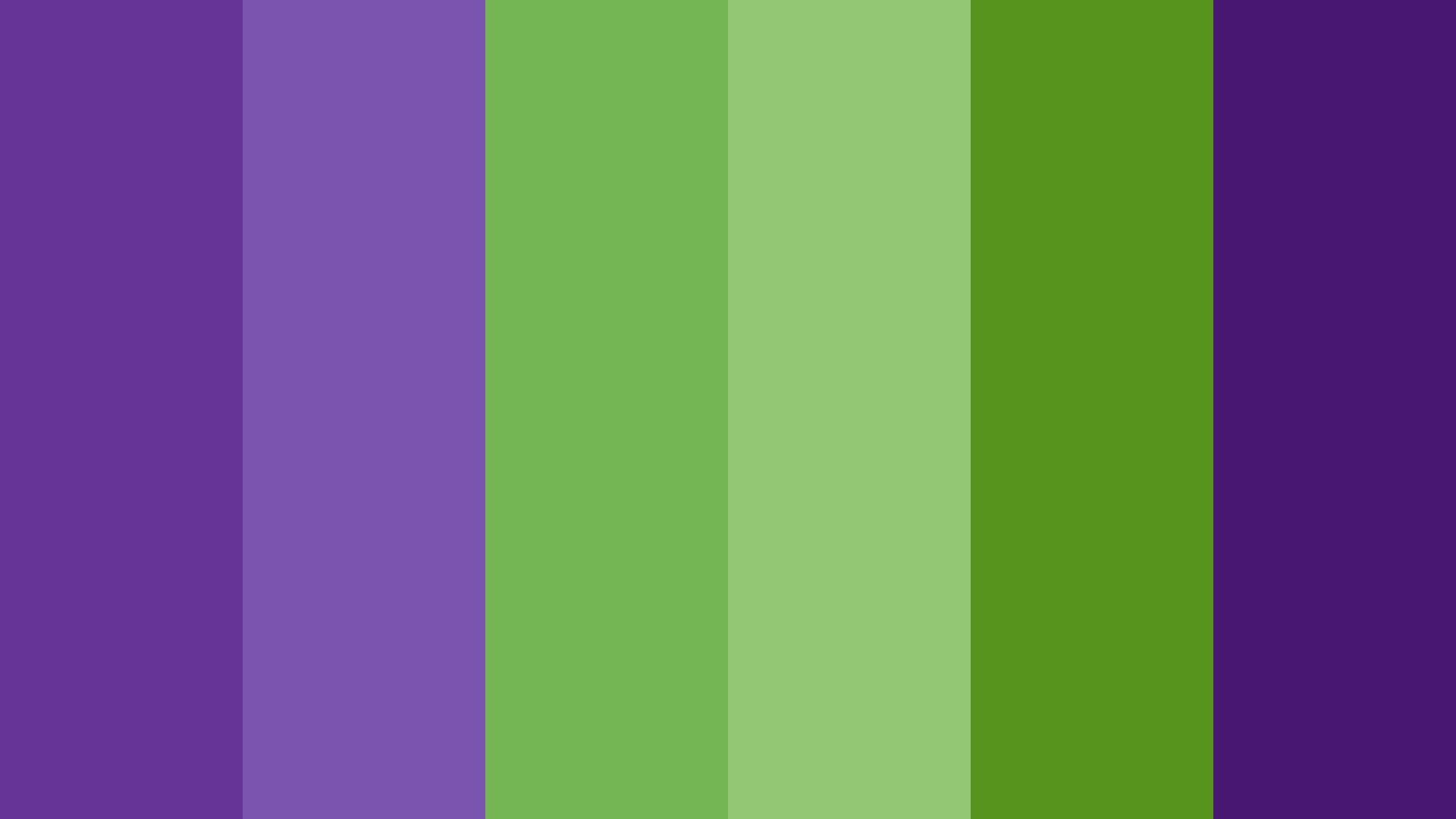
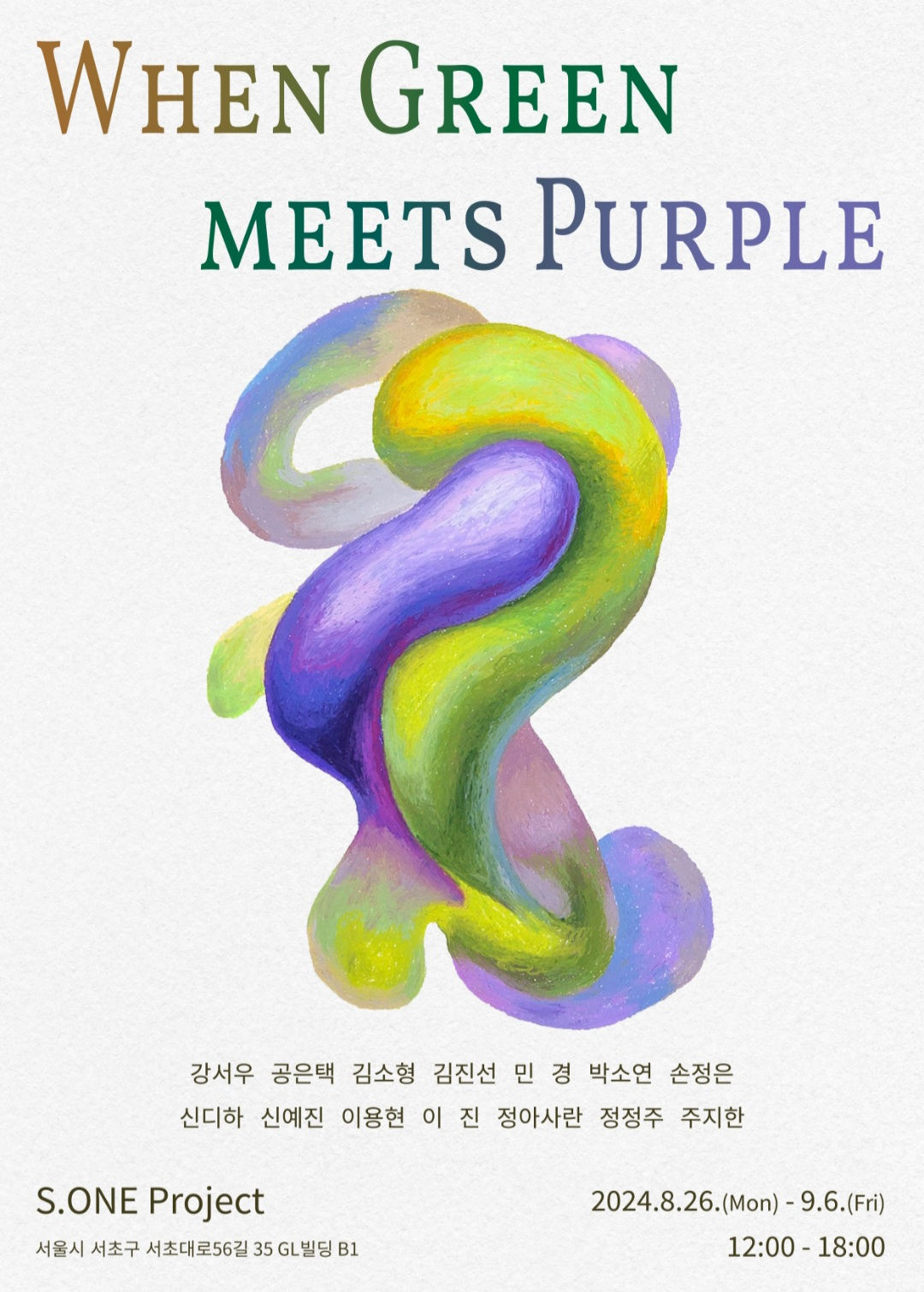
[sps_html tag=”img” src=”https://cdn.theartssection.com/wp-content/uploads/2025/12/when-green-meets-purple-ecb488eba19dec9db4-ebb3b4eb9dbceba5bc-eba78ceb82a0eb958c-within-where-green-meets-purple-in-perfect-balance.jpg” alt=”When Green Meets Purple : 초록이 보라를 만날때 within Where Green Meets Purple in Perfect Balance” style=”width: 100%; height: auto;”]
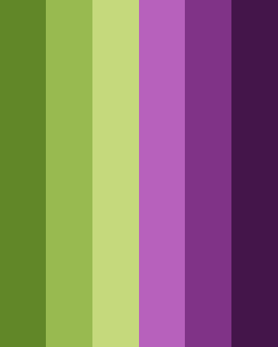
[sps_html tag=”img” src=”https://cdn.theartssection.com/wp-content/uploads/2025/12/10-best-color-combination-with-purple-designer-guide-intended-for-where-green-meets-purple-in-perfect-balance.png” alt=”10 Best Color Combination With Purple- Designer Guide intended for Where Green Meets Purple in Perfect Balance” style=”width: 100%; height: auto;”]
[sps_html tag=”img” src=”https://cdn.theartssection.com/wp-content/uploads/2025/12/new-balance-womens-size-6-green-purple-sneakers-s-intended-for-where-green-meets-purple-in-perfect-balance.jpg” alt=”New Balance Womens Size 6 Green / Purple Sneakers (S) intended for Where Green Meets Purple in Perfect Balance” style=”width: 100%; height: auto;”]
[sps_html tag=”img” src=”https://cdn.theartssection.com/wp-content/uploads/2025/12/30-color-purple-combination-ideas-regarding-green-tree-among-lavender-flowers-landscape-wall-art-print-1-panel.png” alt=”30 Color Purple Combination Ideas regarding "Green Tree Among Lavender Flowers" Landscape Wall Art Print, 1 Panel” style=”width: 100%; height: auto;”]
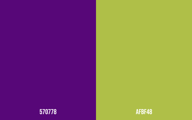
[sps_html tag=”img” src=”https://cdn.theartssection.com/wp-content/uploads/2025/12/green-purple-color-scheme-with-where-green-meets-purple-in-perfect-balance.png” alt=”Green & Purple Color Scheme with Where Green Meets Purple in Perfect Balance” style=”width: 100%; height: auto;”]