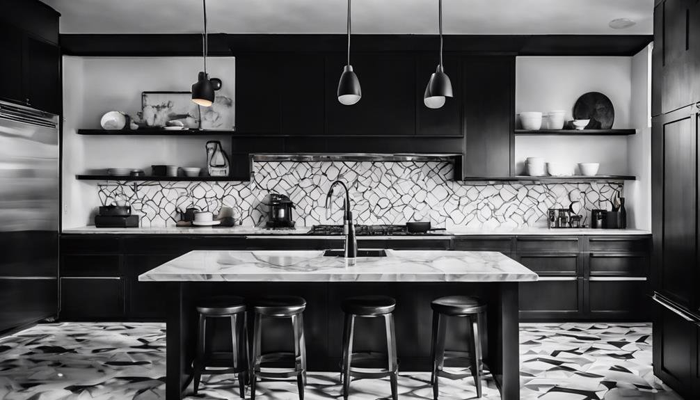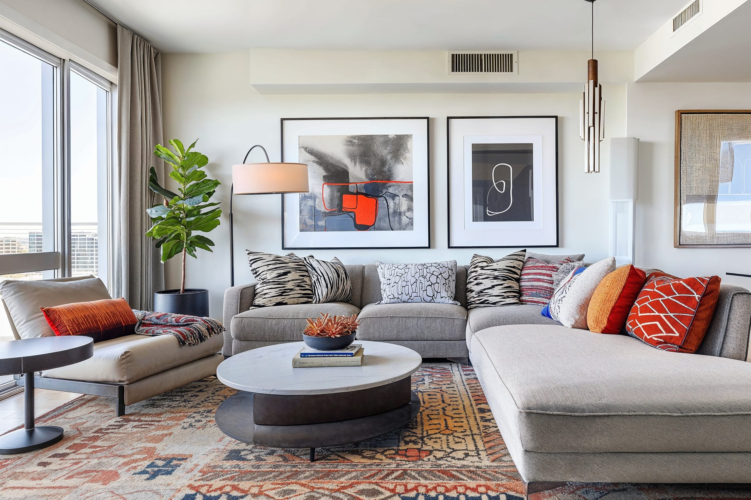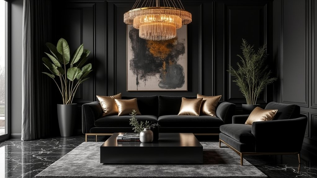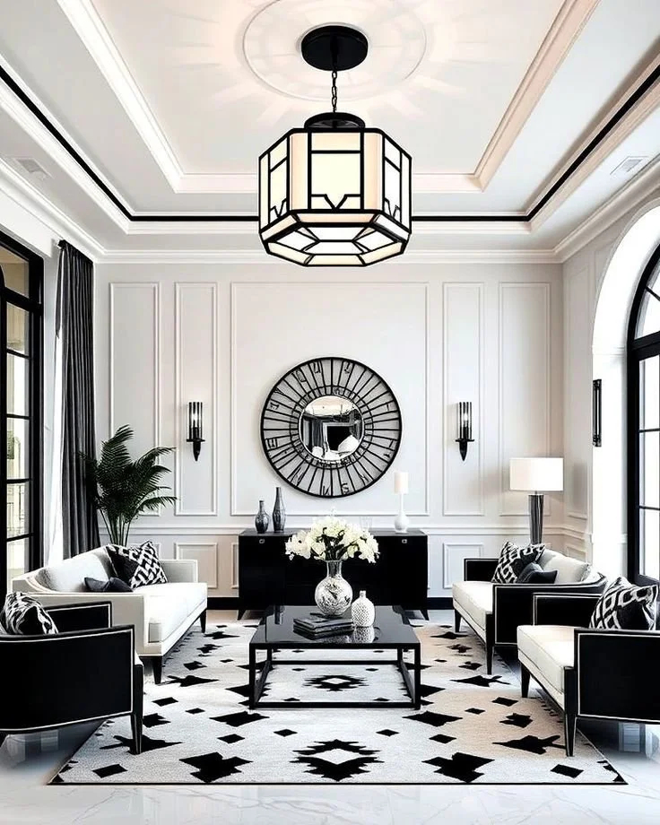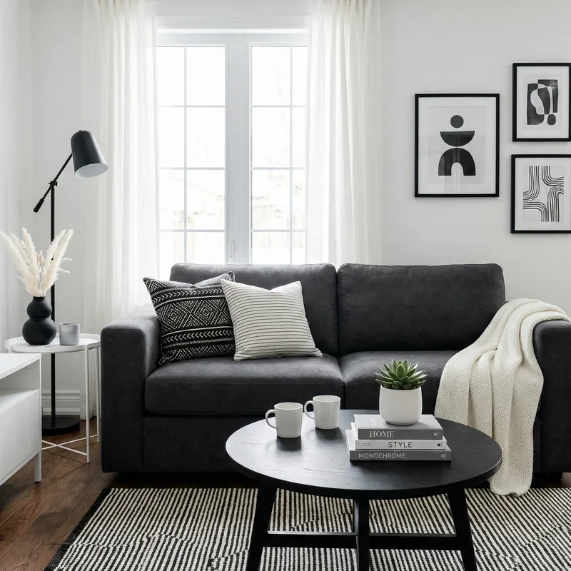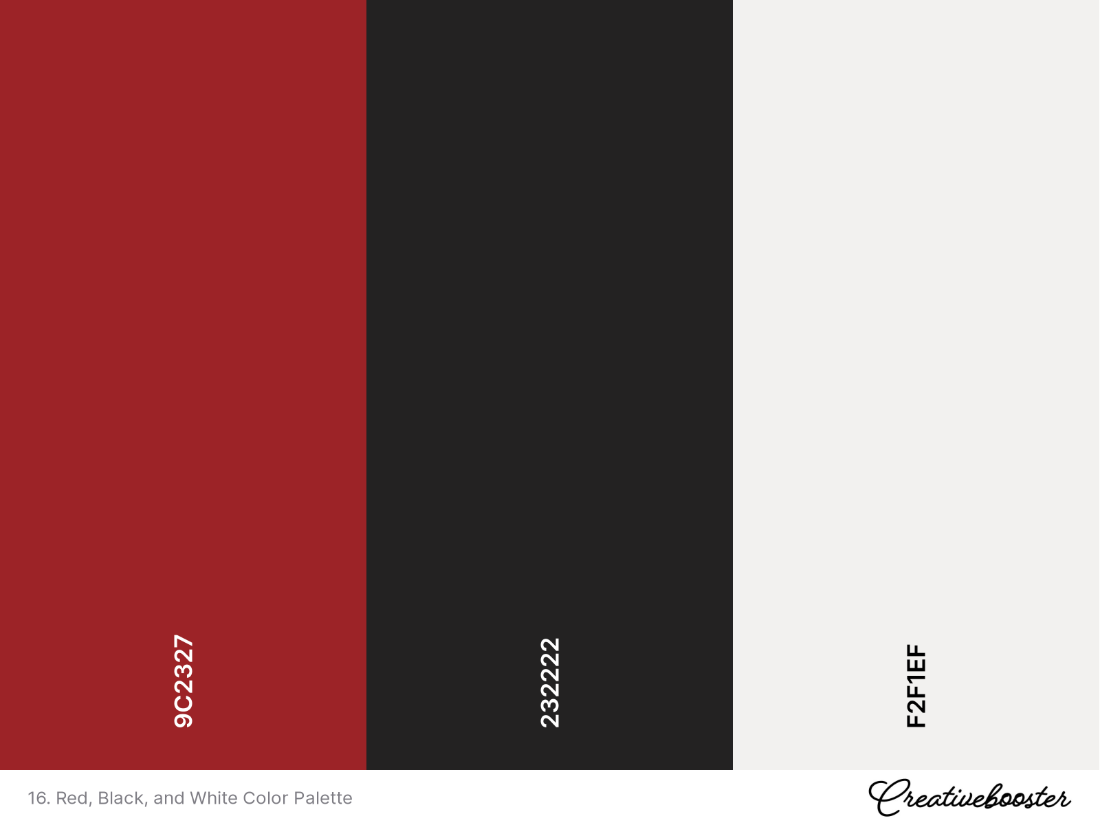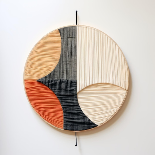
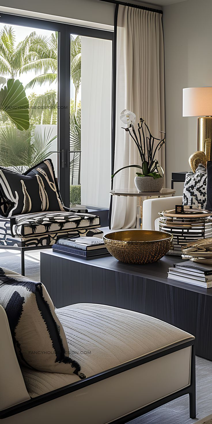
Stepping into a room orchestrated in red, black, and white feels less like entering a domestic space and more like stepping across the threshold of a modern art installation. The air is crisp, defined by absolute contrasts. A matte obsidian bookcase anchors the corner, swallowing the ambient light, while stark alabaster walls reflect the morning sun with uncompromising clarity. Suddenly, a single lacquered vermilion chair cuts through the monochrome expanse like a sudden pulse of adrenaline. Your heart rate shifts slightly. Your eyes lock onto the form. This is not a color palette designed to blend into the background; it is an active participant in the architecture of your daily life.
For decades, this tripartite scheme has haunted the portfolios of avant-garde architects, Bauhaus purists, and high-end hospitality designers. Yet, bringing it into a residential setting terrifies the average homeowner. The fear is palpable: Will the space feel like a stylish boutique hotel, or will it morph into a sterile, aggressive interrogation room? The answer lies not in raw color theory alone, but in the intricate psychological interplay between physiological arousal, spatial perception, and human behavior. When handled with precision, this triad transforms a standard room into a masterclass of emotional choreography, balancing absolute rigor with raw vitality.
Behind every successful execution of this palette is a delicate negotiation of human biology and environmental psychology. Red accelerates the pulse, elevates blood pressure, and commands immediate visual dominance. Black absorbs light, communicates boundaries, and instills a profound sense of gravity, luxury, and protective enclosure. White acts as the great equalizer, offering visual breathing room, architectural cleanliness, and psychological clarity. Understanding how these three forces interact requires diving deep into the neurological impact of light, value, and saturation within our living environments, moving far beyond surface aesthetics into the realm of spatial therapy.
Decoding the Neurological and Emotional Architecture of High-Contrast Triads
The human visual cortex is wired to seek pattern and resolve contrast. When you introduce a red, black, and white palette into an interior, you are engaging primitive survival mechanisms that instantly gauge threat, focus, and safety. White represents light, openness, and psychological safety, providing a neutral canvas where the nervous system can reset. Black, conversely, introduces shadow and the unknown. In evolutionary terms, shadowed zones require heightened awareness. When utilized in furniture or structural elements, black grounds a room, signaling stability and permanence, yet too much of it triggers subconscious feelings of isolation or oppression.
Red disrupts this binary equilibrium. As the longest wavelength on the visible light spectrum, red requires no accommodation by the lens of the eye; it leaps forward into our field of vision. Neurologically, red is an evolutionary cue for biological significance—food, danger, passion, and vitality. In a modern living space, a touch of red stimulates appetite in a dining area or conversational energy in a formal salon. However, when unmitigated by the neutralizing purity of white or the grounding weight of black, red induces sensory overload, leading to irritability and visual fatigue. The genius of the three-color triad is that black absorbs excess visual noise while white diffuses light, creating a stable cage for the fiery energy of red.
Professional designers manipulate tint, shade, value, and chroma to soften or sharpen these psychological responses. A cherry red with high yellow undertones invokes playfulness and mid-century nostalgia, whereas a deep carmine or oxblood leans toward bourgeois opulence and somber introspection. Similarly, pure titanium white can feel clinical and blinding, which is why residential spaces thrive on soft, chalky, or warm-toned whites with micro-doses of grey or ochre. By adjusting the saturation and value of each component, you can dial the room’s mood down to a whisper or dial it up to a cinematic crescendo.
Spatial Manipulation and the Optical Mechanics of Light Absorption
Color choice dictates spatial geometry just as effectively as drywall and framing. In contemporary interior architecture, manipulating perceived volume is a primary utility of color, and the red-black-white triad offers a uniquely powerful toolkit for altering room proportions. White reflects approximately eighty to ninety percent of visible light, bouncing photons across surfaces to push walls outward and make compact urban apartments feel expansive. Black absorbs up to ninety-eight percent of light, effectively dissolving corners and hiding structural flaws, which tricks the brain into reading the boundary as infinite or intimate rather than confining.
Consider the classic architectural dilemma of a narrow, high-ceilinged hallway. Applying a crisp white to the upper walls and ceiling while grounding the lower third in a rich matte black instantly lowers the perceived ceiling height, bringing human-scale comfort to a cavernous passage. Introduce a slender red console table or a vertical red art piece against that black datum line, and the eye is drawn horizontally and purposefully through the space, neutralizing claustrophobia through strategic focal arrest. This is not mere decoration; it is applied environmental ergonomics that dictates how human traffic flows through a home.
Lighting design makes or breaks this chromatic trifecta. Because black absorbs light and red demands illumination to reveal its true chroma, standard residential lighting plans will fail a high-contrast scheme. Layered architectural lighting—combining 2700K warm LED wall washers, directional art spotlights with high Color Rendering Index (CRI) ratings above 90, and concealed linear cove lighting—is mandatory. Without precise illumination, black surfaces become muddy voids and red accents turn black, destroying the dynamic tension that makes the palette so compelling in the first place.
Methodical Implementation Strategies for Residential Interiors
Translating this daring color scheme from a mood board into a livable, breathable home requires a disciplined, step-by-step methodology. Rushing into high-contrast design without a strategic framework often results in chaotic visual clutter or cold, uninhabitable spaces.
- Step 1 (Establish the 60-30-10 Baseline): Dedicate roughly 60 percent of the room to dominant white and light neutral surfaces to maintain spatial openness, 30 percent to supportive black architectural elements or foundational furniture, and precisely 10 percent to deliberate red punctuation marks.
- Step 2 (Select Your Undertones and Finishes): Decide whether your white leans warm (ivory, alabaster) or cool (zinc, snow), and pair it with matching undertones in your blacks (matte carbon versus charcoal sheen) and reds (blue-based ruby versus orange-based vermilion).
- Step 3 (Layer Textural Diversity): Combat the potential sterility of a high-contrast palette by introducing rich textures, such as bouclé white upholstery, fluted black wood paneling, and raw silk or velvet red textiles to catch and diffuse light differently.
- Step 4 (Position Focal Anchors Strategically): Map out your sightlines before placing any red items; ensure red is used sparingly as an accent—such as a single piece of statement art, a sculptural lounge chair, or blown-glass pendant lights—rather than distributed evenly across the room.
- Step 5 (Test Under Variable Lighting Conditions): Evaluate large paint swatches and fabric samples at three distinct times of day—morning natural light, midday overcast conditions, and evening artificial illumination—to confirm the mood holds up without becoming harsh.
Navigating Common Pitfalls and Practitioner Workarounds
Even seasoned designers occasionally stumble when managing the uncompromising nature of red, black, and white. Because the palette leaves zero room for muddy intermediates, minor calculation errors manifest as glaring aesthetic disasters. Recognizing these hazards early saves both financial capital and emotional energy.
- Pitfall 1 (Over-Saturation of Red): Treating red as a primary wall color rather than an accent quickly triggers anxiety and visual fatigue in residents. Workaround: Restrict red to movable, easily replaceable elements like throw pillows, ceramic vases, or inner cabinet linings, keeping permanent architectural planes neutral.
- Pitfall 2 (Creating a Stark, Clinical Environment): Relying solely on glossy white plastics, polished chrome, and flat black laminates turns a home into a sterile laboratory. Workaround: Integrate organic warmth through natural oak flooring, unlacquered brass hardware, woven jute rugs, and living greenery to soften the razor-sharp color edges.
- Pitfall 3 (Ignoring Scale and Proportion): Placing massive, light-swallowing black furniture pieces in a small room destroys the perceived volume and creates an oppressive atmosphere. Workaround: Utilize lightweight black wireframes, glass-topped tables with black iron legs, and floating credenzas that allow light to pass underneath.
- Pitfall 4 (Mismatched Whites): Mixing creamy antique whites with brilliant titanium whites creates a dirty, unintentional yellow cast across the room. Workaround: Standardize your white paint formula across all trim, ceilings, and walls, verifying pigment codes with your paint manufacturer.
- Pitfall 5 (Neglecting Acoustic Softness): High-contrast modern spaces often feature hard surfaces like concrete, glass, and leather, resulting in an echoey, stressful acoustic environment. Workaround: Install thick acoustic wool felt wall panels hidden behind black slatted wood, or use heavy wool area rugs to absorb sound waves.
The Evolution of Minimalism and the Long-Term Sustainability of High-Contrast Design
As interior design trends shift toward wellness-oriented architecture, minimalism has evolved from sterile, austere minimalism into what interior sociologists call "warm minimalism" or "sensory minimalism." The traditional red, black, and white palette is uniquely positioned to bridge this gap. Far from being a fleeting mid-century or postmodern fad, this triad taps into fundamental graphic design principles that transcend seasonal color trends. When executed with sustainable, non-toxic materials—such as zero-VOC mineral paints, sustainably harvested ebonized ash, and organic cotton textiles—this high-contrast approach proves that dramatic aesthetics and ecological consciousness can coexist harmoniously.
Investing in a high-contrast home demands a commitment to quality over quantity. Because the palette strips away decorative camouflage, every line, joint, and material finish is laid bare for inspection. Furniture must be impeccably crafted; upholstery stitching must be straight; hardware must operate with satisfying weight and precision. This inherent demand for architectural honesty fosters a sustainable consumer mindset. Instead of constantly updating seasonal decor to match shifting trends, homeowners who master the red, black, and white palette build timeless, enduring spaces that require minimal intervention over decades of habitation.
Furthermore, this palette acts as an exceptional backdrop for personal curation. Art collectors and literature enthusiasts find that white walls and black structural frameworks provide the ultimate neutral gallery setting, allowing personal artifacts, rare books, and sculptural objects to take center stage. The strategic splash of red provides a conceptual anchor that ties disparate collections together, proving that a palette rooted in stark simplicity can ultimately accommodate the complex, layered realities of a well-lived human life.
Mastering Balance: Actionable Recommendations for Your Space
Crafting a successful red, black, and white interior is an exercise in editorial restraint. The most common error is feeling the compulsion to fill every visual void. To keep the space feeling intentional rather than chaotic, treat every square foot as a composition where negative space—the white and neutral areas—plays just as vital a role as the physical objects within the room. Let your walls breathe. Allow your lighting to sculpt the shadows. Trust that a single, perfectly placed red velvet armchair against a matte black wall carries more emotional weight than a dozen competing red accessories scattered haphazardly throughout the house.
When selecting finishes, prioritize tactile diversity to keep the stark color scheme from feeling flat. Pair the cold geometry of steel and glass with the tactile warmth of brushed leather, natural grain woods, and heavy woven textiles. If you are hesitant to commit to permanent structural changes, begin your journey by introducing temporary high-contrast elements into a neutral room—swap out lampshades, introduce a large abstract canvas featuring bold black-and-red brushstrokes on a white field, or lay down a geometric monochrome rug. Observe how your body responds to the shift in energy over the course of two weeks before expanding the palette further into your architectural finishes.
Ultimately, your home should serve as both a sanctuary and a source of inspiration. The red, black, and white palette is not merely a decorative choice; it is a declaration of confidence. It demands mindfulness, rewards precision, and transforms daily domestic rituals into cinematic experiences. By respecting the psychological weight of each hue—balancing the fierce vitality of red, the protective gravity of black, and the liberating clarity of white—you forge a living environment that is simultaneously exhilarating, grounded, and profoundly human.
The journey through color psychology reminds us that our homes are active emotional ecosystems rather than passive backdrops. When we harness the razor-sharp clarity of white, the grounding gravity of black, and the pulse-accelerating energy of red, we are doing more than decorating a room; we are scripting the emotional rhythm of our daily existence. This triad challenges us to abandon timid choices and embrace design as a form of spatial storytelling.
As you stand at the threshold of your own interior design project, remember that perfection lies not in rigid adherence to rules, but in the intelligent calibration of contrast to suit your personal psychology. Test the light, feel the textures, and respect the power of negative space. By approaching high-contrast design with both courage and restraint, you create a timeless interior that not only commands the eye, but deeply nourishes the soul for years to come.