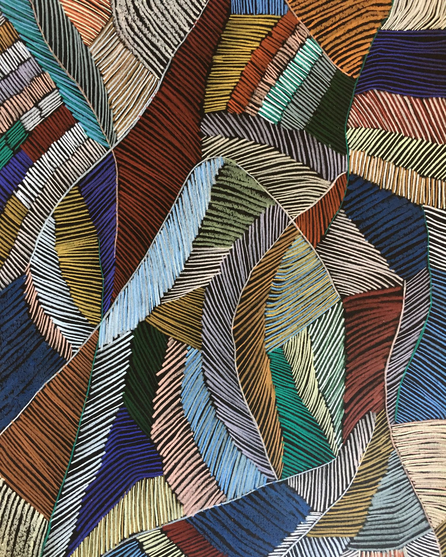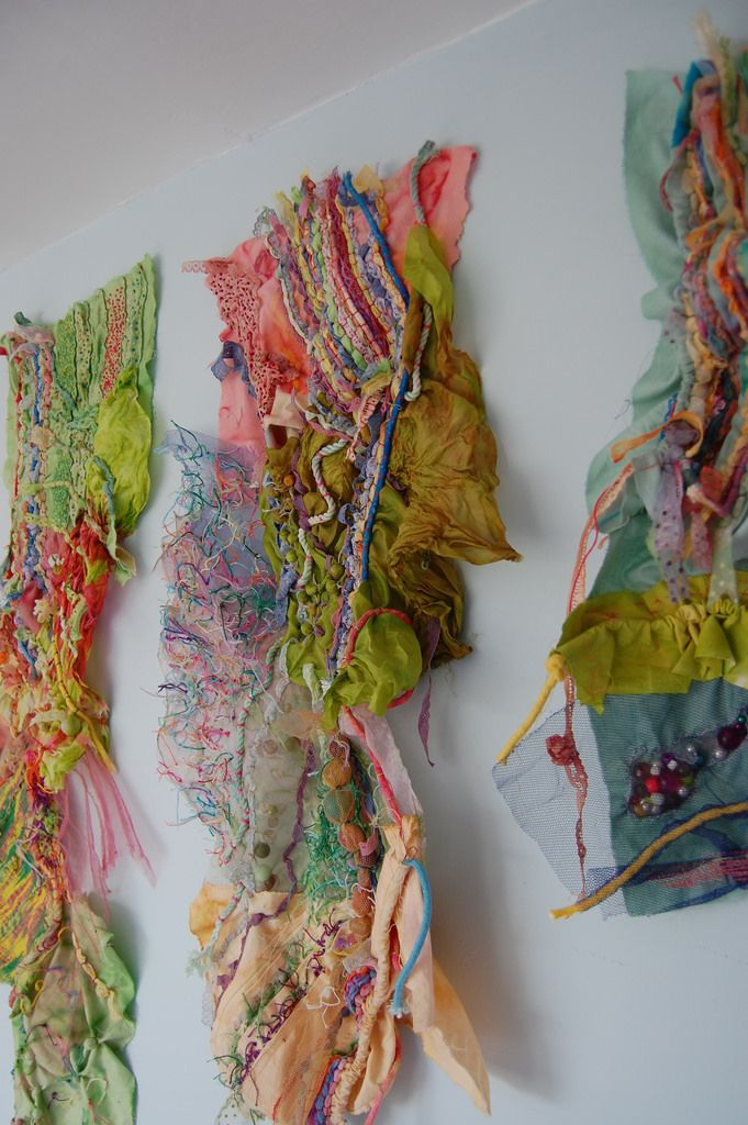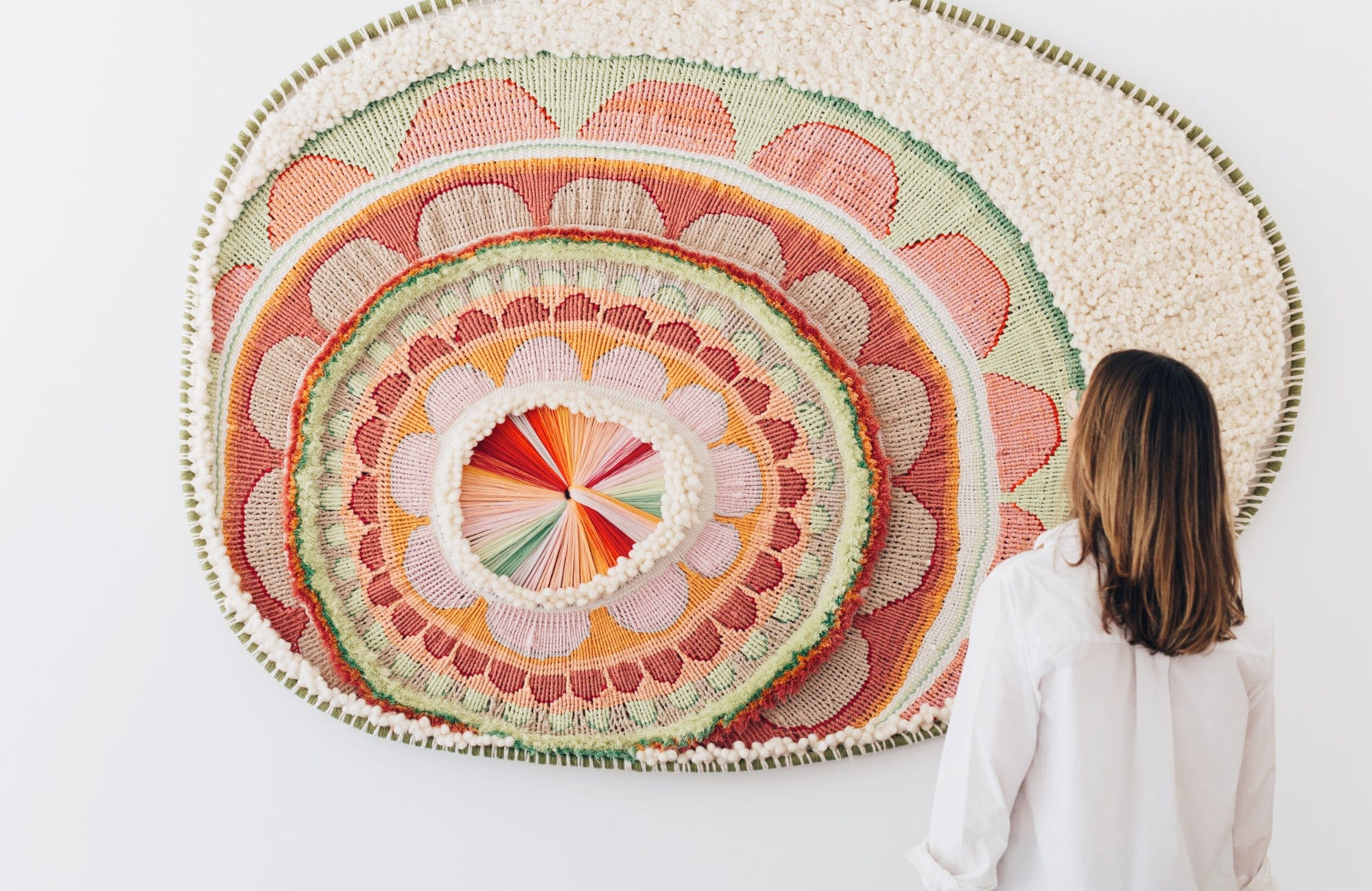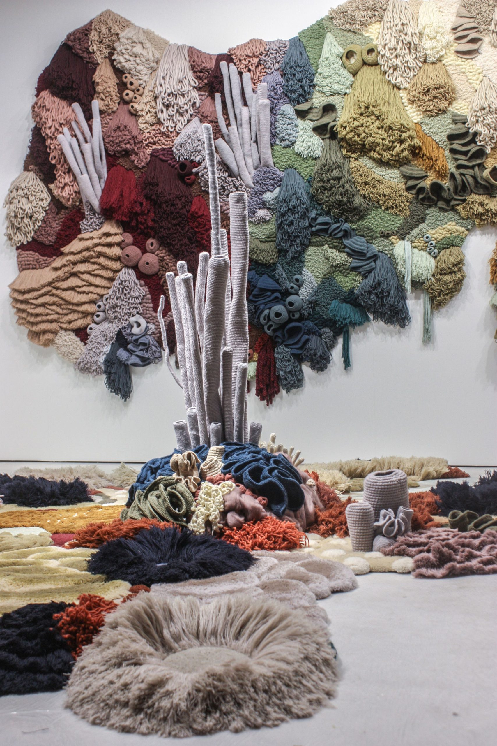
Hey everyone. It’s your friend, here to talk about something I’m incredibly passionate about: textile wall design. It’s so much more than just hanging fabric on a wall. It’s about creating a mood, telling a story, and transforming a space. And at the heart of it all, lies the power of color. Today, we’re going to dive deep into the world of color harmony, exploring how you can use it to elevate your textile wall designs from ordinary to extraordinary. Ready to get inspired?
Color, my friends, is the soul of any design. It’s the first thing we notice, the thing that evokes emotion, and the thing that sets the tone for a room. In textile wall design, color becomes even more important, because it’s not just about the color of the fabric, but how it interacts with the light, the other elements in the space, and the overall aesthetic you’re trying to achieve. Understanding color harmony isn’t about following rigid rules, it’s about understanding the relationships between colors and how they influence each other. It’s about learning to speak the language of color, so you can use it to create the spaces of your dreams. Let’s start our journey, yeah?
Understanding the Color Wheel: Your First Friend
Before we get into harmony, let’s talk about the color wheel. Think of it as your color compass. It shows you the relationships between colors. You’ve got your primary colors (red, yellow, and blue), your secondary colors (made by mixing primaries), and your tertiary colors (made by mixing a primary with a secondary). Knowing these basics is, like, super crucial.
- Primary Colors: The foundation – you can’t make them by mixing other colors.
- Secondary Colors: Created by mixing two primary colors.
- Tertiary Colors: Formed by mixing a primary and a secondary color. For instance, red and orange make red-orange.
Color Harmony: Finding the Perfect Match
Color harmony, in a nutshell, is about creating pleasing color combinations. There are a bunch of different schemes you can use. Each one has its own vibe. Let’s check out some popular ones:
- Complementary: Colors opposite each other on the wheel (think red and green). They create high contrast and energy. Perfect if you’re going for a bold statement.
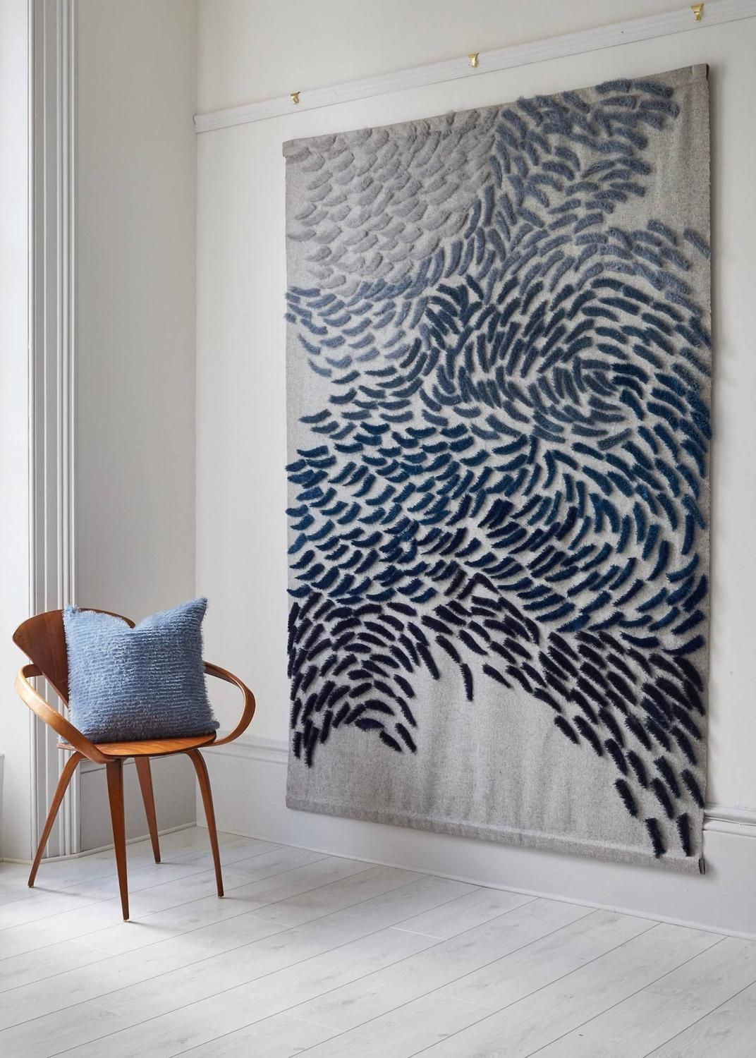
- Analogous: Colors that sit next to each other (like blue, blue-green, and green). They give a sense of calmness and cohesion, a bit like a gentle hug for your eyes.
- Triadic: Three colors evenly spaced on the wheel (like red, yellow, and blue). They offer a balanced and vibrant look. Good for a playful and energetic space.
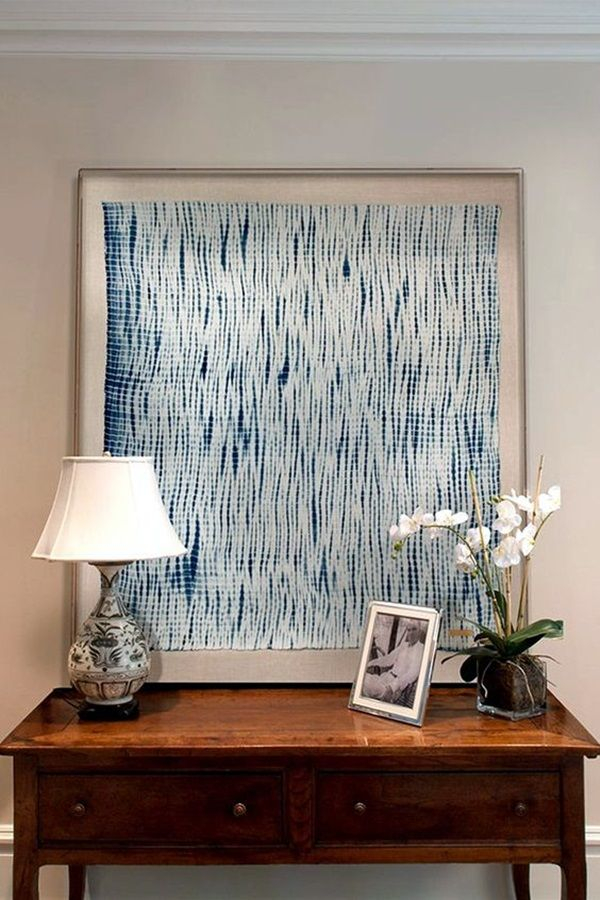
- Monochromatic: Different shades and tints of a single color. This creates a sophisticated, unified look. Imagine a room with various shades of gray, or blue, it creates a really lovely feeling.
Textile Textures and Color Interaction
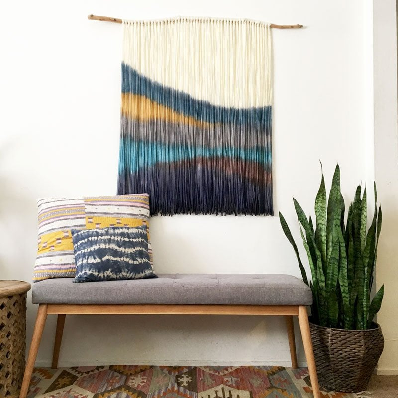
It’s not just about the colors themselves; the textures of your textiles play a huge role. A rough, textured fabric will absorb light differently than a smooth, shiny one. This affects how the colors appear. For example, a deep, rich color in a velvet fabric will look different than the same color in a linen. Consider the light in your space too. Natural light will make colors appear differently than artificial light. Always test your fabric samples in the actual space you’re designing for. It’s a game-changer, I promise!
Real-World Examples: Putting it into Practice
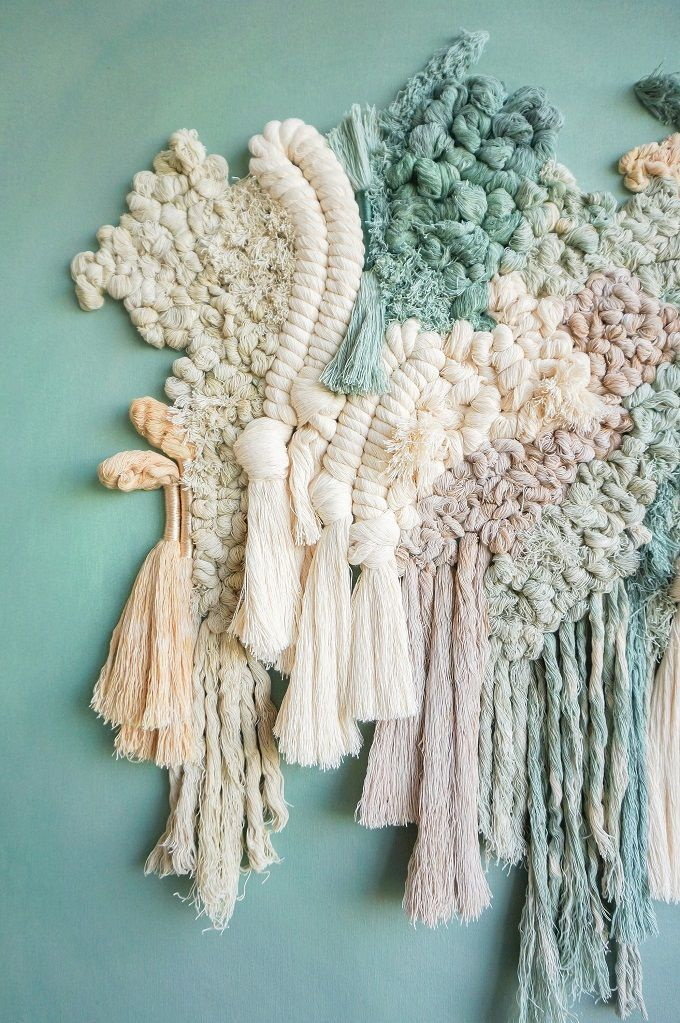
Let’s look at some examples. Imagine a living room with a textile wall featuring a complementary scheme. You could have a deep teal (blue-green) wall and accent with pops of coral (red-orange) in your throw pillows and artwork. This creates a dynamic and eye-catching space.
Or, consider an analogous scheme for a bedroom. A calming blue textile wall, paired with soft blues and greens in your bedding and accessories, creates a serene and relaxing atmosphere. For a more playful setting, think about a triadic scheme. A bright yellow textile wall, paired with blue and red accents, adds a burst of energy and fun to a space. Always remember to experiment, and don’t be afraid to try something new. That’s where the magic happens.
Actionable Tips for Your Textile Wall Design
Okay, let’s get practical. Here’s how to put all this into action:
- Start with Inspiration: Gather images of spaces you love. Notice the color schemes and how they make you feel.
- Create a Mood Board: Collect fabric swatches, paint chips, and images to visualize your design.
- Test, Test, Test: Always test fabric samples in your space. See how they look in different lighting conditions.
- Consider the Scale: Think about the size of your space and the impact of the colors. A smaller room might benefit from a more monochromatic scheme, while a larger room can handle a more complex palette.
- Don’t be Afraid to Experiment: Color is personal. Try different combinations and see what works best for you.
Common Mistakes and How to Avoid Them
There are some common color pitfalls to watch out for. One big one is choosing too many colors. Stick to a limited palette (like 3-5 colors) to keep your design cohesive. Also, don’t underestimate the importance of balance. Make sure your colors are distributed evenly throughout the space, so one color doesn’t overwhelm the others. Finally, don’t be afraid to break the rules. Color is all about expressing your creativity. If something feels right, go for it, even if it’s not ‘technically’ correct.
So there you have it, my friends. A deep dive into the world of color harmony and textile wall design. Remember, mastering color takes time and practice, but it’s an incredible journey. By understanding the principles of color harmony and experimenting with different schemes, you can unlock the full potential of your textile wall designs and create spaces that are both beautiful and meaningful. Go forth, embrace the color, and transform your walls. I can’t wait to see what you create. Feel free to show me your designs! Until next time, keep those creative juices flowing and keep designing. Bye for now.
[sps_html tag=”img” src=”https://cdn.theartssection.com/wp-content/uploads/2025/06/40-ridiculously-artistic-fabric-wall-art-ideas-bored-art-framed-with-color-and-composition-harmonizing-textiles-to-create-breathtaking-wall-designs.jpg” alt=”40 Ridiculously Artistic Fabric Wall Art Ideas - Bored Art | Framed … with Color and Composition Harmonizing Textiles to Create Breathtaking Wall Designs” style=”width: 100%; height: auto;”]
[sps_html tag=”img” src=”https://cdn.theartssection.com/wp-content/uploads/2025/06/deadstock-rug-materials-transformed-into-an-immersive-coral-garden-by-for-scaled.jpg” alt=”Deadstock Rug Materials Transformed Into An Immersive Coral Garden By … for” style=”width: 100%; height: auto;”]
[sps_html tag=”img” src=”https://cdn.theartssection.com/wp-content/uploads/2025/06/textile-art-aboriginal-art-art-inspiration-for.jpg” alt=”Textile Art, Aboriginal Art, Art Inspiration for” style=”width: 100%; height: auto;”]
[sps_html tag=”img” src=”https://cdn.theartssection.com/wp-content/uploads/2025/06/textile-art-wall-decor-popsugar-home-regarding-color-and-composition-harmonizing-textiles-to-create-breathtaking-wall-designs.jpg” alt=”Textile Art Wall Decor | Popsugar Home regarding Color and Composition Harmonizing Textiles to Create Breathtaking Wall Designs” style=”width: 100%; height: auto;”]
[sps_html tag=”img” src=”https://cdn.theartssection.com/wp-content/uploads/2025/06/top-15-of-woven-textile-wall-art-for.jpg” alt=”Top 15 Of Woven Textile Wall Art for” style=”width: 100%; height: auto;”]