For far too long, we’ve treated paint as a static choice, a single decision made under the harsh glare of a hardware store fluorescent. But as someone who has dedicated their life to the subtle dance between color and light, I can tell you this: the right white or pastel isn’t just a backdrop. It’s a living, breathing element that shifts, whispers, and even sings with the sun’s journey across the sky. This isn’t just about ‘picking a color’; it’s about curating an experience, a feeling, a mood that evolves throughout your day.
Have you ever painted a room what you thought was a perfect ‘greige’ only to see it turn lavender at dusk, or a crisp white suddenly feel cold and blue on a cloudy afternoon? You’re not alone, and it’s not your fault. The world of whites and pastels is a deceptively complex one, often misunderstood because we tend to forget their most vital ingredient: light. Natural light isn’t a constant; it’s a dynamic force, changing in intensity, angle, and color temperature from dawn to dusk. And it’s this ever-shifting canvas that truly dictates how your chosen hue will reveal itself. My aim today is to demystify this beautiful complexity and empower you to choose colors that don’t just exist but truly evolve with your space.
Understanding the ‘Undertone’ – Your Secret Weapon
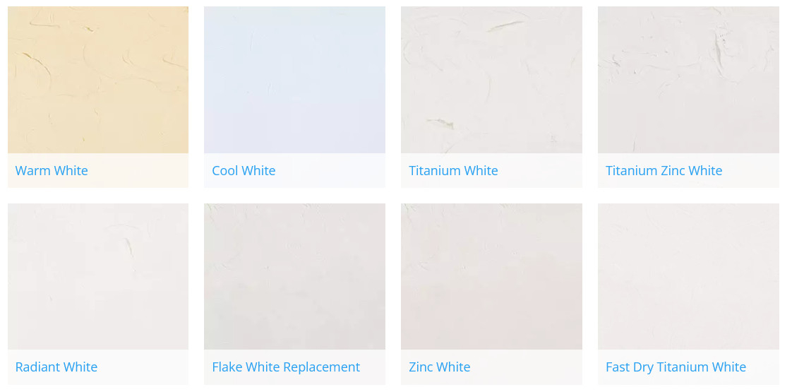
This is where most people get tripped up, and it’s the single most important concept to grasp. Every white and every pastel, no matter how pure it seems, carries a subtle undertone. Think of it as a hidden pigment, a whisper of another color that only truly reveals itself when interacting with light. These undertones are typically:
- Warm (red, yellow, orange): These whites and pastels will feel cozier, more inviting. They can look creamy or even slightly peachy in certain lights. A common example is an ‘off-white’ that leans yellow.
- Cool (blue, green, purple): These shades tend to feel crisper, cleaner, and more contemporary. They can appear stark or even icy if not balanced properly. A classic cool white might reveal a hint of blue in northern light.
- Neutral (grey): A truly neutral white or pastel has a very balanced undertone, often a touch of grey, making it adaptable. However, even these can pull warm or cool depending on the surrounding environment and light.
The trick is to identify the undertone and then consider how it will play with the light entering your room. A south-facing room, bathed in warm, golden light, might make a neutral white appear slightly warm, while a north-facing room, with its cooler, bluer light, will accentuate any cool undertones. It’s a dance, you see, a delicate interaction.
The Direction of Light: Your Room’s Personality Profile
Before you even think about a paint chip, understand your light. This is foundational. Each cardinal direction offers a distinct quality of light that will profoundly impact how your whites and pastels behave:
- North-Facing Rooms: These receive the coolest, most consistent, and often weakest light throughout the day. Colors here can appear muted or even a bit flat. Whites with warm undertones (like a touch of yellow or red) can help counteract the coolness, making the space feel more inviting. Cool whites here might feel too stark.
- South-Facing Rooms: Ah, the sun-drenched haven! These rooms get bright, warm light for most of the day. You have more flexibility here. Cool whites can look crisp and clean without feeling cold, while warm whites will feel incredibly cozy and luminous. Be cautious of overly yellow whites, as they could look ‘dingy’ in intense southern light.
- East-Facing Rooms: Morning glory! These rooms are flooded with warm, golden light in the morning, which then fades to a cooler, softer light in the afternoon. If you want to embrace the morning warmth, choose a white or pastel that has a subtle warm undertone. If you prefer a crisp feel throughout, a neutral or slightly cool white might be better.
- West-Facing Rooms: The evening showstopper. These spaces get soft, cool light in the morning, then a dramatic, warm, often orange-tinged light in the late afternoon and evening. This is where colors can truly transform. A neutral white might appear cool in the morning and then glow golden in the evening. Consider how you use the room most often – morning or evening – and pick accordingly.
From Flat to Luminous: The Power of LRV and Sheen
Beyond the color itself, two technical aspects are crucial for how a white or pastel will evolve: Light Reflectance Value (LRV) and Sheen.
- LRV (Light Reflectance Value): This is a number, typically found on the back of paint chips or in product specifications, that indicates how much light a color reflects. A higher LRV means more light is reflected, making the room feel brighter and more expansive. Whites generally have high LRVs. A white with an LRV of 90 will bounce back more light than one with an LRV of 80. For rooms that lack natural light, choosing a white with a high LRV can significantly enhance their brightness and sense of openness.
- Sheen (Gloss Level): This refers to how shiny the paint finish is. It’s not just about durability; it dramatically affects how light interacts with the surface.
- Flat/Matte: Absorbs light, creating a soft, velvety look. Colors appear truer but can look a bit dull if there’s not enough light. They are also less durable.
- Eggshell/Satin: Offers a subtle sheen, reflecting a little light and adding depth. This is often a great choice for walls as it’s durable and versatile. It allows the color to ‘breathe’ a bit more.
- Semi-Gloss/Gloss: Reflects a lot of light, making colors appear brighter and more vibrant. However, they can highlight imperfections on walls and are generally reserved for trim, doors, or high-traffic areas. The increased reflection can also make a color seem lighter than it actually is.
For whites and pastels that evolve, I often recommend an eggshell or satin finish. It provides just enough reflectivity to allow the color to dance with the light without being overly glossy or flat.
The Surrounding Elements: Your Unseen Collaborators
It’s not just the paint and the light; everything else in the room plays a role. Think of your walls as a chameleon, constantly reacting to their environment.
- Flooring: A warm wooden floor will cast a subtle warm glow upwards, influencing how your wall color appears. A cool-toned tile will do the opposite.
- Furniture and Textiles: A large, vibrant red sofa will subtly reflect red onto a nearby white wall, making it appear slightly pinkish. Green plants can cast a soft green hue. Consider the dominant colors in your furnishings and how they might ‘bounce’ onto your walls.
- Exterior Views: If your window looks out onto a lush green garden, that green will be reflected into the room, impacting your wall color. If you have a deep blue swimming pool outside, expect some blue reflections. This is especially true for large windows.
This interconnectedness is why you can’t just pick a paint color in isolation. You have to envision it within the complete narrative of your space. It’s like a symphony where every instrument contributes to the overall sound, and the absence or presence of one changes the entire composition.
The Practical Application: Testing and Trusting Your Intuition
Alright, so you’ve absorbed all this theory. Now, how do you put it into practice? This is where the rubber meets the road, and frankly, where many people skip crucial steps.
- Narrow it Down: Based on your room’s light direction and your desired feel (warm, cool, neutral), select 3-5 promising large paint swatches. Don’t rely on tiny chips. Get the biggest ones you can find, or even better, order large peel-and-stick samples.
- Paint Generous Swatches: If using liquid samples, paint large (at least 2’x2′) swatches on multiple walls in the room. Don’t just do one wall. The light hits each wall differently. Apply two coats, just as you would when painting the room.
- Observe, Observe, Observe: This is the most critical step. Live with these swatches for at least 24-48 hours. Observe them at different times of day: morning, midday, afternoon, and evening. See how they look in natural light and under your artificial lighting. Do they feel too yellow at night? Do they turn blue on a cloudy day? Do they feel right when you’re having your morning coffee and again when you’re unwinding in the evening? Take notes.
- Compare and Contrast: How do the swatches look next to your trim? Your flooring? Your main furniture pieces? This is where the ‘surrounding elements’ concept comes into play. Hold up fabric samples or small pieces of furniture next to the painted swatches.
- Trust Your Gut (and Your Eyes): After all the analysis, which color genuinely resonates with you? Which one feels like it’s harmonizing with the light, rather than fighting it? The ‘perfect’ white or pastel isn’t just about technical correctness; it’s about how it makes you feel in your space. Don’t rush this process. It’s an investment in your daily well-being.
Embracing the Imperfection: A Living Canvas
Finally, a word of wisdom from someone who’s seen countless transformations: embrace the imperfiction. No white or pastel will look exactly the same at every moment of the day. That’s the beauty of it! It’s a living canvas. The goal isn’t static perfection but dynamic harmony. It’s about selecting a hue that offers a delightful journey of subtle shifts, revealing new facets of itself as the light changes.
Think of it as a quiet, graceful dance between your home and the sun, a gentle reminder of the passage of time and the ever-present beauty of natural light. When you choose a white or pastel with this philosophy in mind, you’re not just painting a wall; you’re inviting the outside world in, allowing your space to breathe and evolve with every sunrise and sunset. It’s a truly rewarding experience, one that transforms a simple room into a sanctuary of ever-changing light and mood.
The art of selecting whites and pastels that evolve with daylight isn’t just about picking a pretty shade; it’s about understanding the profound relationship between color, light, and emotion. It’s about creating spaces that feel alive, responsive, and deeply connected to the natural world outside your windows. By considering undertones, light direction, LRV, sheen, and the surrounding elements, you’re not just making a decorative choice; you’re orchestrating a symphony of light and color that will play out beautifully, day after day. So, step away from the tiny paint chip, embrace the dynamic nature of light, and let your walls truly glow.
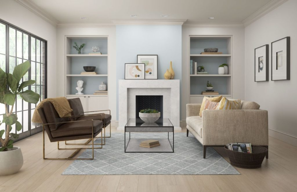
[sps_html tag=”img” src=”https://cdn.theartssection.com/wp-content/uploads/2025/07/my-houzz-inviting-whites-and-pastels-in-a-chicago-condo-throughout-the-painters-secret-whites-and-pastels-that-dance-with-your-homes-natural-light.jpg” alt=”My Houzz: Inviting Whites And Pastels In A Chicago Condo throughout The Painter's Secret Whites and Pastels That Dance with Your Home's Natural Light” style=”width: 100%; height: auto;”]
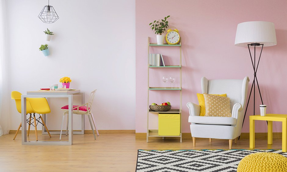
[sps_html tag=”img” src=”https://cdn.theartssection.com/wp-content/uploads/2025/07/the-secret-cottage-color-formula-for-a-cozy-vibe-edward-george-inside-the-painters-secret-whites-and-pastels-that-dance-with-your-homes-natural-light.png” alt=”The Secret Cottage Color Formula For A Cozy Vibe - Edward George inside The Painter's Secret Whites and Pastels That Dance with Your Home's Natural Light” style=”width: 100%; height: auto;”]
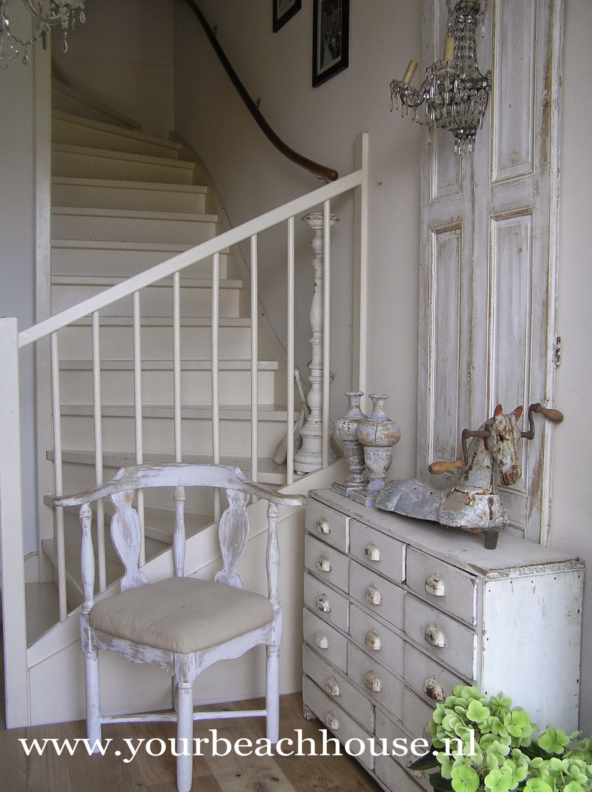
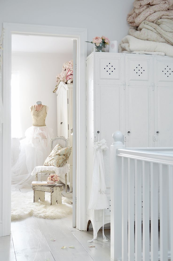
[sps_html tag=”img” src=”https://cdn.theartssection.com/wp-content/uploads/2025/07/gorgeous-home-decorating-in-milky-whites-and-sophisticated-pastels-regarding-the-painters-secret-whites-and-pastels-that-dance-with-your-homes-natural-light.jpg” alt=”Gorgeous Home Decorating In Milky Whites And Sophisticated Pastels regarding The Painter's Secret Whites and Pastels That Dance with Your Home's Natural Light” style=”width: 100%; height: auto;”]
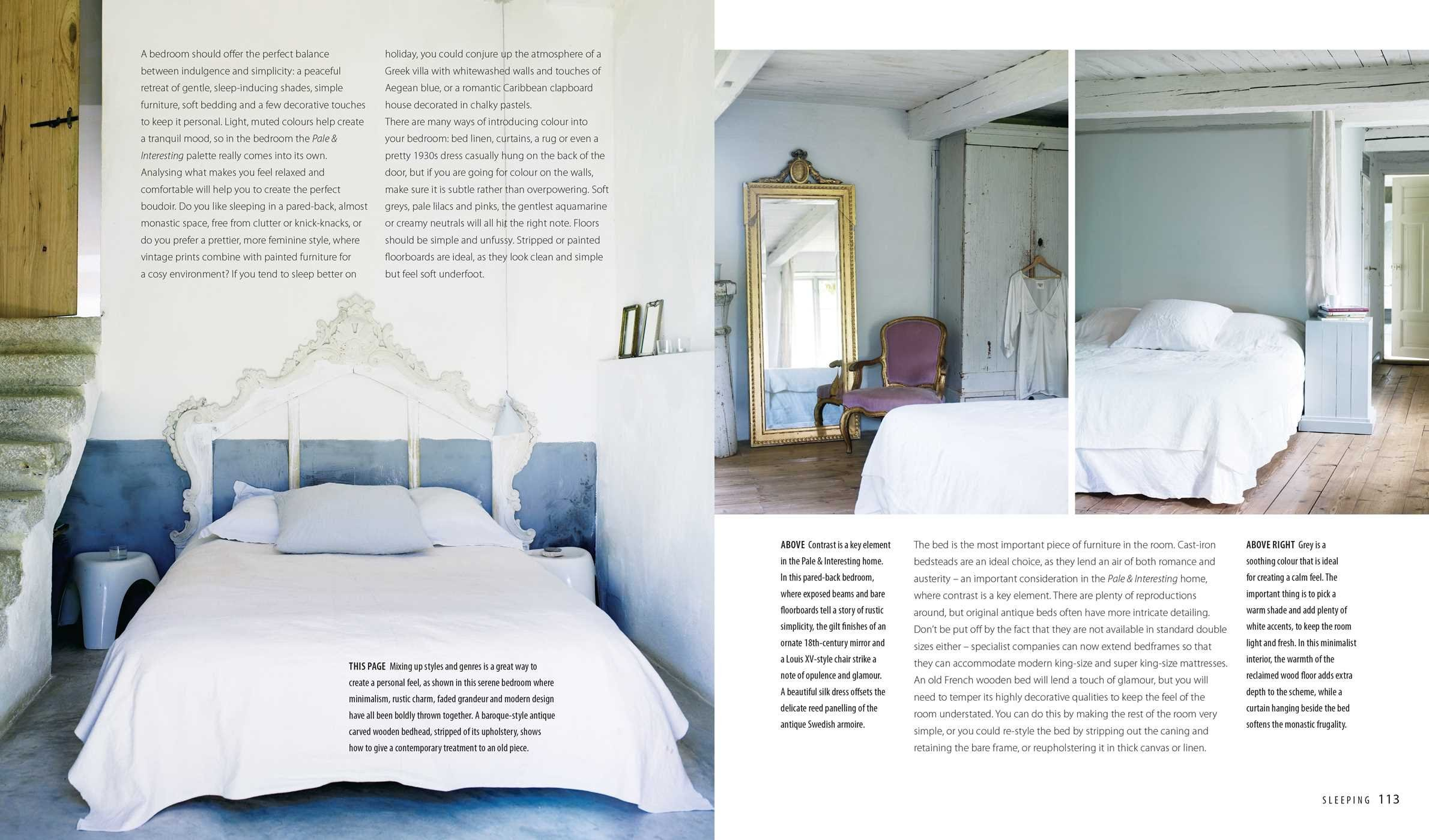
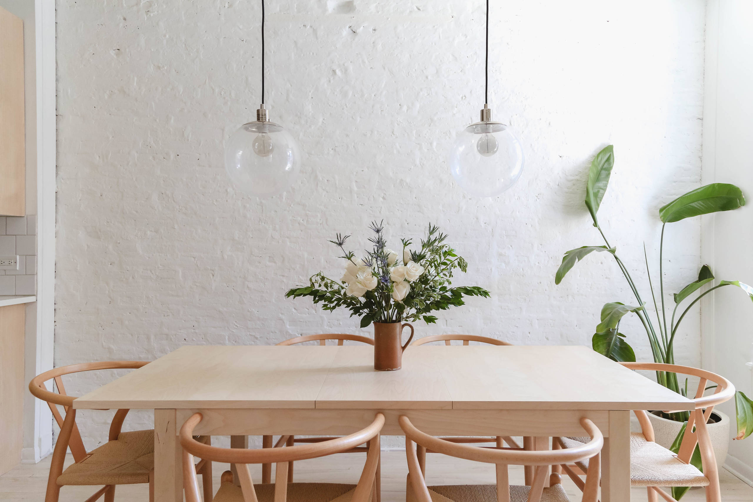
[sps_html tag=”img” src=”https://cdn.theartssection.com/wp-content/uploads/2025/07/pale-amp-interesting-decorating-with-whites-pastels-and-neutrals-for-a-intended-for.jpg” alt=”Pale &Amp; Interesting: Decorating With Whites, Pastels And Neutrals For A … intended for” style=”width: 100%; height: auto;”]
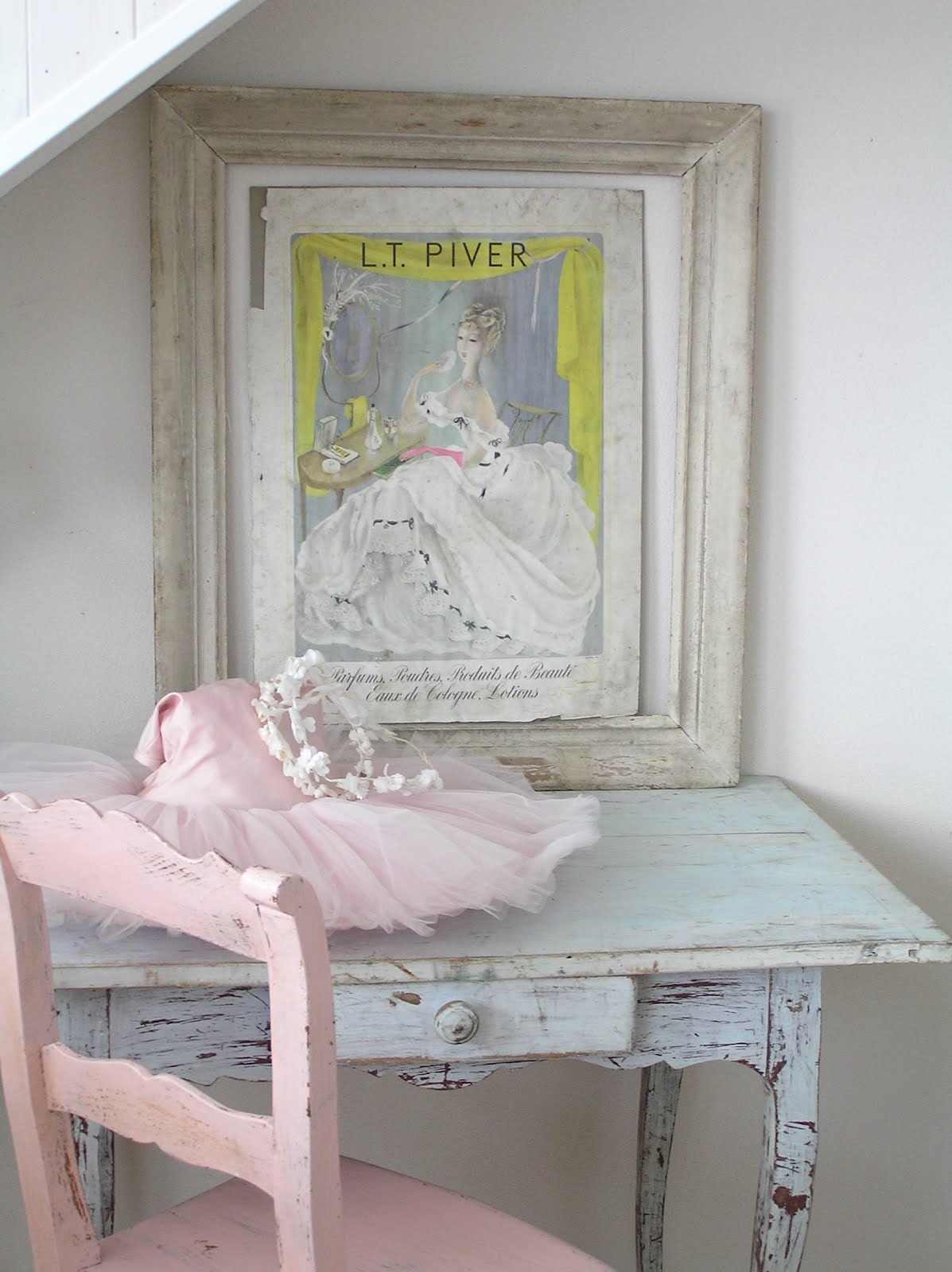
[sps_html tag=”img” src=”https://cdn.theartssection.com/wp-content/uploads/2025/07/pastels-and-whites-pastels-throughout-the-painters-secret-whites-and-pastels-that-dance-with-your-homes-natural-light.jpg” alt=”Pastels And Whites: Pastels… throughout The Painter's Secret Whites and Pastels That Dance with Your Home's Natural Light” style=”width: 100%; height: auto;”]