Imagine walking into a room where the calming blue tones of the ocean meet the warmth of your living space. What if that peaceful scene could be just one panel away? That’s exactly what modern seascape wall art offers – a simple yet powerful way to bring nature’s tranquility indoors.
There’s something deeply soothing about staring at the endless horizon where sky meets sea. It’s no wonder then that we’ve been drawn to ocean-inspired artwork for centuries. Today’s homes are no different, especially when it comes to the growing popularity of single-panel modern seascape wall art. This isn’t just about aesthetics anymore – it’s about creating spaces that genuinely feel good to be in. Whether you’re looking to transform a blank hallway or want to add a focal point to your living room, seascape art offers an easy path to visual harmony. But how do you make sure it works perfectly with everything else in your space? Let’s dive into the details.
Understanding the Psychology of Ocean Colors
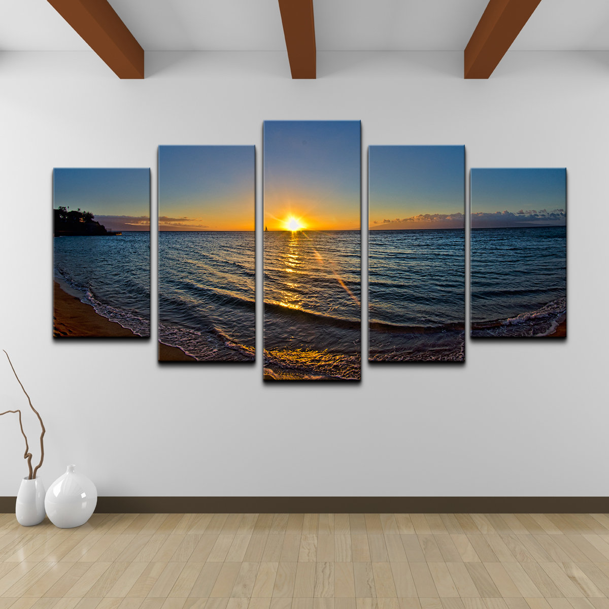
The colors found in ocean scenes aren’t chosen randomly. Blue tones naturally have a calming effect on our minds and bodies. When you look at deep blues, they tend to slow our breathing and reduce stress levels. Lighter blues and aqua shades can evoke feelings of serenity and openness. These hues work because they remind us of vastness and freedom – things we often crave but rarely experience in our daily lives. Think about it: how many times have you felt instantly relaxed just watching waves roll in? That’s the power of ocean color psychology working on you. In your home, using these calming tones creates a peaceful environment that helps people unwind after long days. The beauty of modern seascape art is that it captures these emotional responses through carefully selected pigments and brushstrokes. When choosing your seascape piece, consider the mood you want to create. A vibrant sunset seascape might energize a space, while a soft morning beach scene could provide quiet contemplation. These choices directly impact how people feel when they enter your rooms.
Choosing the Right Size and Proportion
One of the most common mistakes people make is picking artwork that’s either too big or too small for their space. A massive seascape can overwhelm a cozy bedroom, while a tiny piece might get lost in a large living area. Consider your wall’s dimensions and the room’s overall scale. For a standard living room, a 24×36 inch piece usually works well. But remember, proportions matter more than absolute measurements. If you have high ceilings, you might want to go larger to fill the vertical space. For smaller spaces, keeping it compact ensures the artwork doesn’t make the room feel cramped. Sometimes, two smaller panels can create better balance than one oversized piece. Measure your wall space carefully before making a purchase. The key is ensuring the artwork feels like it belongs there, not like it was thrown up against the wall. A good rule of thumb: the artwork should take up roughly one-third of the wall’s width. This creates visual weight that draws the eye naturally across the room. You’ll find that properly proportioned seascape art becomes a natural conversation starter rather than an afterthought.
Color Coordination Strategies
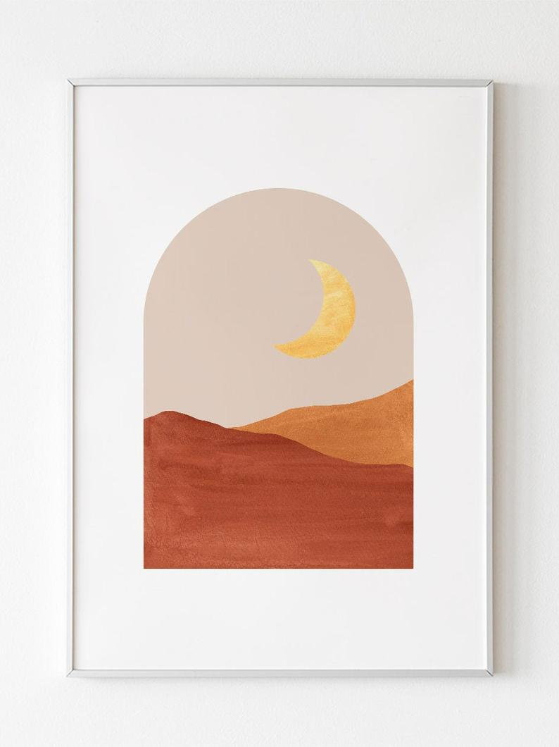
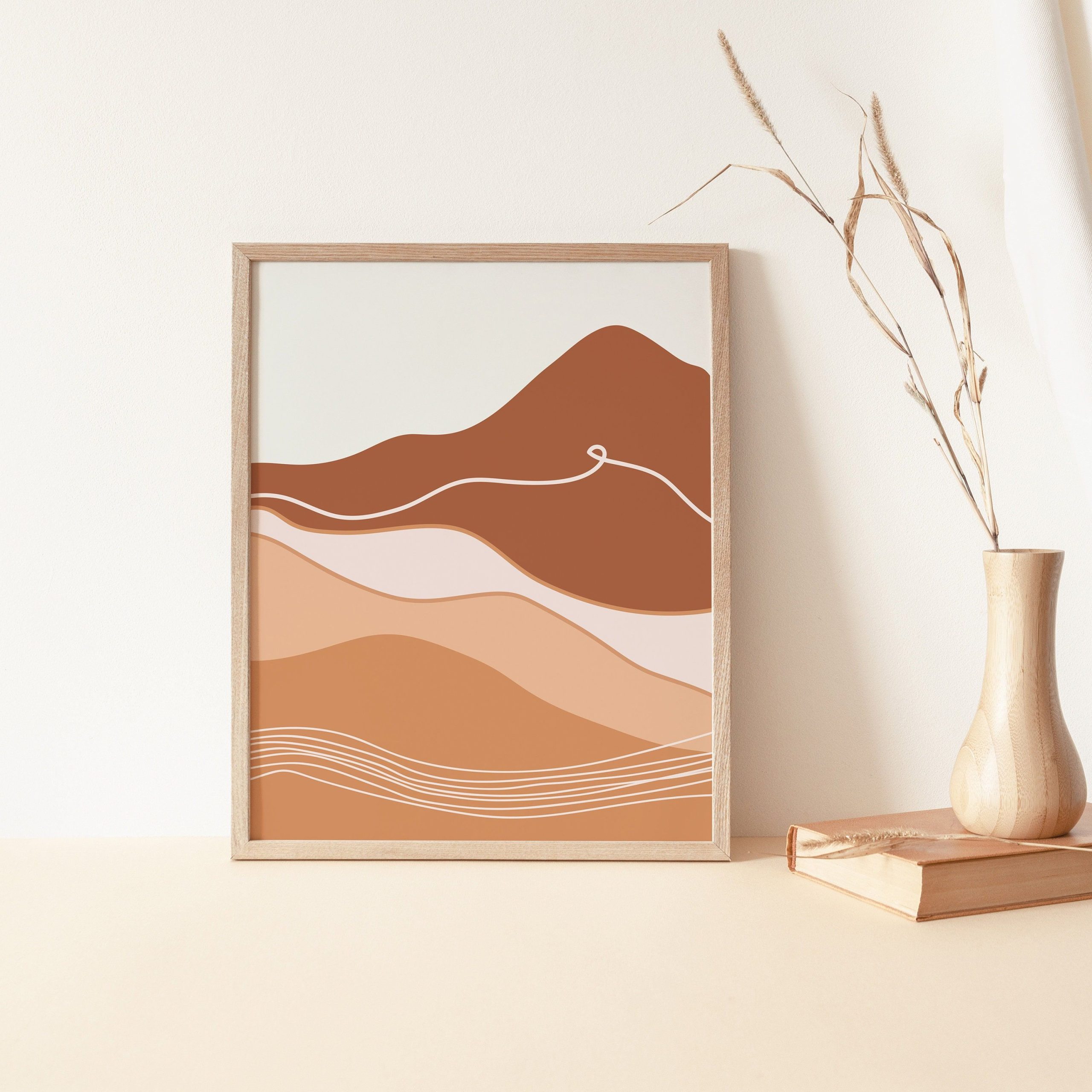
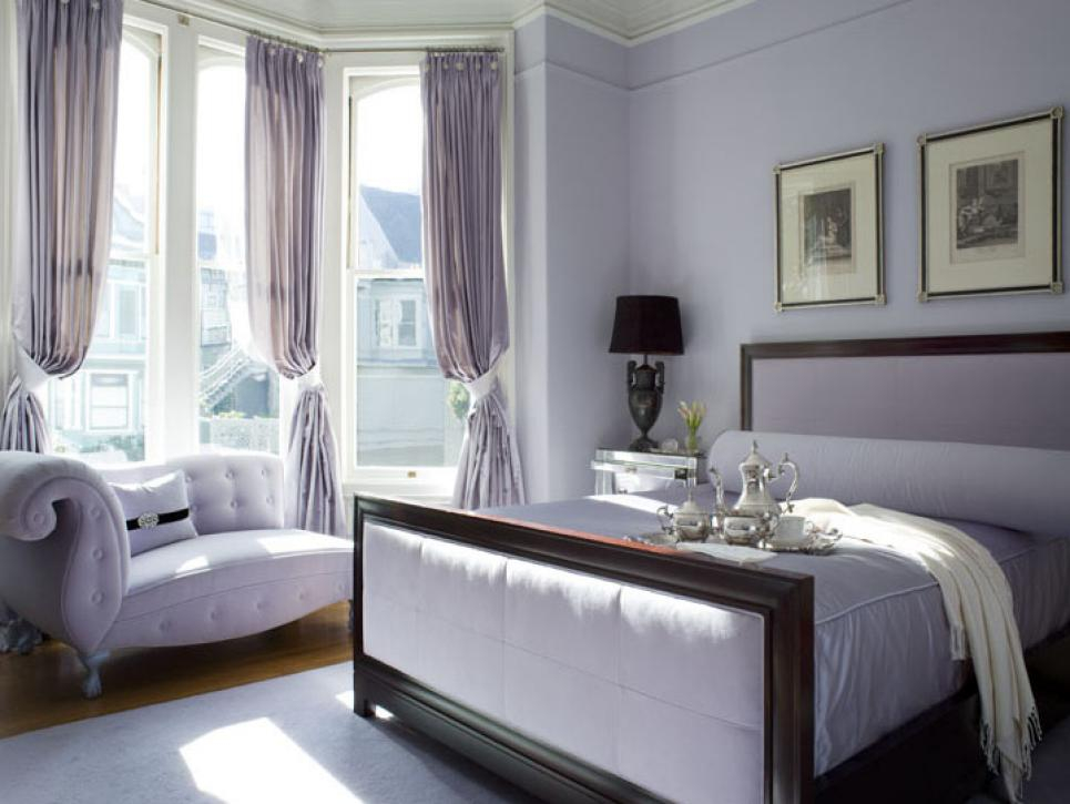
Seascape art doesn’t have to clash with your existing color scheme. In fact, it often complements them beautifully. Start by identifying the dominant colors already present in your space. If you have lots of warm earth tones, consider a seascape with golden hour lighting. This will create a beautiful contrast that makes both elements pop. Neutral walls give you the most flexibility – you can choose any seascape that catches your eye. But even if your walls are bold, you can still find harmony. Look for art with complementary colors that match or echo what’s already in the room. For example, if you have teal furniture, a seascape with similar blue-green tones will create unity. Sometimes, the best approach is to pick a seascape that introduces one new color that ties everything together. This technique prevents overwhelming the senses while adding visual interest. Think of your home as a canvas where each element contributes to the overall composition. Your seascape becomes part of that larger picture, not just another decoration.
Texture and Material Considerations
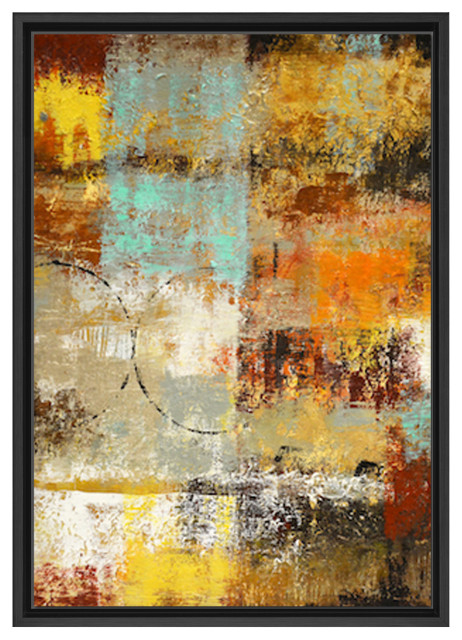
Modern seascape art isn’t just about what you see – it’s also about what you feel. The materials used in creating these pieces play a huge role in how they integrate with your space. Canvas prints offer a traditional, soft touch that works well in most settings. They’re versatile and affordable, making them popular choices for many homeowners. Wood frames can add warmth and texture to a room, especially in rustic or coastal designs. Metal frames might suit contemporary spaces better, offering clean lines and modern appeal. Some artists experiment with mixed media, combining canvas with actual sand or shells. These tactile elements can create interesting conversations and add depth to your visual experience. When selecting materials, think about how they’ll interact with the rest of your furnishings. A smooth canvas might complement rough wooden furniture beautifully. The contrast between textures often creates the most visually appealing results. Consider the room’s atmosphere – a beach house might benefit from natural materials, while a modern office might prefer sleek finishes. Ultimately, the material choice affects how the piece fits into your space’s identity.
Placement and Focal Point Design
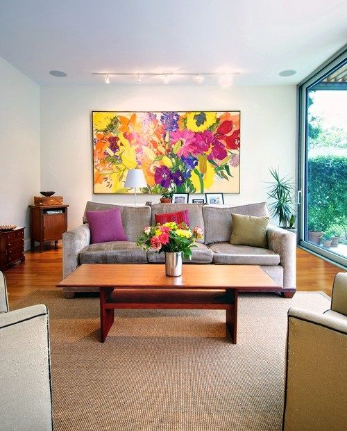
Where you hang your seascape matters more than you might expect. The best placement creates a natural focal point that guides the eye around the room. Hang your artwork at eye level – about 57 inches from the floor to the center of the piece. This height ensures everyone can enjoy the view regardless of their height. For large walls, consider grouping multiple pieces together. This approach creates a gallery wall effect that can transform a simple hallway into a stunning entrance. But be careful not to overcrowd the space. Leave some breathing room around the artwork so it doesn’t compete with other elements. Sometimes, the most effective placement is where it creates the most visual tension – perhaps opposite a window or near a seating area. This positioning allows people to appreciate the artwork while going about their daily activities. Think about how people move through the space. Does the artwork direct attention where you want it to go? Good placement turns a simple wall into a dynamic part of your home’s architecture. It’s not just about decoration – it’s about creating pathways for the eyes and minds of everyone who enters.
Maintaining Visual Balance Over Time
Creating harmony isn’t a one-time task – it requires ongoing attention. As your home evolves, so should your seascape art. What looks perfect today might seem out of place next year. Keep an eye on how the light changes throughout the day and seasons. Morning light might highlight different aspects of your seascape than evening light does. This variation can actually enhance the piece’s impact over time. Don’t be afraid to rotate or reposition your artwork seasonally. A winter storm scene might feel right during cold months, while a tropical beach image could brighten the space during darker periods. Consider how other elements in your home change over time. New furniture, updated lighting, or changing personal preferences all affect how your seascape appears. Regular adjustments ensure your space continues to feel fresh and harmonious. You might find that certain seasons call for different moods in your artwork. The key is staying flexible and responsive to how your space grows and changes.
Creating visual harmony with modern seascape wall art isn’t just about choosing pretty pictures – it’s about understanding how colors, sizes, and placements work together to form a cohesive whole. When you approach this art with intention, you’re not just decorating – you’re crafting experiences. The right seascape can transform a room from ordinary to extraordinary, providing a sense of calm and connection to nature. Remember, the goal isn’t to follow rigid rules but to create something that feels authentically yours. Pay attention to proportions, consider how colors interact, and don’t overlook the importance of placement. Your seascape should feel like a natural extension of your lifestyle, not an artificial addition. By taking these factors into account, you’ll discover that even the simplest wall art can become a powerful anchor for your entire home’s aesthetic. It’s not about having the most expensive piece – it’s about finding the one that speaks to you and fits perfectly within your space.
[sps_html tag=”img” src=”https://cdn.theartssection.com/wp-content/uploads/2025/12/abstract-art-print-landscape-wall-art-warm-color-palette-minimalist-for-open-window-to-bright-yellow-sunset-modern-seascape-wall-art-1-panel-scaled.jpg” alt=”Abstract Art Print Landscape Wall Art Warm Color Palette Minimalist … for "Open Window To Bright Yellow Sunset" Modern Seascape Wall Art, 1 Panel” style=”width: 100%; height: auto;”]
[sps_html tag=”img” src=”https://cdn.theartssection.com/wp-content/uploads/2025/12/sun-art-print-abstract-desert-sand-dunes-landscape-mountains-poster-for-the-psychology-of-warm-colors-in-contemporary-wall-art.png” alt=”Sun Art Print Abstract Desert Sand Dunes Landscape Mountains Poster … for The Psychology of Warm Colors in Contemporary Wall Art” style=”width: 100%; height: auto;”]
[sps_html tag=”img” src=”https://cdn.theartssection.com/wp-content/uploads/2025/12/warm-colors-art-warm-colors-painting-abstract-horizon-art-textured-regarding-open-window-to-bright-yellow-sunset-modern-seascape-wall-art-1-panel.webp” alt=”Warm Colors Art Warm Colors Painting Abstract Horizon Art Textured regarding "Open Window To Bright Yellow Sunset" Modern Seascape Wall Art, 1 Panel” style=”width: 100%; height: auto;”]
[sps_html tag=”img” src=”https://cdn.theartssection.com/wp-content/uploads/2025/12/the-psychological-effect-of-colors-in-your-living-room-summer-living-within-open-window-to-bright-yellow-sunset-modern-seascape-wall-art-1-panel.jpg” alt=”The Psychological Effect Of Colors In Your Living Room | Summer Living … within "Open Window To Bright Yellow Sunset" Modern Seascape Wall Art, 1 Panel” style=”width: 100%; height: auto;”]
[sps_html tag=”img” src=”https://cdn.theartssection.com/wp-content/uploads/2025/12/the-healing-power-of-colour-art-psychology-chakra-art-colours-throughout-the-psychology-of-warm-colors-in-contemporary-wall-art.jpg” alt=”The Healing Power Of Colour | Art Psychology, Chakra Art, Colours throughout The Psychology of Warm Colors in Contemporary Wall Art” style=”width: 100%; height: auto;”]