Ever walk into a room and your eyes are instantly drawn to a particular painting or sculpture? It’s not always the subject matter, or even the artist’s fame. More often than not, it’s the masterful deployment of color that grabs your attention and refuses to let go. This isn’t just about pretty hues; it’s about a deep understanding of how color interacts with space, light, and our very own psychology. It’s about turning a simple canvas into the undisputed commander of a room’s aesthetic.
For centuries, artists have understood that color is more than just a visual element. It’s a language, a feeling, a force. But when we bring art into our homes, we often underestimate its potential. We might pick a piece we love, hang it on the wall, and consider our job done. Yet, the true magic happens when we recognize that the colors within that artwork possess an inherent power to dictate the entire mood and focus of a room. It’s not just about matching your sofa; it’s about leveraging color to create a compelling dialogue between the art and its environment.
The Psychology of Shades: How Colors Speak to Us
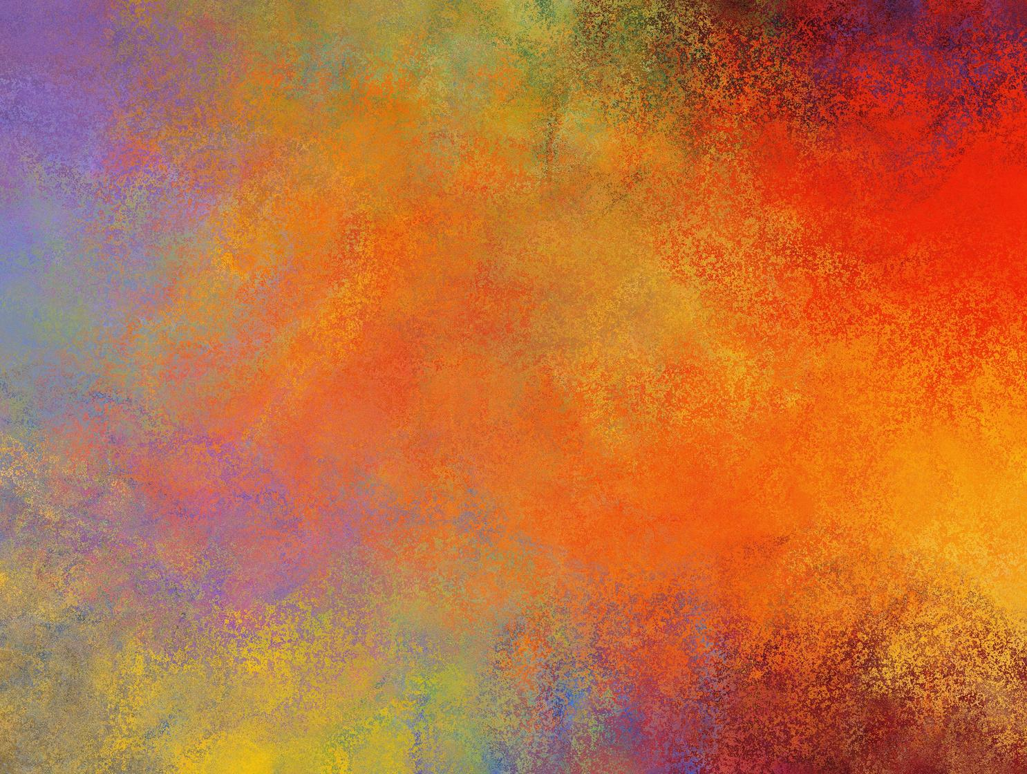
Before we even get to placement, we must appreciate the inherent psychological impact of different colors. Reds and oranges, for instance, are often associated with energy, passion, and warmth. Imagine a vibrant abstract painting in these tones – it immediately injects vitality into a space. Blues and greens, on the other hand, tend to evoke feelings of calm, tranquility, and nature. A serene seascape can instantly create a peaceful oasis. Understanding these fundamental associations is the first step in choosing art that will command the desired atmosphere. A bold, warm piece will naturally draw the eye, while a cool, subtle one might create a more understated, yet equally powerful, focal point if used effectively with other elements.
Contrast is King: Making Your Art Pop
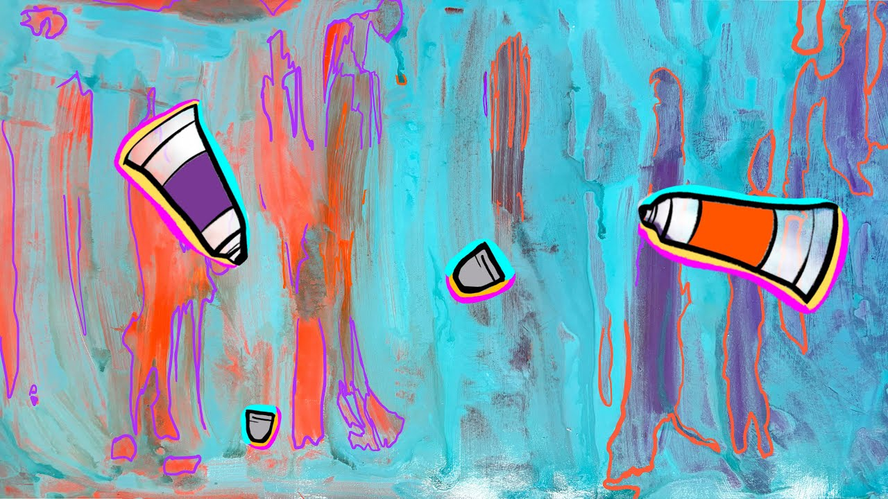
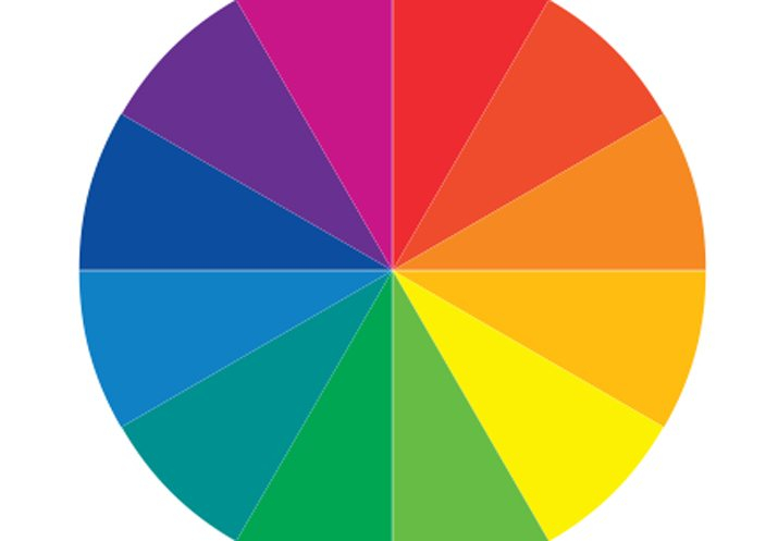
One of the most effective ways to make art a focal point is through strategic contrast. This isn’t just about light and dark; it’s about contrasting the colors in your artwork with the surrounding wall color and decor. A brightly colored pop art piece against a neutral grey wall will undeniably stand out. Conversely, a piece with muted tones can become a powerful focal point if placed in a room with equally muted, yet complementary, colors. The key is to create a visual tension that pulls the eye towards the art. Think of a rich, deep indigo painting on a pale cream wall – the contrast is subtle but undeniable, and it makes the art sing.
The Dominant Hue: Guiding the Eye with a Singular Statement
Often, a single dominant color within an artwork can become the anchor for the entire room’s design. If your painting features a striking cerulean blue, you can subtly echo that blue in throw pillows, a decorative vase, or even a small rug. This creates a cohesive visual pathway that leads the eye directly back to the art. The art isn’t just hanging there; it’s actively dictating the color palette of the entire space. This technique works best when the dominant color in the art is truly impactful and unique, making it a natural magnet for attention. It’s about building a visual story around that one powerful hue.
Light and Shadow: Illuminating Your Art’s Color Story
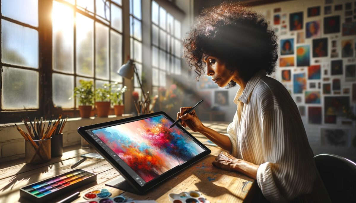
The way light interacts with the colors in your art is absolutely crucial. Natural light can bring out the nuances of a painting, making colors appear more vibrant and alive. Artificial lighting, especially directional lighting like spotlights, can be used to dramatically highlight certain colors or areas within a piece, effectively ‘framing’ it with light. Consider how a warm, soft light can enhance the golden tones in a landscape, or how a cooler light might emphasize the blues and silvers in a modern abstract. The right lighting can transform a good piece of art into an extraordinary focal point, making its colors truly sing and command attention.
Beyond the Wall: Integrating Art’s Colors into the Room’s Flow
Making art a focal point isn’t just about hanging it and hoping for the best. It’s about designing the room around the art. This means extending the color story of the artwork into the broader room. For example, if your art has a vibrant green, you might introduce a plant with similar green foliage or a cushion with a touch of that hue. This creates a seamless flow, where the art isn’t an isolated object but an integral part of the room’s design. It’s about creating a ‘color echo’ that reinforces the art’s presence and makes it feel like an intentional centerpiece, rather than just an afterthought. This integration makes the art feel truly at home, and in command.
Trust Your Eye: The Ultimate Arbiter of Color Command
While there are theories and guidelines, the most important tool you have is your own eye and your own feeling. Don’t be afraid to experiment. Move things around. See how different lighting affects the colors. Sometimes, the most unexpected combination of colors, or the most unconventional placement, can create the most powerful and captivating focal point. Your home is a reflection of you, and the art you choose, and how you choose to present it, should reflect your unique taste and vision. So, play with those pigments, let the colors guide you, and watch your art take command.
The journey from a canvas on a wall to a room’s undeniable focal point is paved with color. By understanding the psychology of hues, leveraging contrast, identifying dominant shades, optimizing lighting, and integrating the art’s palette into the broader room, you can transform any piece into a commanding presence. It’s not just about decorating; it’s about curating an experience, a visual narrative that begins and ends with the powerful story told by the colors of your chosen art. So, go forth, experiment, and let your art truly take command of your space.
[sps_html tag=”img” src=”https://cdn.theartssection.com/wp-content/uploads/2025/06/elevate-your-art-unleashing-the-power-of-contrasting-colors-in-in.jpg” alt=”Elevate Your Art: Unleashing The Power Of Contrasting Colors In … in” style=”width: 100%; height: auto;”]
[sps_html tag=”img” src=”https://cdn.theartssection.com/wp-content/uploads/2025/06/master-artists-and-their-relationship-with-color-within-elevate-your-art-the-strategic-use-of-color-for-wall-dominance.jpg” alt=”Master Artists And Their Relationship With Color within Elevate Your Art The Strategic Use of Color for Wall Dominance” style=”width: 100%; height: auto;”]
[sps_html tag=”img” src=”https://cdn.theartssection.com/wp-content/uploads/2025/06/dominance-in-art-example-regarding-elevate-your-art-the-strategic-use-of-color-for-wall-dominance.jpg” alt=”Dominance In Art Example regarding Elevate Your Art The Strategic Use of Color for Wall Dominance” style=”width: 100%; height: auto;”]
[sps_html tag=”img” src=”https://cdn.theartssection.com/wp-content/uploads/2025/06/elevate-your-art-magazine-april-2021-by-elevateyourart-issuu-with-elevate-your-art-the-strategic-use-of-color-for-wall-dominance.jpg” alt=”Elevate Your Art Magazine, April 2021 By Elevateyourart - Issuu with Elevate Your Art The Strategic Use of Color for Wall Dominance” style=”width: 100%; height: auto;”]
[sps_html tag=”img” src=”https://cdn.theartssection.com/wp-content/uploads/2025/06/5-pastel-color-paints-to-elevate-your-walls-with-iwmbuzz-intended-for.jpg” alt=”5 Pastel Color Paints To Elevate Your Walls With | Iwmbuzz intended for” style=”width: 100%; height: auto;”]