Thinking about giving your 1920s home a facelift? It’s a fantastic idea! These homes, with their charming details and solid bones, offer a wonderful canvas. But what if you want to shake things up a bit, move beyond the typical muted palettes often associated with the era? What if you want to inject some serious vibrancy into those classic spaces? It’s totally doable, and honestly, it can look absolutely stunning. We’re talking about making those period features pop with a burst of color, creating a home that feels both historically rooted and wonderfully alive.
When people picture 1920s homes, they often conjure images of subdued tones – think creams, browns, and maybe a dusty rose if they’re feeling adventurous. And while those colors certainly had their place, the truth is, the 1920s was also an era of immense change and a surprising amount of flair, especially as Art Deco began to take hold. People were starting to experiment, to embrace new ideas, and that extended to their homes. So, when you’re looking to renovate, don’t feel boxed in by historical stereotypes. This is your chance to honor the past while bringing in a fresh, energetic spirit. Let’s delve into how you can skillfully weave vibrant colors into your 1920s renovation, making it truly sing.
Understanding the 1920s Aesthetic: A Foundation for Color
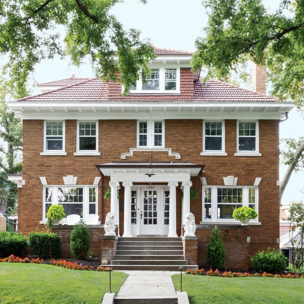
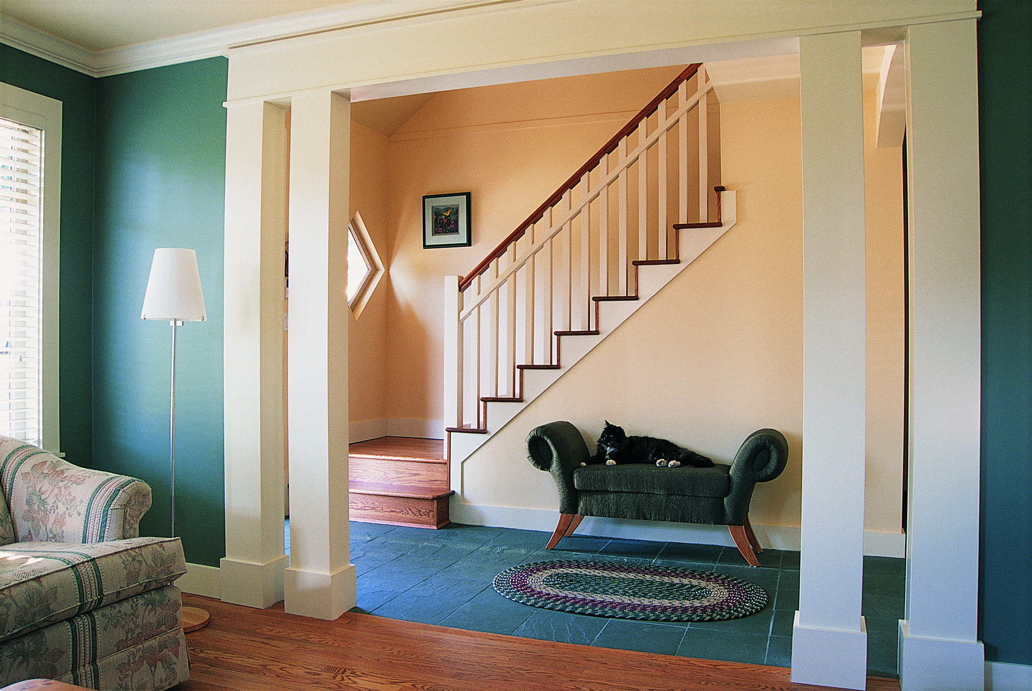
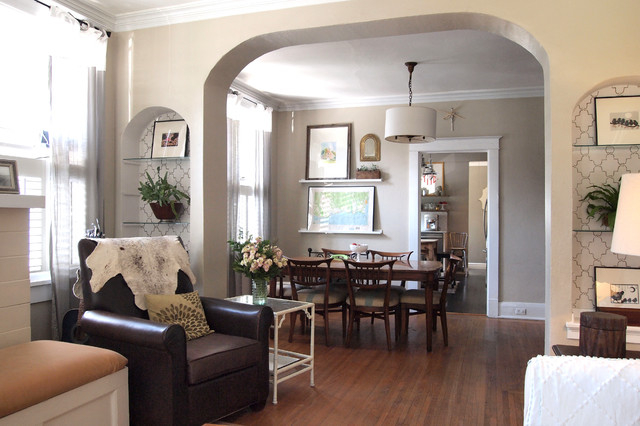
Before we splash paint everywhere, it’s helpful to grasp the core design elements of a 1920s home. Picture sturdy architecture, often with a good deal of natural wood trim, built-in shelving, and sometimes those lovely arched doorways. The style often leaned towards Craftsman, Colonial Revival, or even early Art Deco influences. Knowing these underlying features is key because your vibrant colors will be playing with them, not against them. For example, a deep emerald green might beautifully complement dark oak trim, creating a rich, opulent feel. Conversely, a bright, sunny yellow might lighten a space that feels too heavy with original dark elements. It’s about finding that balance, that harmonious conversation between the old and the new.
Where to Begin: Strategic Color Placement
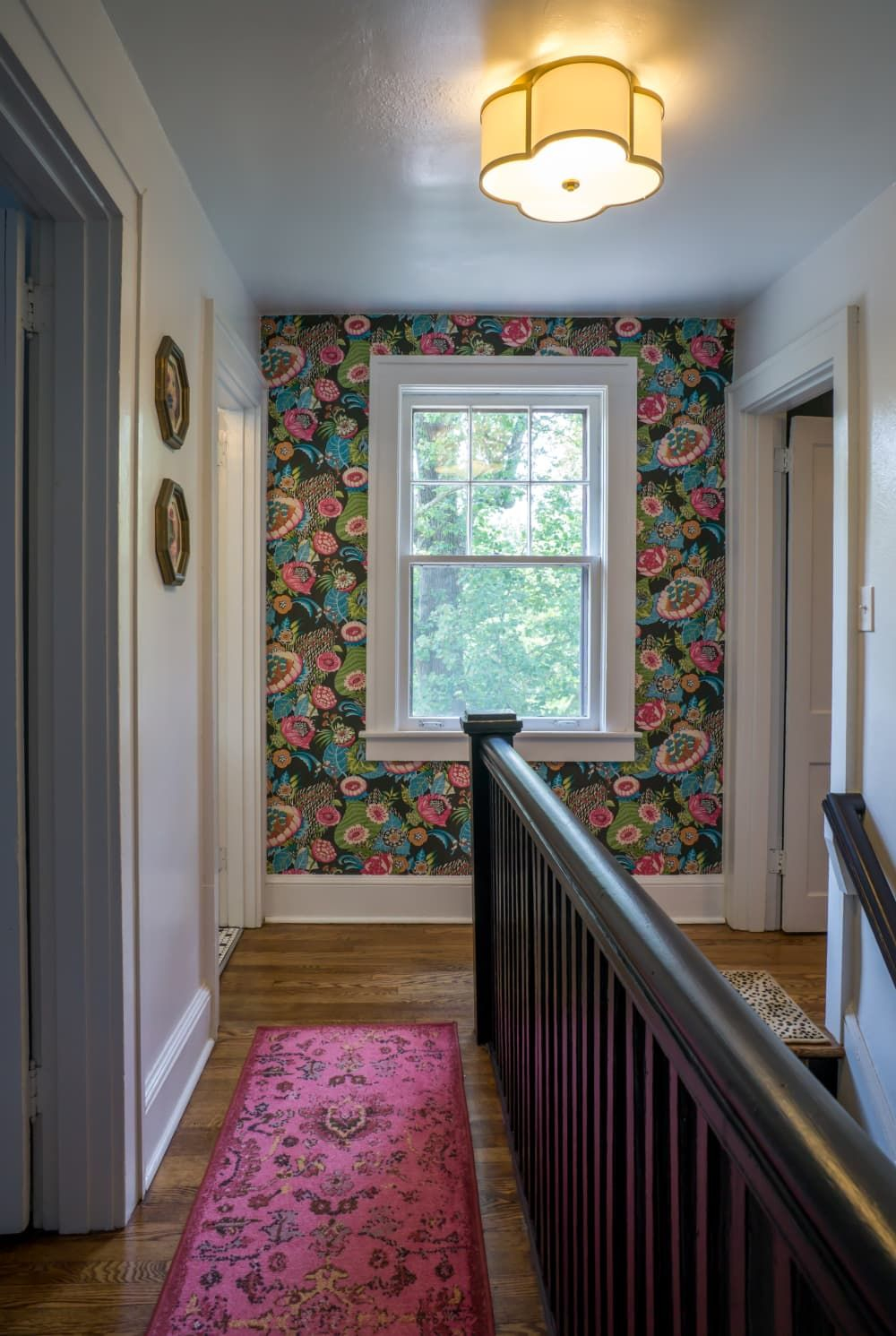
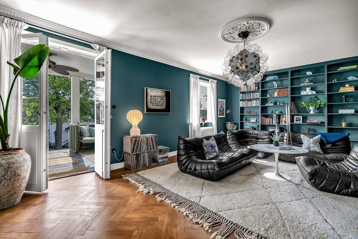
You don’t have to paint every wall a shocking pink! The trick to using vibrant colors successfully in a period home is often strategic placement. Think about accent walls – a bold teal in the dining room can instantly transform the space without overwhelming it. Or consider smaller, more contained areas: a vibrant red in a powder room, a sunny yellow in a breakfast nook, or even a deep sapphire blue on the inside of a built-in bookshelf. These pops of color draw the eye and create focal points, adding personality without detracting from the home’s original charm. Even painting a ceiling a subtle, unexpected color like a soft sky blue or a pale peach can add a delightful, uplifting touch that feels both classic and fresh.
Drawing Inspiration from Historical (and Modern) Palettes
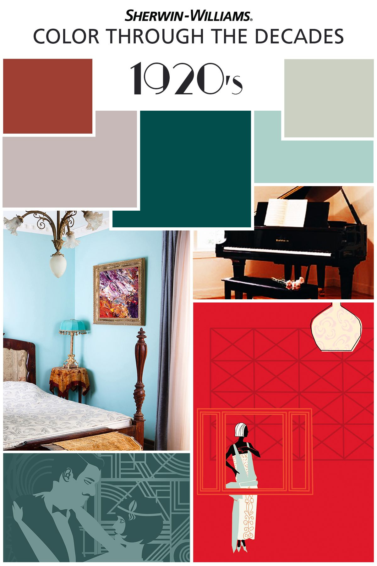
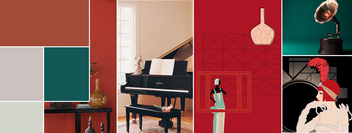
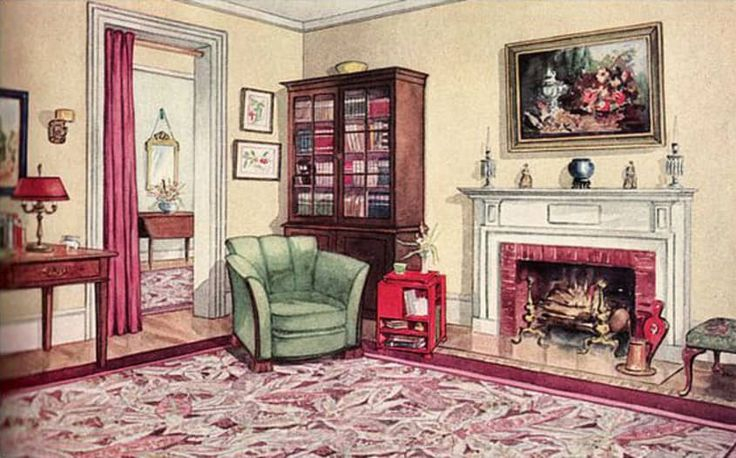
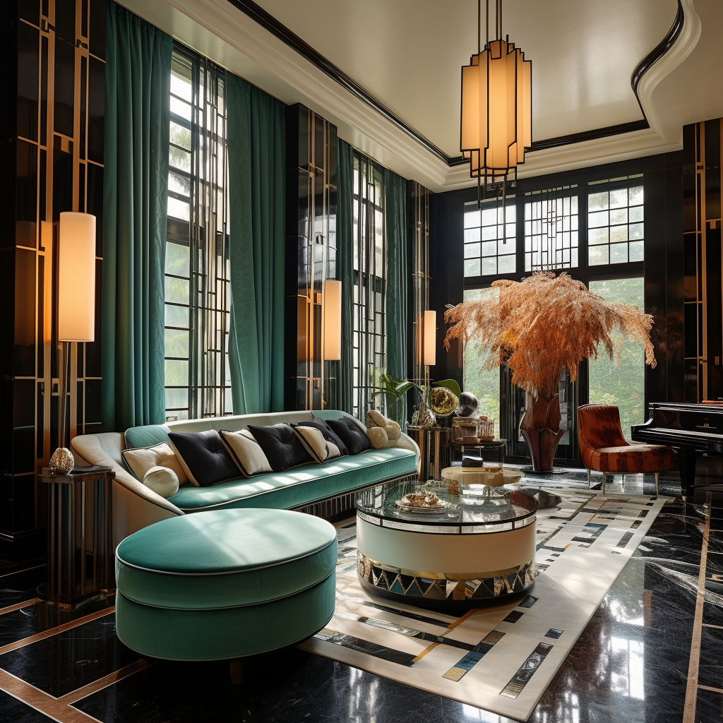
While the common perception of 1920s colors leans muted, the Art Deco movement, which gained traction throughout the decade, embraced bold, jewel-toned colors. Think about the rich blues, emerald greens, ruby reds, and even metallic gold and silver that defined that era’s glamour. You can draw on these historical precedents for your vibrant choices. Don’t be afraid to look at old posters, textile designs, or even vintage travel brochures from the period. For a more contemporary twist, consider color trends that pair well with vintage aesthetics, like mustard yellows, deep olives, or even a sophisticated coral. The goal isn’t to perfectly replicate a 1920s home, but to infuse its spirit with a modern, lively energy.
The Power of Texture and Finish: Beyond Just Color
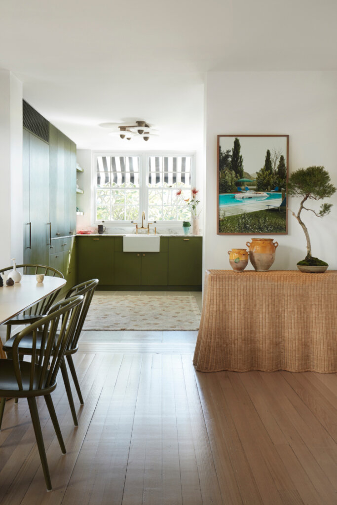
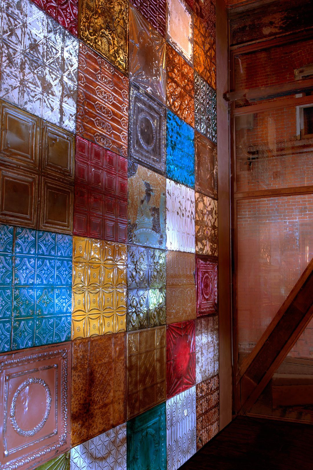
It’s not just the hue, but also how the paint interacts with light and other surfaces. A matte finish on a vibrant color can give a room a sophisticated, almost velvety feel, absorbing light and making the color feel deeper. A high-gloss finish, on the other hand, can reflect light and make a bold color feel even more dynamic and energetic. Think about using different sheens on trim versus walls, or even on different parts of the same wall. And don’t forget about textiles and furnishings! A neutral room with vibrant throw pillows, a colorful rug, or a statement piece of furniture in a bold hue can achieve a similar effect without committing to a full wall of color. These elements can be changed out more easily too, offering flexibility.
Balancing Act: Muting and Highlighting Period Details
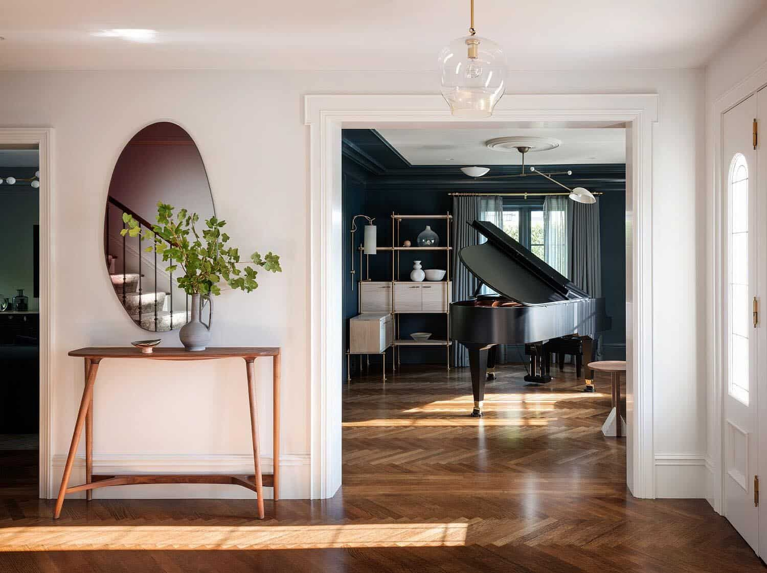
One of the most important aspects of renovating a 1920s home is respecting its original character. Vibrant colors can either enhance or detract from these details, depending on how you use them. If you have beautiful original wood trim, a contrasting vibrant wall color can make that trim really stand out. Imagine a creamy white trim against a rich, deep purple wall – the trim becomes a frame for the color, and the color highlights the craftsmanship of the trim. Conversely, if you have a less desirable feature, a bold color can sometimes distract the eye from it. It’s all about intentionality. Walk through your home, identify the features you love, and consider how color can help them shine.
Practical Considerations and Testing Colors
Before you commit to a gallon of ‘Electric Chartreuse,’ test, test, test! Paint swatches on your walls and observe them at different times of day, under various lighting conditions. Natural light changes throughout the day, and artificial lighting can drastically alter how a color appears. A color that looks amazing in the morning sun might feel too intense under evening lamplight. Also, consider the flow between rooms. Do you want a dramatic contrast, or a more gradual transition of colors? And remember, a little bold color can go a long way. Start small if you’re unsure – a single wall, a piece of furniture, or even just accessories. You can always build up from there. Don’t be afraid to play around; it’s your home, after all!
Renovating a 1920s home offers a unique chance to blend the charm of a bygone era with the vibrancy of contemporary design. By thoughtfully incorporating bold and lively colors, you’re not just updating a space; you’re infusing it with personality, energy, and a clear sense of style. Whether you opt for jewel tones reminiscent of Art Deco, or more modern, unexpected hues, the key is to approach it with intention and a willingness to experiment. The result will be a home that feels deeply rooted in its history, yet wonderfully alive and undeniably yours. So go on, grab that paint swatch, and let your 1920s home truly roar with color!
[sps_html tag=”img” src=”https://cdn.theartssection.com/wp-content/uploads/2025/07/color-through-the-decades-1920s-sherwin-williams-inside.jpg” alt=”Color Through The Decades: 1920S - Sherwin-Williams inside” style=”width: 100%; height: auto;”]
[sps_html tag=”img” src=”https://cdn.theartssection.com/wp-content/uploads/2025/07/step-into-the-jazz-age-with-a-stunning-1920s-inspired-living-room-get-within-breathing-life-into-a-1920s-home-with-bold-wall-colors.jpg” alt=”Step Into The Jazz Age With A Stunning 1920S Inspired Living Room - Get … within Breathing Life into a 1920s Home with Bold Wall Colors” style=”width: 100%; height: auto;”]
[sps_html tag=”img” src=”https://cdn.theartssection.com/wp-content/uploads/2025/07/1920-s-living-room-colors-baci-living-room-intended-for-breathing-life-into-a-1920s-home-with-bold-wall-colors.jpg” alt=”1920 S Living Room Colors | Baci Living Room intended for Breathing Life into a 1920s Home with Bold Wall Colors” style=”width: 100%; height: auto;”]
[sps_html tag=”img” src=”https://cdn.theartssection.com/wp-content/uploads/2025/07/bold-colors-in-a-1920s-villa-in-sweden-the-nordroom-with-regard-to-breathing-life-into-a-1920s-home-with-bold-wall-colors.jpg” alt=”Bold Colors In A 1920S Villa In Sweden - The Nordroom with regard to Breathing Life into a 1920s Home with Bold Wall Colors” style=”width: 100%; height: auto;”]
[sps_html tag=”img” src=”https://cdn.theartssection.com/wp-content/uploads/2025/07/1920s-colonial-revival-home-renovation-this-old-house-with-regard-to.jpg” alt=”1920S Colonial Revival Home Renovation - This Old House with regard to” style=”width: 100%; height: auto;”]