Every photograph carries more than just pixels and light. It holds the emotional weight of color temperature, the invisible force that can make viewers feel cozy, melancholy, energized, or nostalgic. Whether you’re shooting portraits, landscapes, or street scenes, understanding how to manipulate color temperature transforms your images from simple snapshots into emotionally resonant experiences.
Think about the last time you walked into a room and instantly felt different emotions based on the lighting. Maybe it was a warm, golden glow that made you feel comfortable, or perhaps a stark blue light that gave you a sense of coldness or detachment. That’s the power of color temperature in photography. It’s not just about technical accuracy—it’s about creating a feeling, telling a story, and connecting with your audience on a visceral level. We all know that great photos don’t just capture moments; they capture feelings. But how do you make sure those feelings come through clearly? The answer lies in mastering color temperature.
What Is Color Temperature?
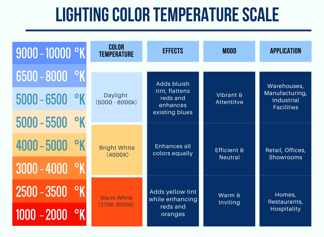
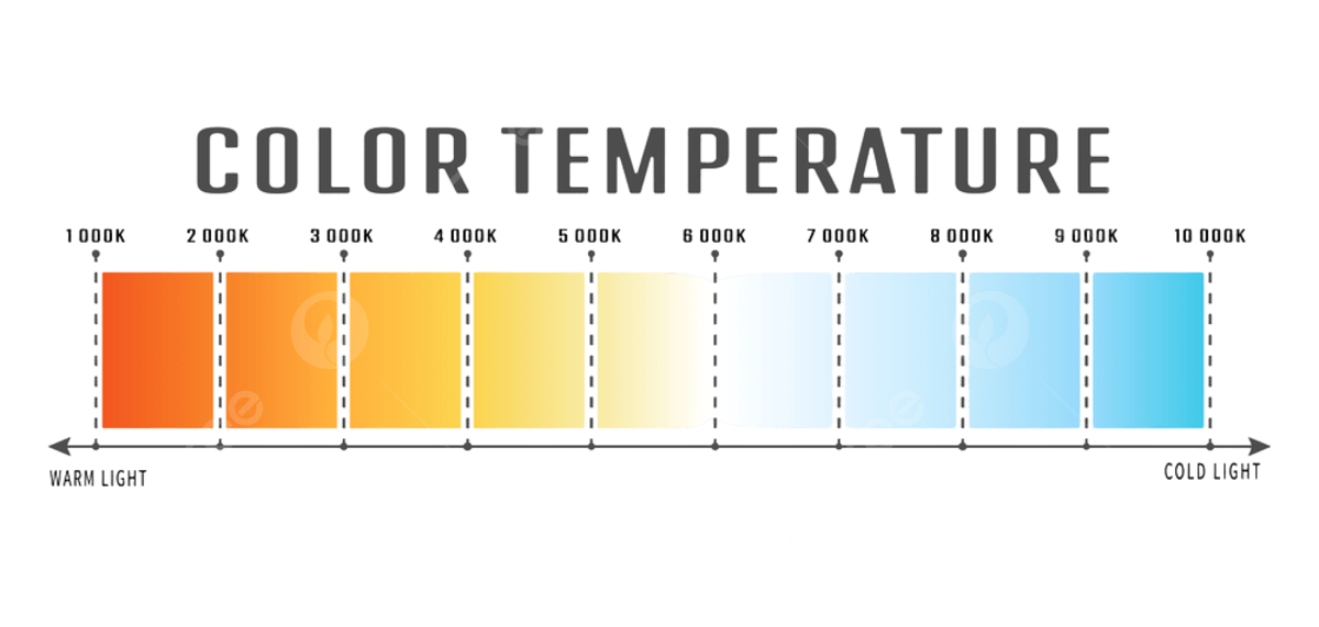
Color temperature measures the warmth or coolness of light, expressed in Kelvin (K). The lower the number, the warmer the light; the higher the number, the cooler. A typical incandescent bulb sits around 2500K, giving off a soft yellow glow that makes everything look cozy. Meanwhile, daylight at noon hovers around 5500K, appearing bright and crisp. But here’s something fascinating: we often don’t even realize we’re perceiving these differences until we see them side-by-side. For example, imagine two identical faces photographed under different light sources. One might appear cheerful and inviting, while another seems distant or serious. This is because the color temperature subtly shifts our perception of mood and emotion.
Warm Colors: Comfort, Nostalgia, and Intimacy
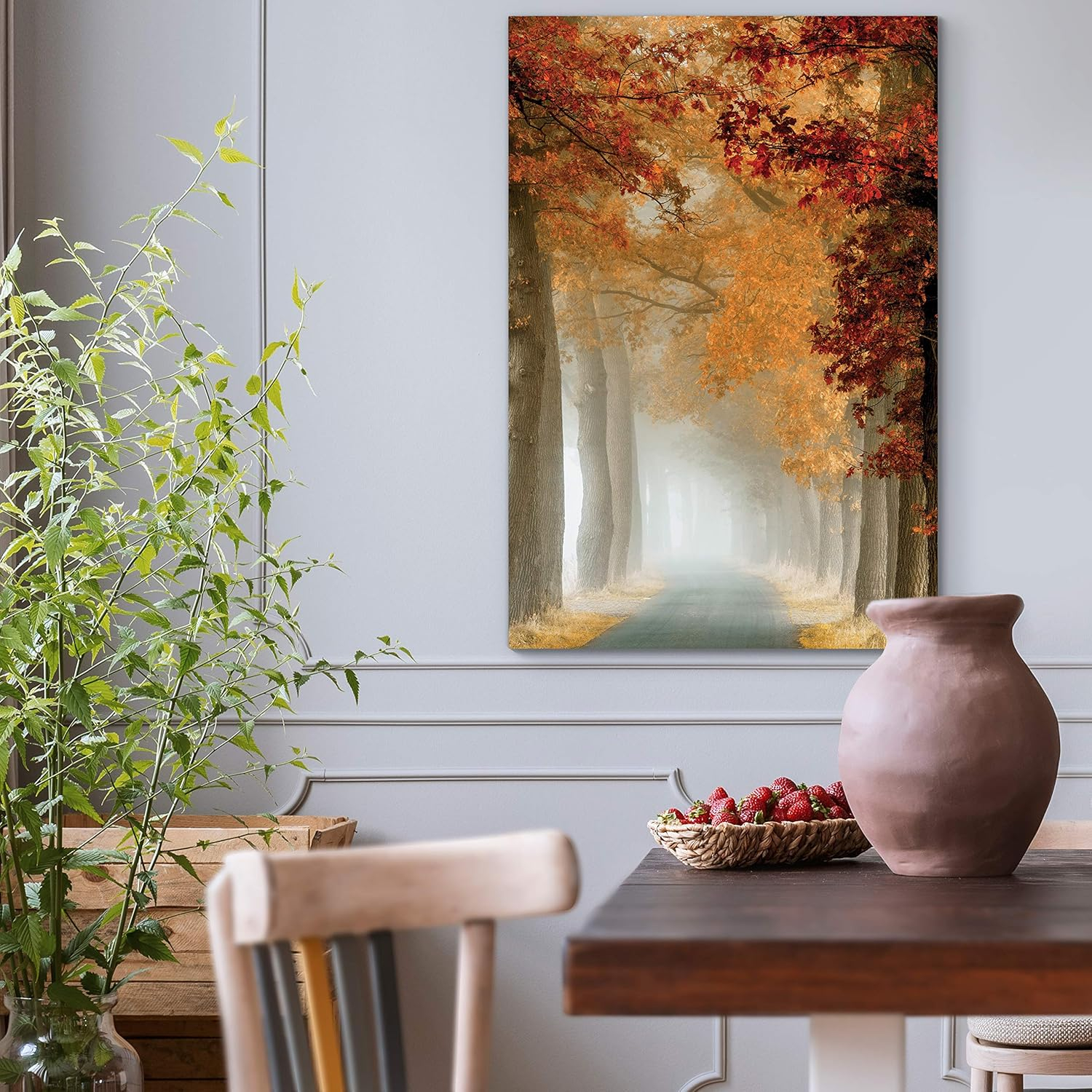
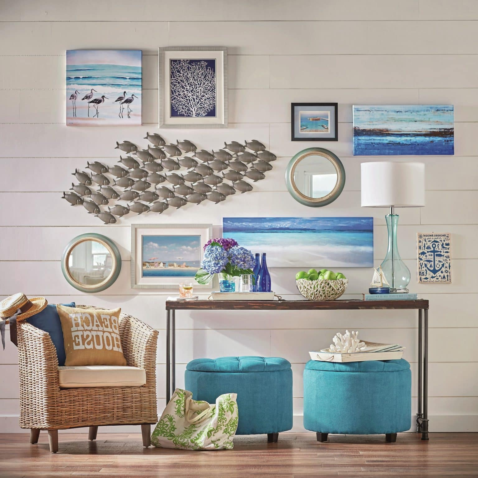
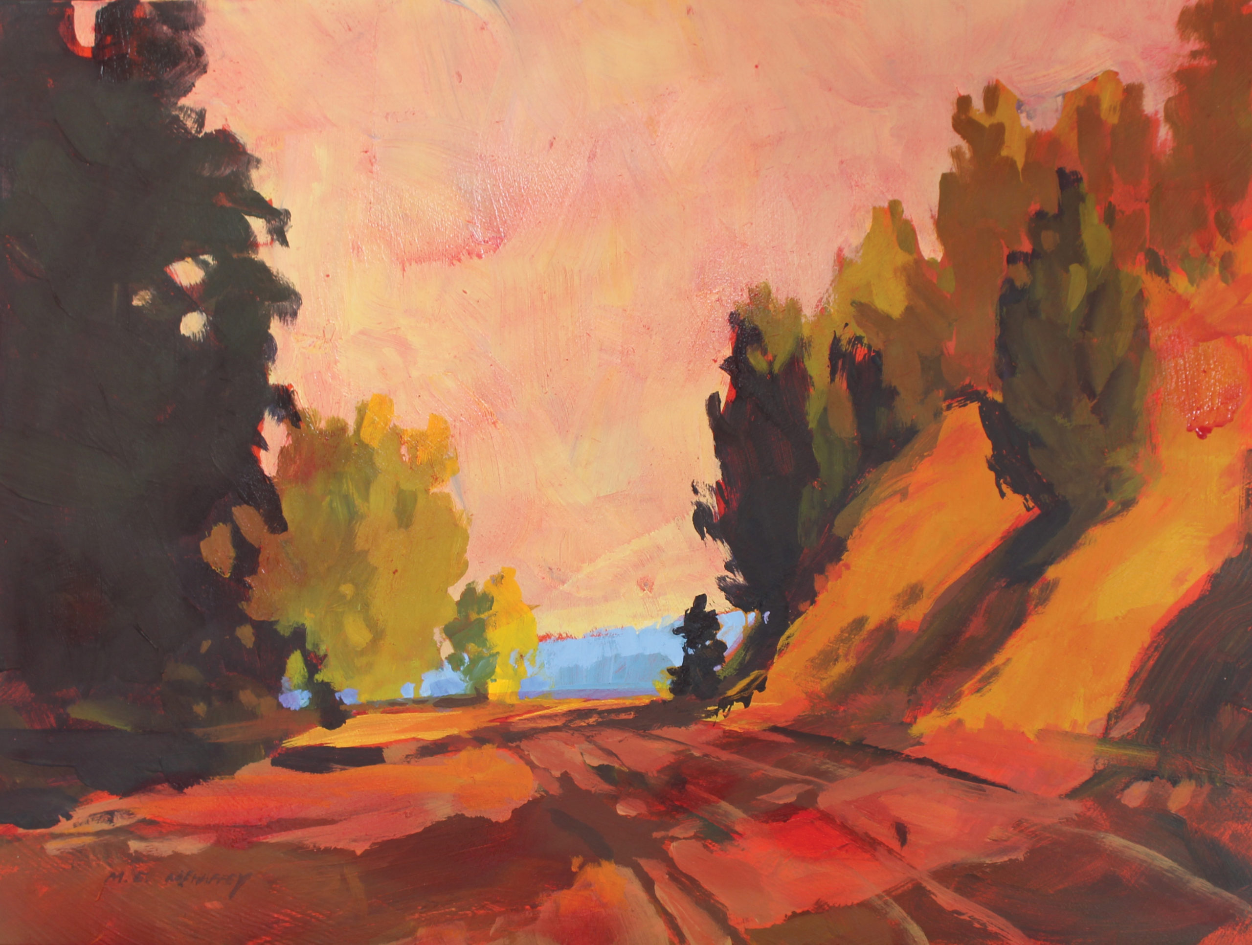
When you want to create a feeling of comfort, warmth, or nostalgia, you’re looking to use warm color temperatures. These typically fall between 2000K and 4000K and tend to make subjects appear more inviting and friendly. Think of how a sunset photograph feels different when shot during golden hour versus midday. The golden hour light adds a soft amber hue that instantly evokes feelings of home, romance, and contentment. Warmer tones also naturally draw attention to the subject, making them seem more present and engaged. Consider using warm lighting when photographing family gatherings, intimate conversations, or romantic moments. The colors themselves become storytellers, carrying emotional weight beyond what the subject alone could convey.
Cool Colors: Clarity, Distance, and Emotion
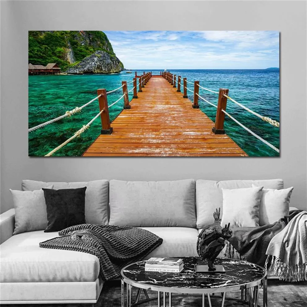
On the flip side, cool colors—those above 5000K—can create a sense of clarity, distance, or even isolation. Blue-tinted light often makes scenes feel more clinical or detached. But don’t mistake this for negative emotion. Cool tones can be incredibly effective for conveying calmness, serenity, or even mystery. A portrait taken under overcast skies might feel peaceful, while a landscape shot with cool lighting can appear dramatic or ethereal. In some cases, cool lighting works perfectly for creating contrast or highlighting certain elements within a frame. It’s a powerful tool for setting tone and guiding the viewer’s emotional journey through your image.
Mixing Temperatures for Complex Emotions
Sometimes the most interesting images happen when you blend both warm and cool tones. This approach allows for layered storytelling and emotional complexity. Imagine a wedding photo where the bride wears a dress that catches the warm glow of candlelight, but the background remains softly cool due to window light. The result? A beautiful tension between intimacy and openness. Or think of a scene where someone stands in front of a warm fireplace while being partially lit by cool blue evening sky. You’re not just showing a moment—you’re showing a conflict or harmony between different moods. Mixing temperatures creates depth, and that depth invites viewers to explore the image more deeply.
Practical Tips for Using Color Temperature
• Shoot during golden hour for naturally warm tones that enhance emotion
• Use white balance presets to quickly adjust the overall feel of your images
• Consider your subject matter—a warm palette works well for portraits, while cooler tones suit landscapes or architectural shots
• Experiment with mixed lighting to add dimensionality to your photos
• Edit carefully—don’t overdo it, but allow subtle shifts to guide the viewer’s eye
• Study real-world examples—look at how famous photographers like Annie Leibovitz or Ansel Adams used lighting to shape their narratives
The Psychology Behind Color Temperature
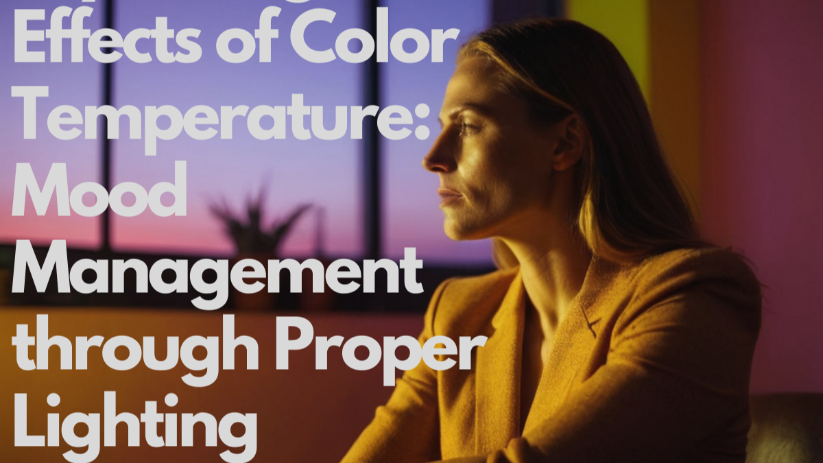
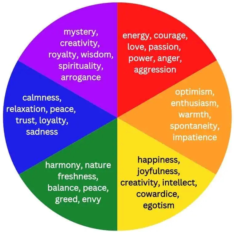
There’s science behind why color temperature affects us so deeply. Our brains have evolved to associate certain wavelengths with specific environments and emotions. Warm tones remind us of fire, sunlight, and comfort, triggering feelings of safety and warmth. Cool tones remind us of ice, water, and open skies, often associated with calmness or even sadness. When we see a photo with warm tones, we unconsciously respond with positive emotions. When we see cooler tones, we may feel more reflective or distant. Understanding this connection helps photographers make intentional choices that align with their artistic vision and the message they want to communicate.
Color temperature isn’t just a technical detail—it’s a creative tool that shapes how viewers experience your photographs. Whether you’re aiming to make someone feel cozy, distant, nostalgic, or energized, mastering the art of warm and cool lighting gives you control over the emotional narrative of your work. It’s not enough to simply take a picture; you must craft it with intention. So next time you pick up your camera, consider not just what you’re capturing, but how the light itself will help tell your story. Because in the end, great photography isn’t just about what’s in the frame—it’s about how you make people feel when they look at it.
[sps_html tag=”img” src=”https://cdn.theartssection.com/wp-content/uploads/2025/12/what-is-color-temperature-outdoorpainter-with-yellow-sunlight-and-fiery-clouds-landscape-photo-wall-art-4-panels.jpg” alt=”What Is Color Temperature? - Outdoorpainter with "Yellow Sunlight And Fiery Clouds" Landscape Photo Wall Art, 4 Panels” style=”width: 100%; height: auto;”]
[sps_html tag=”img” src=”https://cdn.theartssection.com/wp-content/uploads/2025/12/the-psychological-effects-of-color-temperature-mood-management-through-for-yellow-sunlight-and-fiery-clouds-landscape-photo-wall-art-4-panels.png” alt=”The Psychological Effects Of Color Temperature: Mood Management Through … for "Yellow Sunlight And Fiery Clouds" Landscape Photo Wall Art, 4 Panels” style=”width: 100%; height: auto;”]
[sps_html tag=”img” src=”https://cdn.theartssection.com/wp-content/uploads/2025/12/color-temperature-of-the-light-cold-compare-energy-png-and-vector-in-exploring-the-relationship-between-color-temperature-and-mood-in-landscape-art.png” alt=”Color Temperature Of The Light, Cold, Compare, Energy Png And Vector … in Exploring the Relationship Between Color Temperature and Mood in Landscape Art” style=”width: 100%; height: auto;”]
[sps_html tag=”img” src=”https://cdn.theartssection.com/wp-content/uploads/2025/12/color-emotions-and-how-they-influence-your-mood-intended-for-yellow-sunlight-and-fiery-clouds-landscape-photo-wall-art-4-panels.jpg” alt=”Color Emotions And How They Influence Your Mood intended for "Yellow Sunlight And Fiery Clouds" Landscape Photo Wall Art, 4 Panels” style=”width: 100%; height: auto;”]
[sps_html tag=”img” src=”https://cdn.theartssection.com/wp-content/uploads/2025/12/color-temperature-origin-meaning-importance-inside-exploring-the-relationship-between-color-temperature-and-mood-in-landscape-art.jpg” alt=”Color Temperature: Origin, Meaning & Importance inside Exploring the Relationship Between Color Temperature and Mood in Landscape Art” style=”width: 100%; height: auto;”]