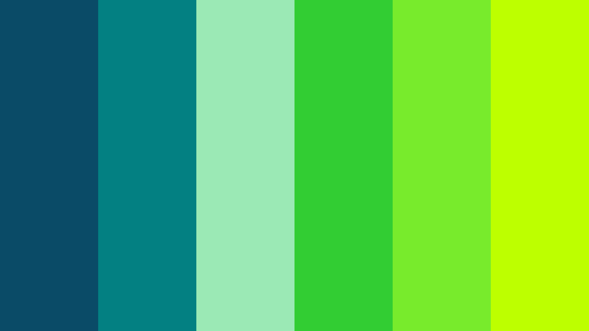
Remember that old rule our grandmothers used to repeat? The one that said "blue and green should never be seen." Well, it turns out that old design myth is totally dead. In fact, if you look at the most exciting digital design trends and interior spaces this year, these two colors are actually leading a massive style revolution.
It is all about contrast and balance. When you mix the deep, quiet vibe of a cool blue with the bright, almost blinding energy of an electric green, something magical happens. They do not fight for attention; instead, they make each other pop in ways that feel completely fresh and modern.
The Science of the Cool Spectrum
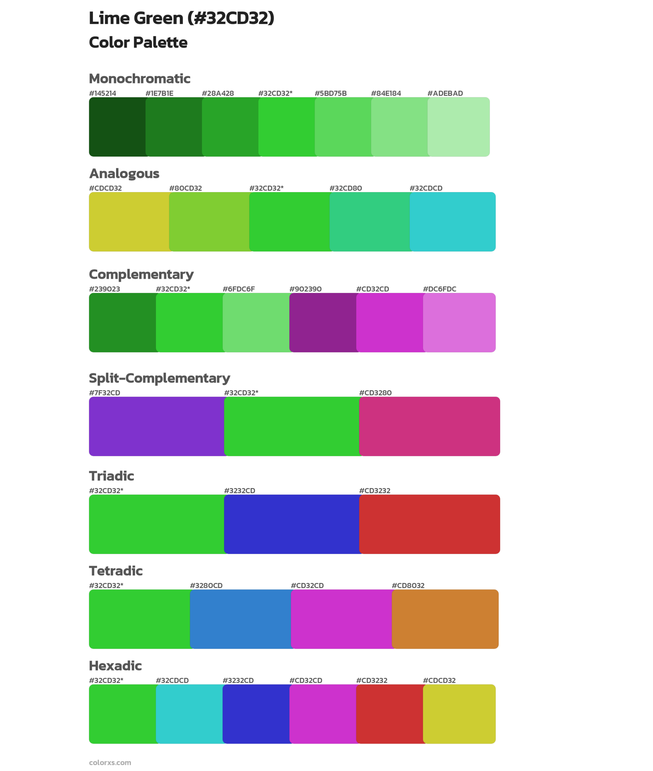
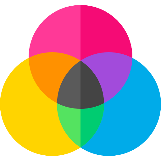
Why do these colors actually feel so good to look at. To understand it, we have to look at basic color theory. Both blue and green sit right next to each other on the color wheel, making them analogous shades. This means they share a lot of the same DNA, which is why your eyes find the combination naturally pleasing rather than chaotic.
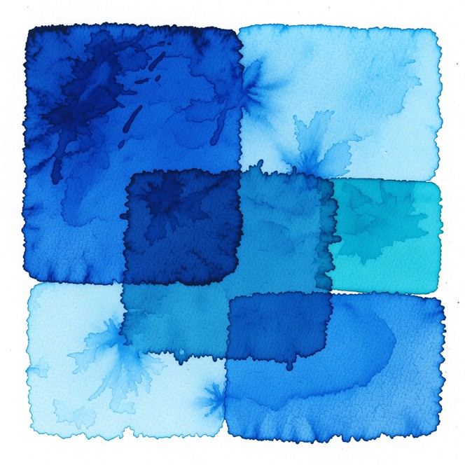
But the real magic happens when you mess around with the brightness. Cool blues bring a sense of stability, trust, and calm—think of a deep ocean or a clear winter sky. When you inject a shot of electric green into that mix, you are adding an unexpected spark of life that breaks up the quietness. It is like putting a neon sign in the middle of a foggy forest.
Breaking the Old Rules of Decor
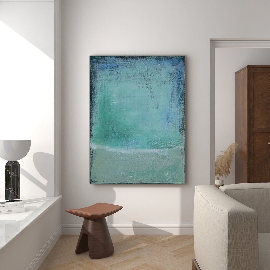
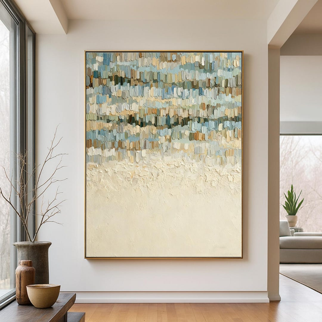
For a long time, interior designers stuck to very safe combinations. People would mix blue with white, or green with soft wood tones. But lately, homeowners are craving a lot more personality in their living spaces. They want rooms that tell a story and feel alive rather than just looking like a boring hotel lobby.
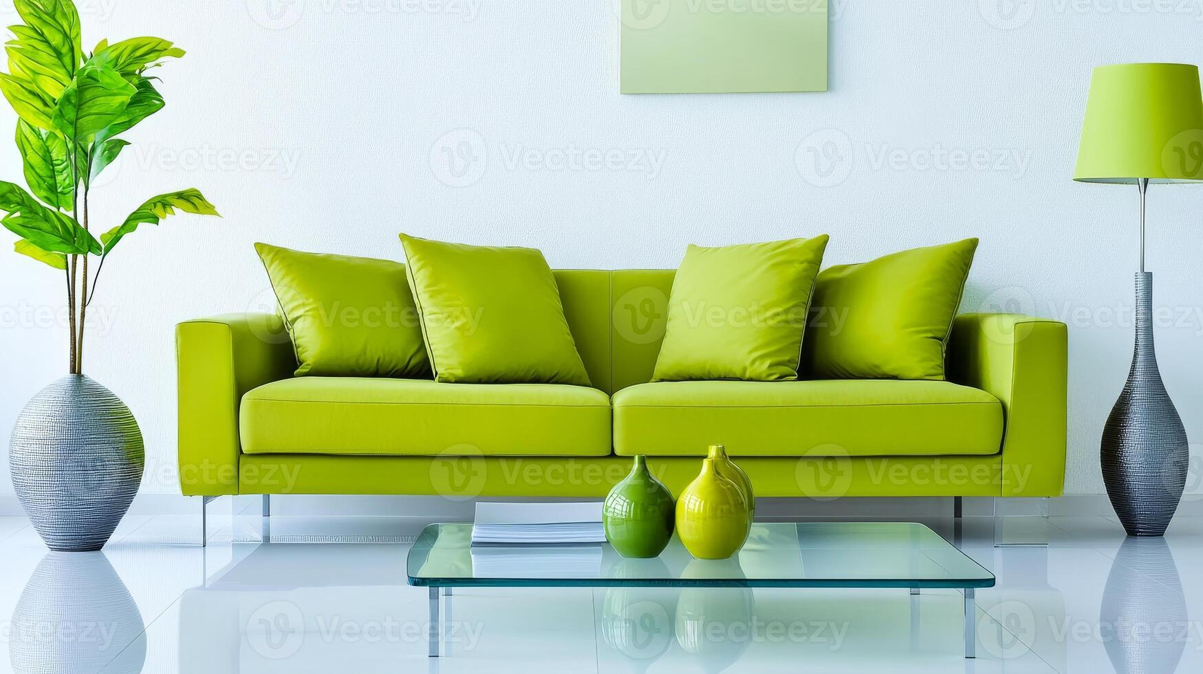
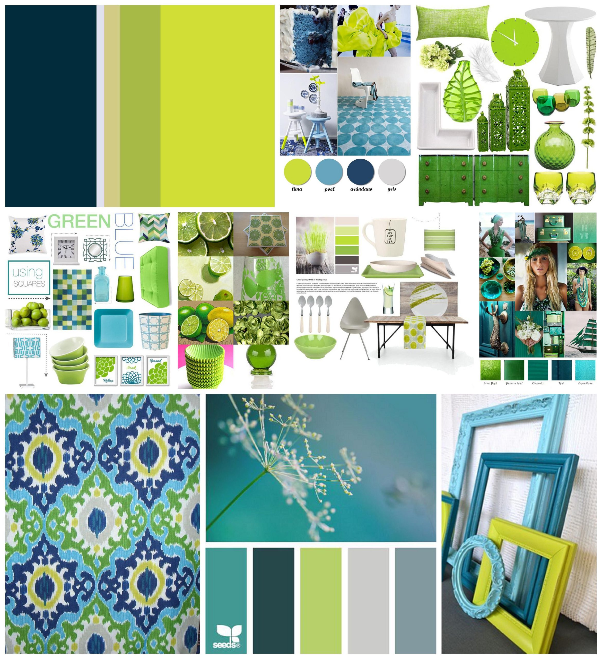
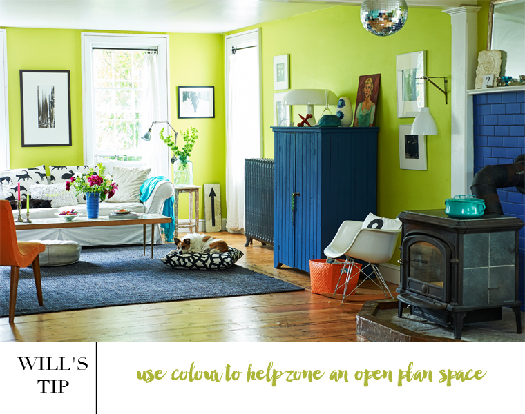
Using these two colors together lets you strike a perfect balance between peace and punchy energy. Imagine a room with dark navy walls, and suddenly there is a bright lime velvet chair or an electric green lamp sitting in the corner. The blue keeps the room grounded so it does not feel overwhelming, while the green adds a fun, rebellious streak.
Digital Branding and the Neon Wave
If you look at your phone screen right now, you will probably notice this trend everywhere. Tech companies, fintech apps, and wellness platforms are obsessed with this palette. Why? Because cool blues give off massive trust signals, making you feel secure about using their service, while the electric green feels fast, high-tech, and forward-thinking.
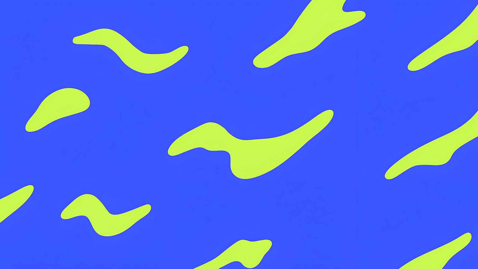
It is an incredibly smart way to stand out in a crowded digital marketplace. In web design, using an electric green button against a deep slate-blue background creates the perfect visual anchor. It guides the user’s eye instantly without needing to use aggressive colors like red or orange, which can sometimes make people feel anxious.
Sourcing Inspiration Straight from Nature
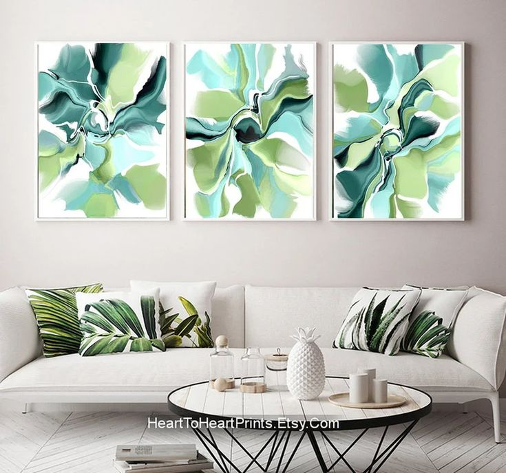
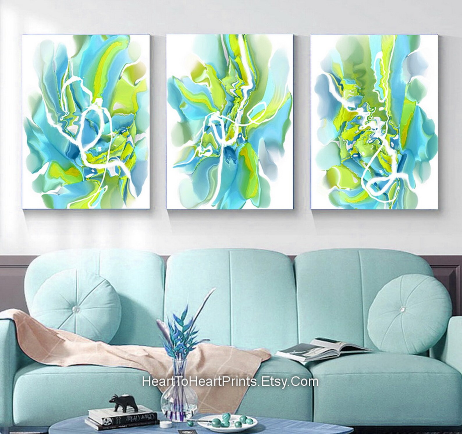
Whenever you feel stuck trying to make these shades work, the best trick is to just step outside. Color experts love to point out that nature always creates the most wicked combinations, even the ones we think might clash. Think about a bright green tropical leaf silhouetted against a deep blue ocean, or the way a brilliant aurora borealis cuts through a dark, icy night sky.
- Oceanic Depths: Pairing deep teal or midnight blue with seafoam and neon lime accents.
- Cyber Punk Nature: Mixing frosty sky blue with a super-charged caterpillar green.
- The Northern Lights Look: Blending rich royal blues with glowing, radioactive-looking greens.
By copying these natural contrasts, your designs will instantly feel more authentic and less forced.
Practical Tips for Your Next Project
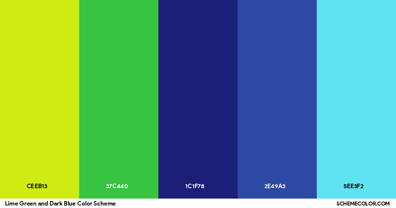
Ready to try this palette out for yourself. If you are painting a room or designing a graphic, the secret is all about ratios. You don’t want to use both colors in equal amounts, or they will start fighting each other for dominance. Instead, pick one color to do the heavy lifting and use the other as a surprise element.
Try letting a cool, muted blue take up about 70% of the space to establish a calm mood. Then, use your electric green for the remaining 30% to highlight the most important details. This keeps the overall look feeling clean, deliberate, and easy on the eyes.
As we move through 2026, it is clear that our obsession with vibrant, energetic color schemes isn’t going anywhere. We live in a world that shifts constantly between quiet digital spaces and loud, busy realities. This specific color duo mirrors exactly what we are looking for right now: a way to feel grounded without losing our spark.
By pairing the trustworthy, soothing nature of blue with the hyper-vibrant kick of electric green, creators are building a new visual language. It proves that you can have a space or a brand that feels incredibly peaceful while still being completely thrilling to look at. Don’t be afraid to experiment with these tones and see how they can transform your own creative projects.