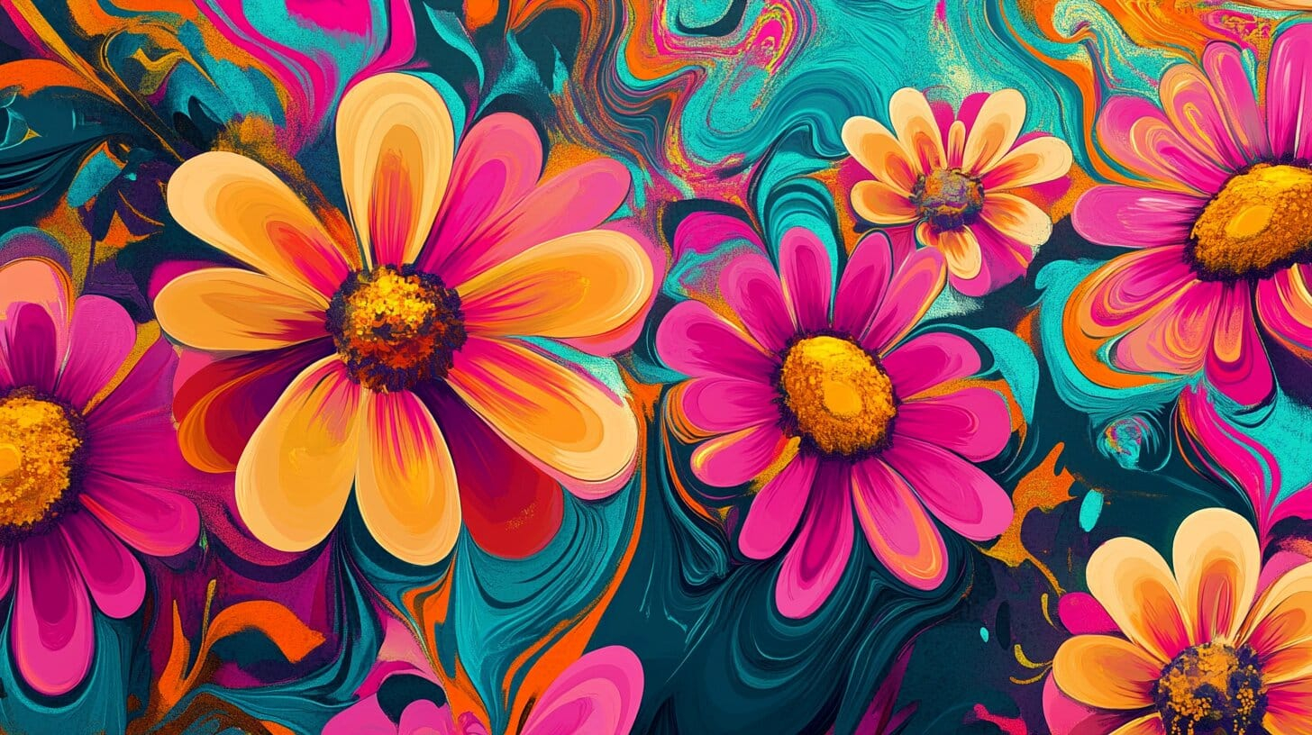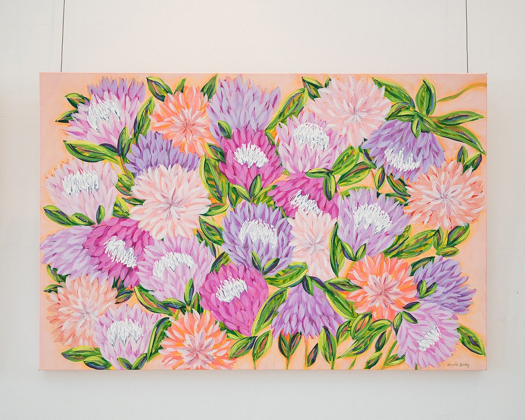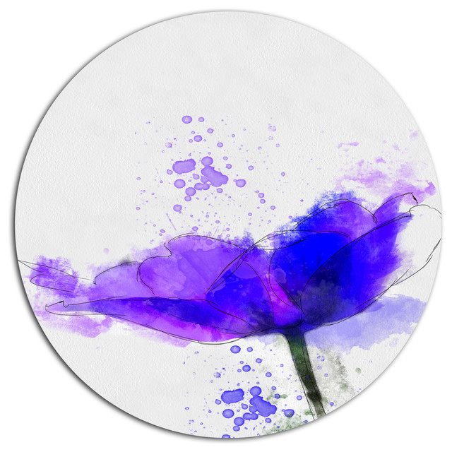

You know that feeling when you walk into a room and your shoulders just drop. Like, instantly. It isn’t always about fancy furniture or expensive rugs. Sometimes it is just a splash of wet pigment on a stark, clean background catching the morning light. We are talking about bright, messy, beautiful watercolor roses painted on pure white. It sounds simple. Maybe even a bit old fashioned. But there is a reason people keep hanging these up year after year.
Think about your own walls for a second. A lot of us stick to safe neutrals or maybe some moody dark tones we saw on a design show. But then you see a canvas where a bright pink or deep crimson bloom just explodes against a totally blank white space. It grabs you. It feels alive. In 2026, we are seeing a massive shift back to these organic, hand-made looks. People want their houses to feel like actual homes, not just showrooms. And nothing says home quite like a slightly imperfect flower painted with real water and real emotion.
Why the Blank Canvas Matters So Much
Let’s talk about the white part first. You might wonder why not paint the background blue or yellow. Well, leaving the paper or wall totally bare gives the eye a place to rest. It is kind of like taking a deep breath between songs on a good album. When you put loud, saturated pinks and reds right next to nothingness, the colors pop way harder. They definately look brighter than they would on a busy patterned wallpaper.
Plus, modern houses today have a lot of clean lines. Sharp edges, flat surfaces, minimalist vibes. A soft, bleeding watercolor edge breaks up all that rigid geometry. It softens the room without making it feel cluttered. You get the best of both worlds. The crispness of modern design and the messy warmth of a garden.
Dragging the Garden Inside Your House
There is a website I read recently, Casolia I think, that mentioned how painting roses is just a nice way to drag nature indoors. And they are totally right. We spend so much time staring at screens. Our phones, our laptops, the TV. Having something that mimics a living plant helps ground us. It reminds us that things grow and change and eventually fade.
Watercolor is the perfect medium for this because it is literally mostly water. It flows. It dries with those cool little hard edges where the pigment settles. It looks like a real petal that might bruise if you touch it too hard. When you hang a piece like this in your kitchen or living area, it tricks your brain into feeling like a window is open somewhere, even if it is freezing outside.
Finding Pieces That Actually Speak to You
Now, getting your hands on the right art can be a bit of a hunt. You could just buy a mass produced print from a big box store. But honestly, those usually feel a bit flat. A lot of folks are heading to places like Etsy to find actual humans making stuff. You can find small batches or even commission someone to paint a specific color to match your favorite throw pillow.
It is worth taking your time here. Look at the way the artist handles the shadows. Do the leaves look like plastic, or do they have that murky, beautiful greenish-brown tint that real leaves get when they are sitting in water. Those little details are what seperate a cheap poster from a piece of art you will actually want to look at every single day.
Where to Hang Them for Maximum Impact
Placement is everything. You don’t just slap it anywhere and call it a day. Think about the hallway. Hallways are usually boring, right. Just doors and baseboards. Putting a large, vibrant rose piece at the end of a long corridor draws the eye foward and makes the whole house feel bigger. It gives you a nice little destination when you are walking from the bedroom to the kitchen.
Bedrooms are another great spot. But keep it away from direct, harsh sunlight if you can. Real watercolor on paper will fade over the years if it gets baked by the afternoon sun. Hang it on a wall that gets soft, indirect morning light. It makes waking up feel a lot gentler.
Mixing It Up With Frames and Textures
The frame you pick changes the whole mood. A thick, ornate gold frame makes it feel very traditional, almost like something you would see in a museum. But if you want that contemporary 2026 vibe, try a very thin, matte black metal frame. Or even just float-mount the paper so you can see the raw, torn edges of the watercolor block.
I once saw a really cool setup where someone hung a delicate floral wash right next to a rough, woven macrame wall hanging. The contrast was wild. The soft, wet look of the paint against the dry, scratchy rope. It just worked. Don’t be afraid to mix your textures. Your house should feel collected over time, not bought all at once from a catalog.
Something interesting has occured lately in the design world. With all the computer-generated art floating around, people are craving the mistakes. They want to see the brush hairs stuck in the paint. They want to see the water rings where the artist set down their cup.
This is why original paintings are getting so popular again. Even if it costs a bit more, owning a physical object that another person spent hours hunched over a table creating means something. It brings a quiet kind of energy into your space. You aren’t just decorating. You are supporting a craft. And that feels pretty good when you are sitting on your couch drinking your morning coffee.
At the end of the day, decorating your space is really just about building a backdrop for your life. The colorful blooms on a stark white background give you a daily dose of joy without screaming for attention. They sit there quietly, looking pretty, reminding you to slow down and appreciate the little things.
So if you have been staring at a blank wall wondering what to do with it, maybe skip the abstract geometric shapes for once. Look for something with a bit of soul. A messy, bright, watery flower that makes you smile when you walk past it. That is really all a house needs to finally feel like home.
[sps_html tag=”img” src=”https://cdn.theartssection.com/2026/07/gallery-floral-hues-for-the-unexpected-beauty-of-pairing-bright-floral-hues-with-crisp-white-metal-discs.jpg” alt=”Gallery - Floral Hues for The Unexpected Beauty of Pairing Bright Floral Hues With Crisp White Metal Discs” style=”width: 100%; height: auto;”]
[sps_html tag=”img” src=”https://cdn.theartssection.com/2026/07/vibrant-floral-ikat-pattern-on-crisp-white-background-design-stock-intended-for-the-unexpected-beauty-of-pairing-bright-floral-hues-with-crisp-white-metal-discs.jpg” alt=”Vibrant Floral Ikat Pattern On Crisp White Background Design Stock … intended for The Unexpected Beauty of Pairing Bright Floral Hues With Crisp White Metal Discs” style=”width: 100%; height: auto;”]
[sps_html tag=”img” src=”https://cdn.theartssection.com/2026/07/these-unexpected-interior-colour-pairings-are-trending-for-2024-good-with-the-unexpected-beauty-of-pairing-bright-floral-hues-with-crisp-white-metal-discs.webp” alt=”These Unexpected Interior Colour Pairings Are Trending For 2024 | Good … with The Unexpected Beauty of Pairing Bright Floral Hues With Crisp White Metal Discs” style=”width: 100%; height: auto;”]
[sps_html tag=”img” src=”https://cdn.theartssection.com/2026/07/unexpected-pairing-of-colors-but-it-works-wonderfully-floral-wreath-in-colorful-watercolor-roses-on-white-floral-disc-metal-artwork-11.jpg” alt=”Unexpected Pairing Of Colors, But It Works Wonderfully! | Floral Wreath … in Colorful Watercolor Roses On White, Floral Disc Metal Artwork, 11"” style=”width: 100%; height: auto;”]
[sps_html tag=”img” src=”https://cdn.theartssection.com/2026/07/which-is-prettier-the-orange-hues-or-the-crisp-white-you-be-the-judge-for-colorful-watercolor-roses-on-white-floral-disc-metal-artwork-11.jpg” alt=”Which Is Prettier The Orange Hues Or The Crisp White? You Be The Judge … for Colorful Watercolor Roses On White, Floral Disc Metal Artwork, 11"” style=”width: 100%; height: auto;”]