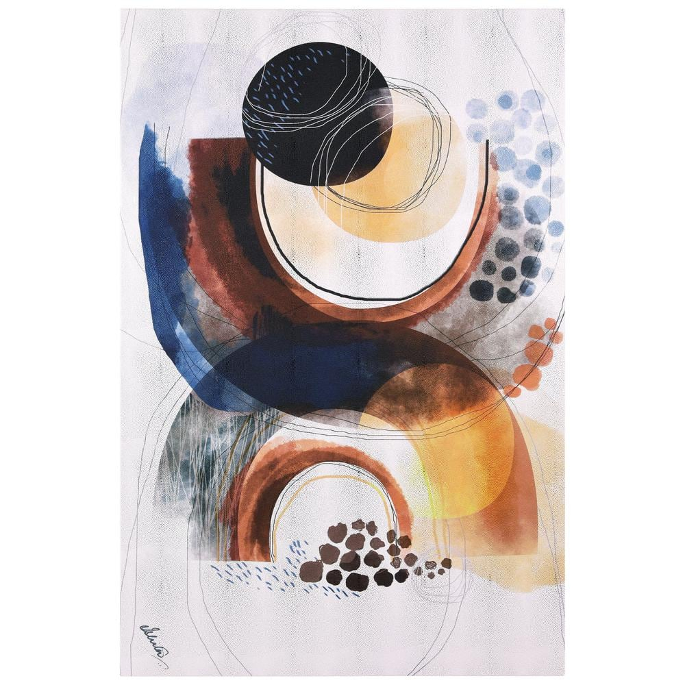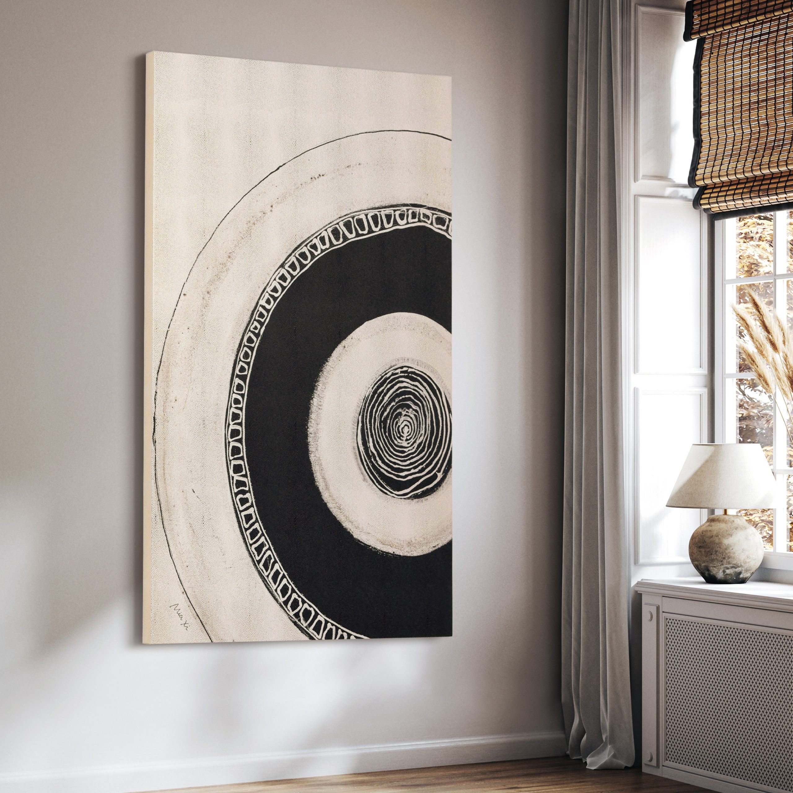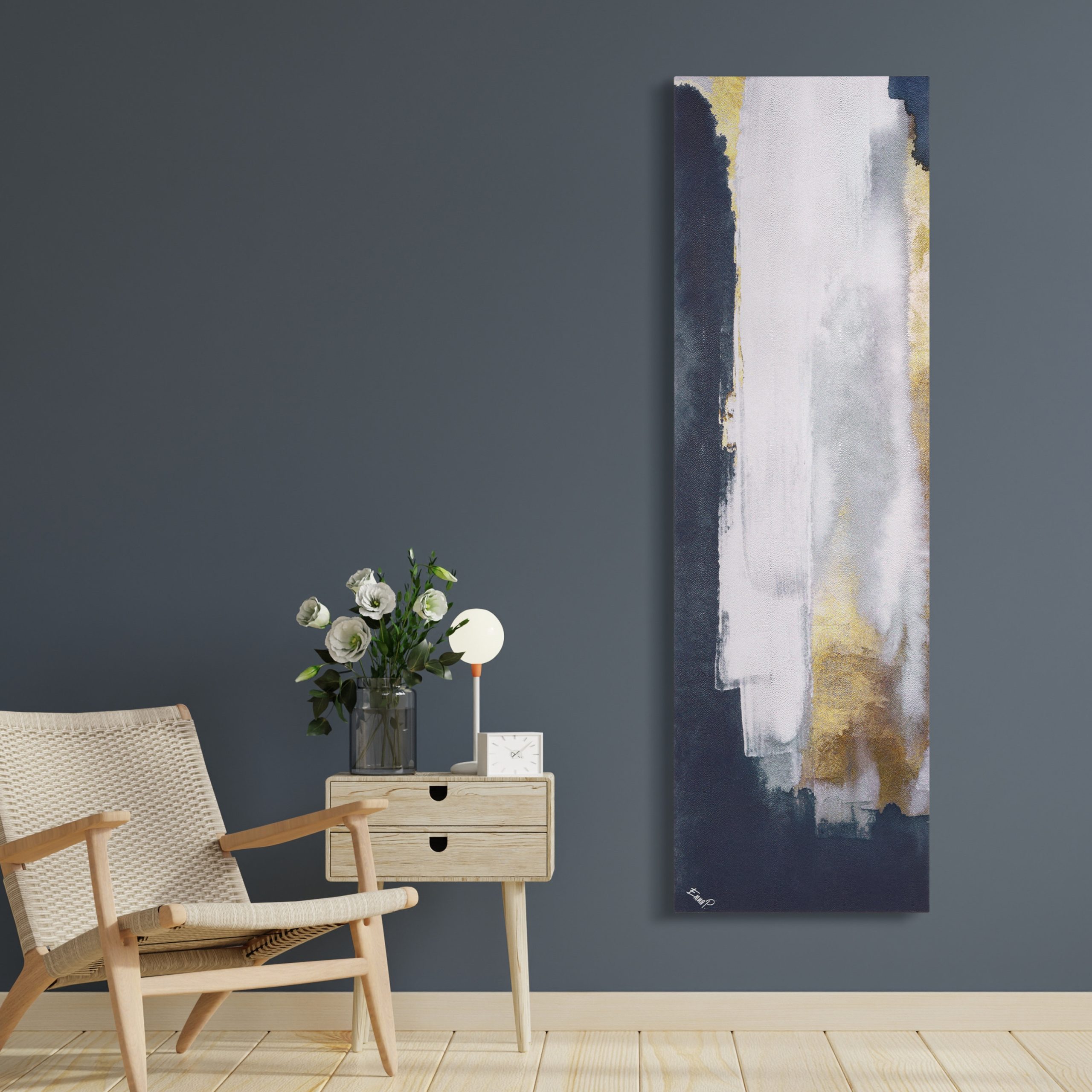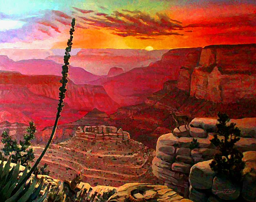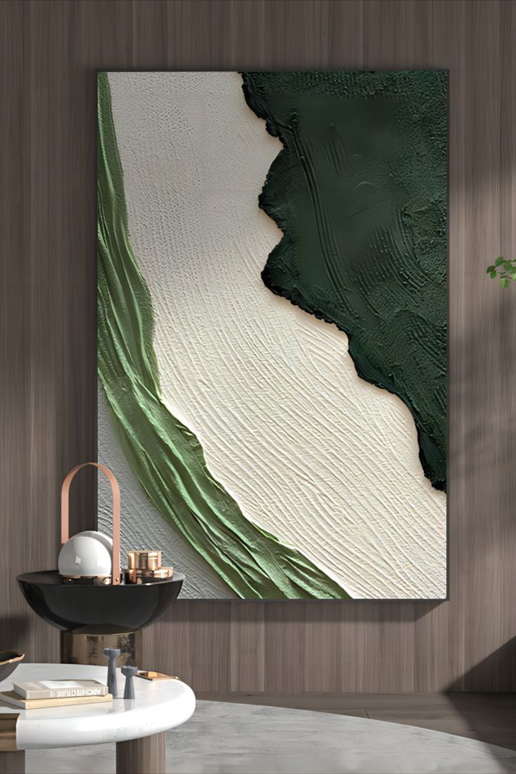
Abstract art isn’t just about random splashes of paint or geometric shapes. It’s a sophisticated conversation between color, form, and space that can move us deeply. When we look at bold abstraction pieces hanging on walls, we’re experiencing something far more complex than simple decoration. These works speak through their visual vocabulary – the way colors interact, how shapes balance each other, and the energy that flows through the entire composition.
Imagine walking into a room where abstract paintings dominate the walls. The first thing that strikes you might be the vibrant hues that seem to pulse with life. But beyond the immediate visual impact lies a carefully constructed dialogue between color theory and composition. This isn’t just about pretty pictures – it’s about understanding how artists use fundamental principles to create emotional resonance and visual harmony. Whether you’re a collector, an artist, or simply someone who appreciates great art, grasping these concepts helps unlock the full experience of abstract wall art. What makes one piece truly captivating while another feels flat? The answer often lies in how color and composition work together to tell a story.
The Foundation of Visual Impact
Every great abstract artwork starts with a solid understanding of basic color relationships. Think of color theory not as a rigid set of rules, but as a toolkit for communication. Primary colors – red, blue, yellow – form the foundation. When artists mix these, they create secondary colors like green, orange, and purple. But it’s not just about mixing paint. It’s about how colors make us feel. Red can feel energetic and passionate, while blue often brings calmness and depth. In bold abstraction, artists frequently use contrasting colors to create drama. A bright yellow next to deep purple creates tension that draws the eye across the canvas. The most compelling abstract pieces often play with these relationships in unexpected ways. Sometimes they use analogous colors – those that sit next to each other on the color wheel – to create unity and flow. Other times they might use complementary colors – those directly opposite each other – to create dynamic contrast. The interplay between these choices determines whether a piece feels balanced or chaotic, harmonious or jarring.
Composition as Visual Architecture
Composition in abstract art is like building a house – every element must serve a purpose and contribute to the overall structure. Artists use various techniques to guide our eyes around the canvas. One fundamental principle is the rule of thirds. Imagine dividing your artwork into nine equal sections using two horizontal and two vertical lines. Placing key elements along these lines or at their intersections creates visual interest. But abstract art isn’t limited to mathematical precision. Sometimes artists use negative space strategically. That empty area around a large red shape might be just as important as the shape itself. It breathes and gives the eye somewhere to rest. The size relationship between different elements also matters enormously. A small triangle might be more visually dominant than a large rectangle if it’s positioned correctly. Artists often experiment with asymmetry, which can feel more modern and exciting than perfectly balanced compositions. The key is understanding that composition isn’t about making everything look neat – it’s about creating visual rhythm that keeps viewers engaged.
Emotional Resonance Through Color Choices
What happens when you look at a painting filled with deep blues and muted greens? You might feel calm, perhaps even nostalgic. But what if those same colors appear in a different context – perhaps with sharp, angular shapes and sudden bursts of bright orange? Suddenly, the mood shifts entirely. This is the power of color psychology in abstract art. Colors carry emotional weight that transcends cultural boundaries. Warm colors like reds and oranges tend to feel energizing and forward-moving. They’re like the heartbeat of a piece. Cool colors such as blues and purples often create a sense of distance and tranquility. They pull the viewer backward, inviting contemplation. Artists working in bold abstraction frequently manipulate these associations to create specific emotional responses. A single color can be interpreted differently depending on its context within the whole composition. For instance, a bright red circle might seem cheerful against a black background, but completely menacing against a white one. Understanding these subtle shifts helps explain why some abstract pieces feel uplifting while others seem melancholic or intense.
Balance and Rhythm in Abstract Space
Great abstract compositions often have a natural rhythm that guides the viewer’s eye. This rhythm comes from repetition, variation, and the careful arrangement of visual elements. Think about how a song builds and releases tension – abstract art does something similar. Artists might repeat certain shapes or colors to create a sense of unity, but vary them slightly to prevent monotony. Consider the difference between a series of identical circles and a series of circles that gradually change in size or color. The latter creates a visual rhythm that moves the eye naturally through the piece. Balance in abstract art doesn’t always mean symmetrical arrangements. Sometimes it’s about achieving visual equilibrium through contrasting elements. A large dark shape might be balanced by several smaller light forms scattered throughout the canvas. The artist’s choice of placement becomes crucial. Where do they put the focal point? How much space do they give to each element? These decisions shape the viewer’s journey through the artwork. Some artists even use the concept of ‘visual weight’ – heavier-looking elements require more space to balance them properly. The result is a composition that feels both dynamic and stable.
Texture and Dimensionality in Flat Surfaces
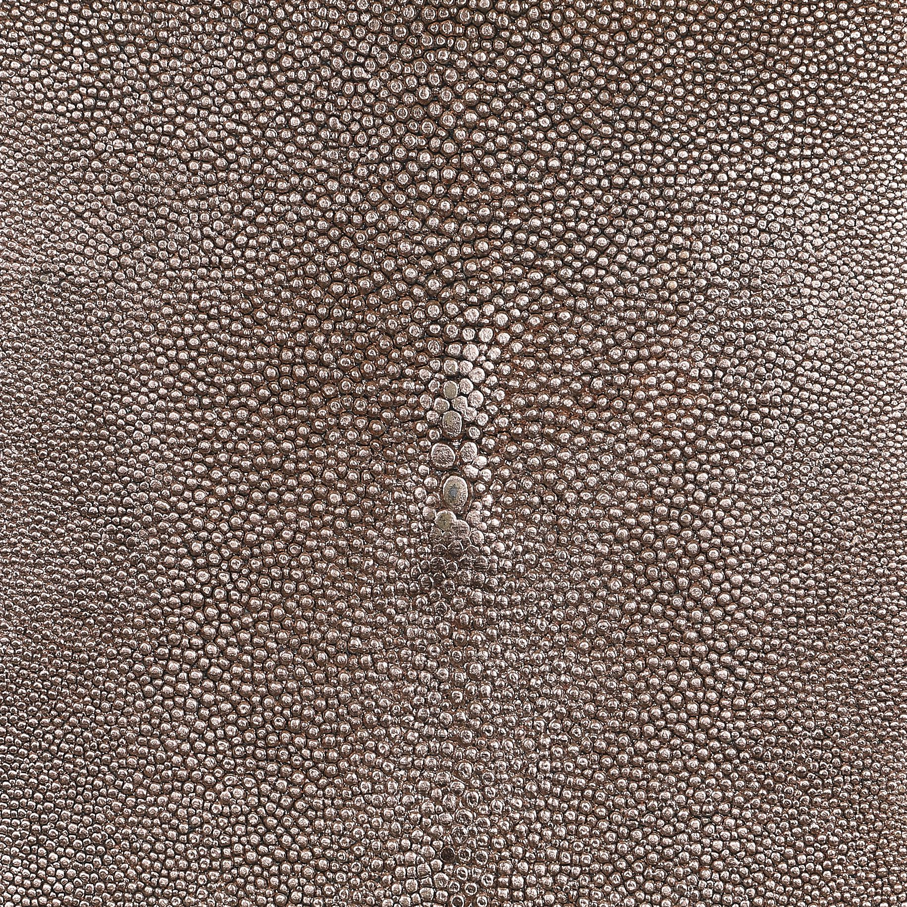
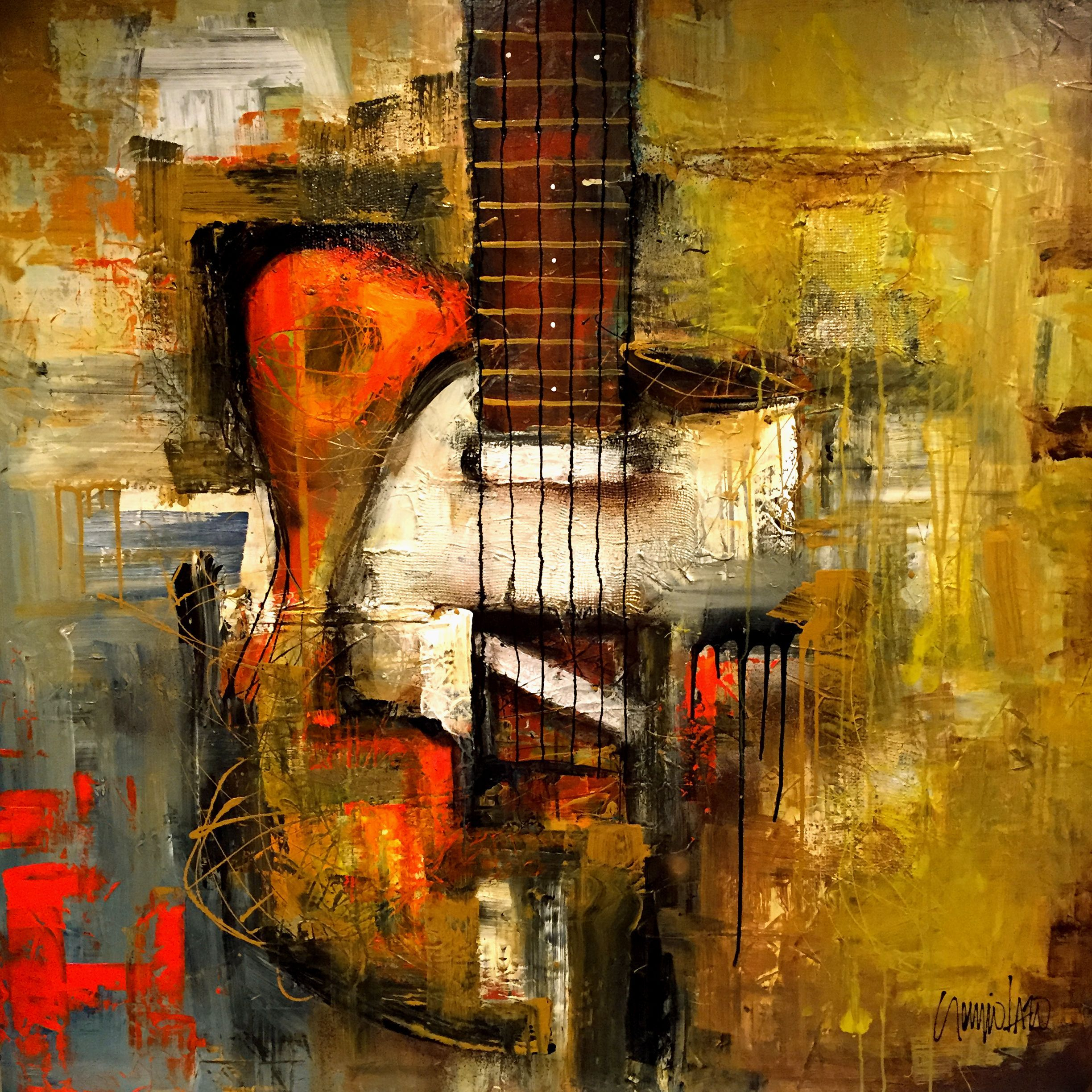
Even though abstract paintings exist on flat surfaces, skilled artists find ways to suggest three-dimensional qualities and tactile experiences. Texture plays a huge role in this illusion. Thick impasto paint creates physical texture that catches light and adds depth. Thin washes of paint might suggest transparency or fluidity. Some artists use palette knives to create visible brushstrokes that add movement and energy to their work. Others might layer different materials or incorporate mixed media elements to enhance the tactile quality. The interaction between different textures within a single piece can create surprising effects. A smooth, glossy area next to a rough, matte section might draw attention to one part of the composition while gently leading the eye elsewhere. These textural contrasts also affect how light reflects off the surface, changing the appearance of the artwork depending on viewing conditions. This is particularly important for wall art because the lighting in a room can dramatically alter the mood and impact of a piece. Artists must consider how their work will look under different types of illumination.
Cultural Context and Personal Interpretation
While color theory provides a universal framework, individual interpretations of abstract art often depend heavily on personal and cultural backgrounds. What one person sees as pure joy might represent struggle to another viewer. An artist might choose specific colors or shapes based on their own experiences or cultural references. A red circle might remind someone of a sunrise, while for another it could evoke danger or passion. The beauty of abstract art lies in its open-ended nature – it allows each viewer to project their own feelings onto the canvas. However, this doesn’t mean that all interpretations are equally valid. Understanding the artist’s intended message or the historical context can provide deeper appreciation. For example, many early abstract expressionists used color and form to express post-war emotions and existential concerns. Their work was deeply connected to their time and place. Today’s abstract artists might reference these traditions while adding their own contemporary perspectives. The dialogue between past and present, between cultural influences and personal expression, continues to evolve in bold abstraction. This ongoing conversation ensures that abstract art remains relevant and emotionally resonant across generations.
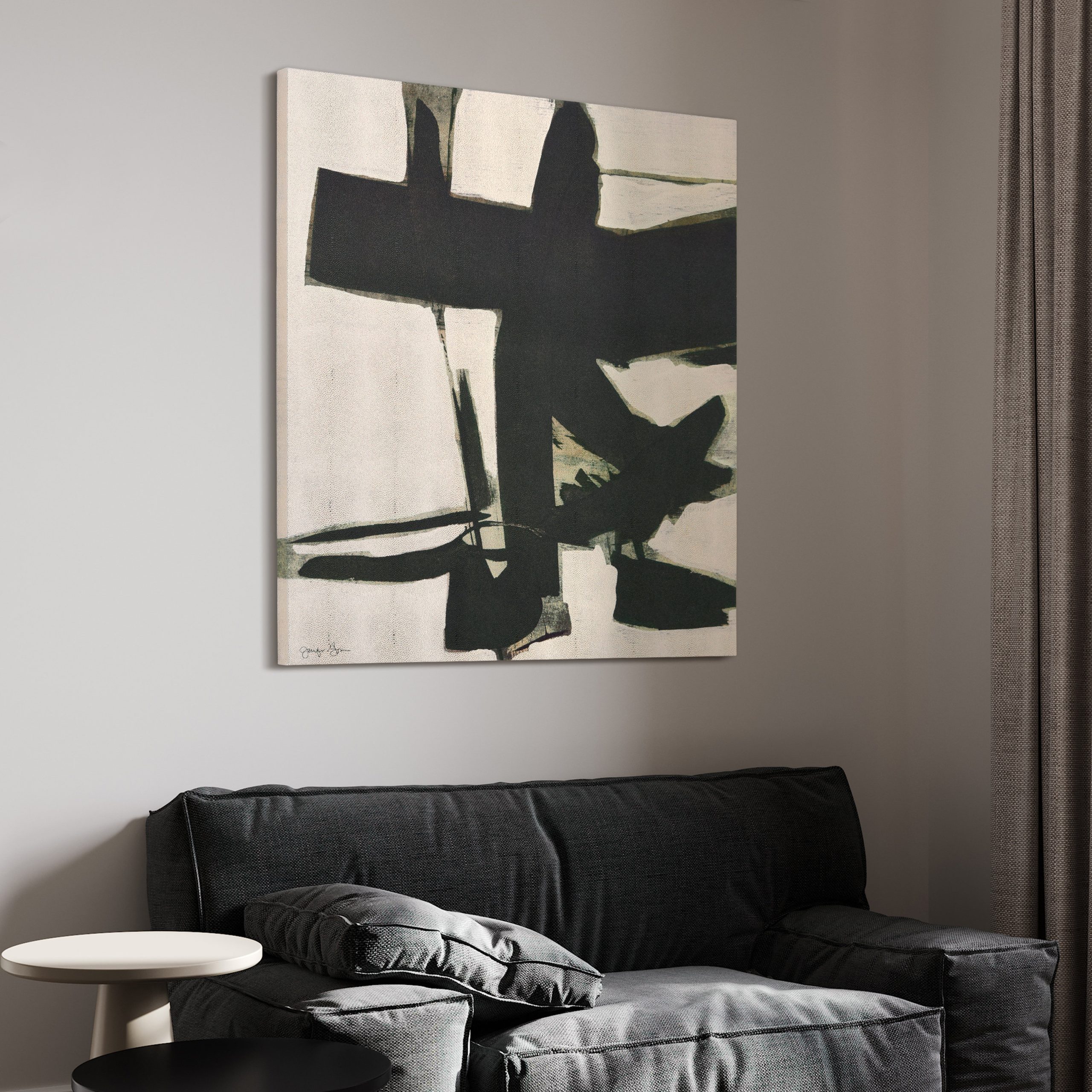
Bold abstraction in wall art represents more than mere decoration – it’s a sophisticated form of visual communication that relies heavily on the thoughtful application of color theory and composition principles. When we examine these pieces closely, we see how artists skillfully manipulate hue, saturation, and brightness to create emotional responses. They carefully arrange elements to guide our gaze and create rhythm within the frame. Understanding these fundamentals doesn’t diminish the artistic magic – instead, it enhances our appreciation of the craft involved. Every brushstroke, every color choice, and every compositional decision contributes to the overall impact of the work. Whether you’re buying, creating, or simply admiring abstract art, recognizing these underlying principles opens up a richer, more meaningful experience. The next time you encounter a striking abstract piece, try to identify how color and composition work together to create its unique presence. You might discover that what seemed like random splashes of paint actually tells a carefully constructed story.
[sps_html tag=”img” src=”https://cdn.theartssection.com/wp-content/uploads/2025/11/empire-art-direct-silver-elegance-i-abstract-artwork-rendered-on-throughout-exploring-how-shagreen-texture-enhances-abstract-canvas-wall-art-scaled.jpg” alt=”Empire Art Direct "Silver Elegance I", Abstract Artwork Rendered On … throughout Exploring How Shagreen Texture Enhances Abstract Canvas Wall Art” style=”width: 100%; height: auto;”]
[sps_html tag=”img” src=”https://cdn.theartssection.com/wp-content/uploads/2025/11/shagreen-art-resources-for-bold-abstraction-i-abstract-shagreen-wrapped-canvas-wall-art-sized.jpg” alt=”Shagreen - Art Resources for "Bold Abstraction I" Abstract Shagreen Wrapped Canvas Wall Art, Sized” style=”width: 100%; height: auto;”]
[sps_html tag=”img” src=”https://cdn.theartssection.com/wp-content/uploads/2025/11/empire-art-direct-colorful-harmony-ii-abstract-rendered-on-silver-in-exploring-how-shagreen-texture-enhances-abstract-canvas-wall-art.jpg” alt=”Empire Art Direct Colorful Harmony Ii Abstract Rendered On Silver … in Exploring How Shagreen Texture Enhances Abstract Canvas Wall Art” style=”width: 100%; height: auto;”]
[sps_html tag=”img” src=”https://cdn.theartssection.com/wp-content/uploads/2025/11/empire-art-direct-ecliptic-focus-abstract-circle-rendered-on-gold-intended-for-bold-abstraction-i-abstract-shagreen-wrapped-canvas-wall-art-sized-scaled.jpg” alt=”Empire Art Direct "Ecliptic Focus" Abstract Circle Rendered On Gold … intended for "Bold Abstraction I" Abstract Shagreen Wrapped Canvas Wall Art, Sized” style=”width: 100%; height: auto;”]
[sps_html tag=”img” src=”https://cdn.theartssection.com/wp-content/uploads/2025/11/wabi-sabi-wall-art-green-abstract-textured-canvas-art-abstract-green-regarding-bold-abstraction-i-abstract-shagreen-wrapped-canvas-wall-art-sized.jpg” alt=”Wabi-Sabi Wall Art Green Abstract Textured Canvas Art Abstract Green … regarding "Bold Abstraction I" Abstract Shagreen Wrapped Canvas Wall Art, Sized” style=”width: 100%; height: auto;”]