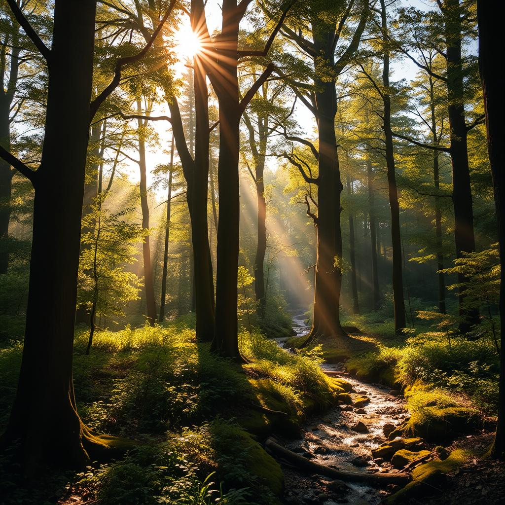
When you look at a forest landscape painting or print hanging on your wall, you’re not just admiring nature’s beauty. You’re witnessing one of the most sophisticated color experiments ever created. Every shade of green, every hint of blue, and each touch of earthy brown tells a story about how colors work together to create emotion, mood, and meaning.
Forest landscapes have always held a special place in human imagination. They’re not just trees and dirt though – they’re complex color systems that speak to us on a fundamental level. When artists capture these scenes, they’re essentially conducting experiments with light, shadow, and pigment that reveal deep truths about how we see and feel. This isn’t just about pretty pictures; it’s about understanding the invisible forces that shape our visual experience. Think about it – when you walk through a forest, what do you notice first? The way sunlight filters through leaves? The contrast between dark trunks and bright undergrowth? That’s color theory in action, right there in nature itself. These same principles apply whether you’re looking at a real forest or a painted representation of one.
The Foundation of Forest Colors
Forest scenes naturally follow certain color patterns that make them particularly instructive for studying color theory. The dominant colors usually come from the three primary greens – from the palest mint to the deepest forest hues. These aren’t random choices. They represent different emotional states and visual impacts. Lighter greens often suggest freshness, growth, and hope. They might appear in spring foliage or early morning dappled light. Deeper greens convey stability, wisdom, and maturity. They’re found in dense canopy areas or during the height of summer. Artists learn to balance these tones carefully. A forest that’s too green can feel monotonous. Too many different shades might confuse the eye. The secret lies in creating harmony while maintaining enough variation to keep things interesting. Consider how a single tree might show several greens at once – the trunk, the bark, the leaves, and the shadows beneath all contribute to the overall color story. This complexity is what makes forest art so rich for learning about color relationships.
Understanding Warm and Cool Tones
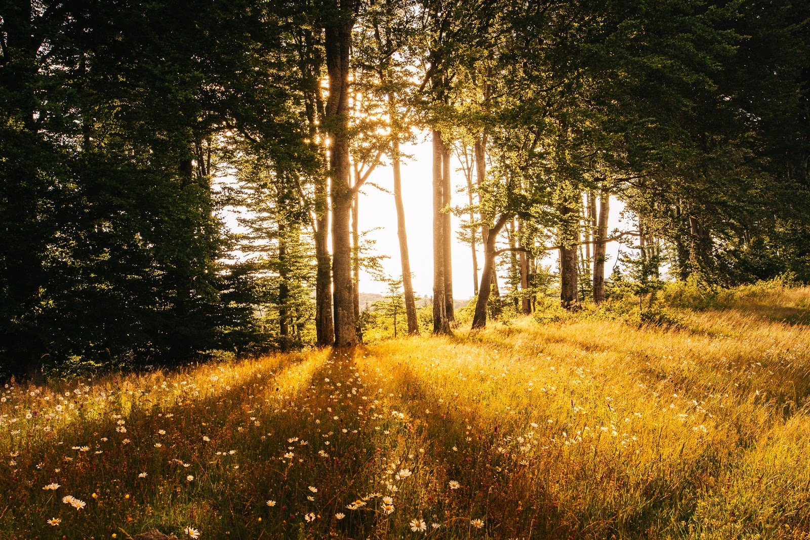
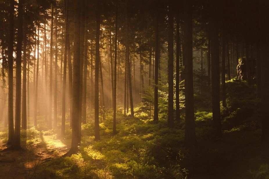
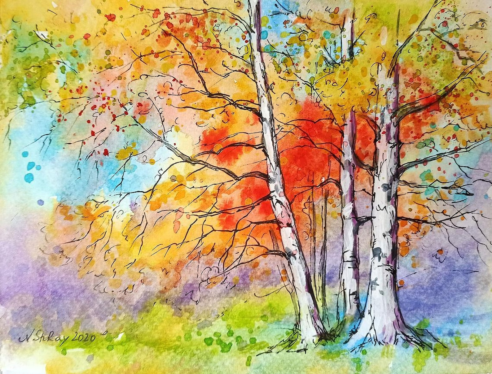
One of the most fascinating aspects of forest art is how it demonstrates the interplay between warm and cool colors. When you examine a forest scene, you’ll notice that the sunlit areas tend to show warmer tones – yellows, oranges, and reds. These colors seem to jump out at you, drawing attention and creating energy. Meanwhile, the shaded areas often display cooler blues and purples. These tones recede visually, creating depth and space. This contrast isn’t accidental. It mimics how our eyes naturally perceive light and shadow in outdoor environments. Artists use this knowledge to guide viewers’ attention and create emotional responses. A painting might emphasize warm tones to evoke feelings of comfort or nostalgia. Cool tones might dominate to suggest tranquility or melancholy. The key is balancing these opposing forces so neither overwhelms the other. A forest painting with too much warmth might feel chaotic, while one dominated by cool tones could seem lifeless. The best forest art finds that sweet spot where both elements work together.
The Role of Complementary Colors
Complementary colors – those opposite each other on the color wheel – play a crucial role in forest art. While forests are primarily green, they often contain unexpected pops of complementary colors that make the whole composition sing. Think of the red berries against green leaves, or yellow flowers among dark foliage. These contrasting pairs create visual tension that draws the eye and adds excitement. The relationship between complementary colors creates a dynamic balance that keeps viewers engaged. When used skillfully, these colors can make even simple forest scenes feel complex and alive. For example, a blue sky might complement the greenery below, creating a sense of vastness and openness. Or perhaps a red mushroom against dark soil provides the perfect focal point. The beauty of this approach is that it works whether you’re looking at a realistic painting or a stylized interpretation. The mathematical relationships between colors still apply, even when artistic liberties are taken.
Color Temperature in Nature
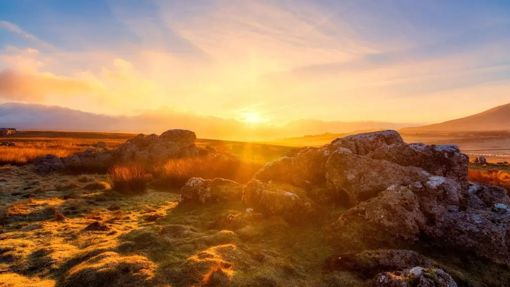
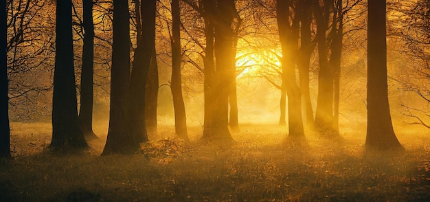
Temperature – how warm or cool a color appears – is one of the most subtle but powerful tools in forest art. The same green can look completely different depending on whether it’s bathed in golden afternoon light or filtered through misty morning air. Artists learn to observe these shifts and translate them onto canvas. A forest in late autumn might shift from warm golds and reds to cooler browns and grays. This change in temperature affects how viewers interpret the scene. Warmer temperatures often suggest activity, life, and energy. Cooler temperatures might imply rest, reflection, or transition. Understanding this concept helps artists create paintings that feel authentic to their environment. It also helps viewers connect more deeply with the artwork. When you see a forest that feels warm, you might feel energized. When it appears cool, you might feel calm. This emotional response is exactly why forest landscape art is so effective in interior design and therapeutic settings.
Harmony Through Contrast
True mastery in forest art comes from knowing how to create harmony while embracing contrast. The challenge lies in making diverse colors work together without creating visual chaos. Artists often use techniques like analogous color schemes – groups of colors that sit next to each other on the color wheel. In forest scenes, this might mean using various shades of green, along with blues and browns. But the magic happens when they add strategic contrasts. A flash of red or orange can make all the surrounding greens pop more vibrantly. The key is moderation and intentionality. Not every element needs to be dramatically different. Sometimes a single accent color can transform an entire composition. This principle applies whether you’re creating art or choosing wall decor. The same rules govern both. A living room with forest-themed artwork benefits from careful consideration of how those colors will interact with the existing color scheme. Too much variety can overwhelm, but just the right amount creates visual interest.
Practical Applications for Designers
For anyone working with color in design or decoration, forest landscape art offers practical lessons that extend far beyond the canvas. The principles learned from studying these natural compositions can be applied to everything from home interiors to corporate spaces. The way artists balance dominant and secondary colors in forest scenes mirrors how successful designers approach room layouts. Just as a forest needs both foreground and background elements to create depth, a room needs layered colors to avoid flatness. The color temperature changes in seasonal forest art teach us about creating moods in different spaces. A kitchen might benefit from warmer tones to encourage appetite and activity. A bedroom might use cooler tones to promote relaxation and sleep. Even the way artists handle transitions between different color zones can inform how we organize furniture and lighting in our homes. These lessons make forest art not just beautiful, but genuinely useful for practical design decisions.
Forest landscape wall art reveals the hidden mathematics of color in ways that are both educational and deeply moving. When you look at these paintings, you’re seeing centuries of accumulated knowledge about how our eyes and brains process visual information. The greens, the blues, the earth tones – they’re all part of a larger conversation about perception, emotion, and beauty. Whether you’re an artist, designer, or simply someone who appreciates beautiful spaces, understanding these principles can transform how you see and interact with color. The next time you hang a forest scene on your wall, remember that you’re not just adding decoration – you’re bringing nature’s own color theory into your daily life. It’s a reminder that art and science aren’t separate domains; they’re two sides of the same creative coin. That’s what makes forest landscape art so special – it teaches us to see the world differently, one beautiful color at a time.
[sps_html tag=”img” src=”https://cdn.theartssection.com/wp-content/uploads/2025/12/golden-hour-landscape-artofit-in-capturing-the-golden-hour-magic-in-forest-landscapes.jpg” alt=”Golden Hour Landscape – Artofit in Capturing the Golden Hour Magic in Forest Landscapes” style=”width: 100%; height: auto;”]
[sps_html tag=”img” src=”https://cdn.theartssection.com/wp-content/uploads/2025/12/5-tips-for-capturing-the-magic-of-golden-hour-photography-light-stalking-within-rising-sun-over-colorful-forest-landscape-photo-wall-art-4-panels.jpg” alt=”5 Tips For Capturing The Magic Of Golden Hour Photography | Light Stalking within "Rising Sun Over Colorful Forest" Landscape Photo Wall Art, 4 Panels” style=”width: 100%; height: auto;”]
[sps_html tag=”img” src=”https://cdn.theartssection.com/wp-content/uploads/2025/12/practical-tips-to-help-you-capture-beautiful-golden-hour-shots-every-intended-for-capturing-the-golden-hour-magic-in-forest-landscapes.jpg” alt=”Practical Tips To Help You Capture Beautiful Golden Hour Shots Every … intended for Capturing the Golden Hour Magic in Forest Landscapes” style=”width: 100%; height: auto;”]
[sps_html tag=”img” src=”https://cdn.theartssection.com/wp-content/uploads/2025/12/golden-hour-magic-step-into-an-enchanted-forest-intended-for-capturing-the-golden-hour-magic-in-forest-landscapes.jpg” alt=”Golden Hour Magic: Step Into An Enchanted Forest intended for Capturing the Golden Hour Magic in Forest Landscapes” style=”width: 100%; height: auto;”]
[sps_html tag=”img” src=”https://cdn.theartssection.com/wp-content/uploads/2025/12/premium-photo-enchanted-fantastic-forest-panoramic-view-morning-pertaining-to-capturing-the-golden-hour-magic-in-forest-landscapes.jpg” alt=”Premium Photo | Enchanted Fantastic Forest Panoramic View Morning … pertaining to Capturing the Golden Hour Magic in Forest Landscapes” style=”width: 100%; height: auto;”]