Have you ever walked into a room and instantly felt calm or energized? That’s not just coincidence. The colors surrounding us have a profound impact on our emotions and well-being. When we look at nature-inspired wall art, we’re tapping into thousands of years of visual wisdom. Think about it – when you see a sunset painting the sky in oranges and pinks, or a forest canopy in deep greens, there’s something inherently soothing about those combinations. These aren’t random choices. They’re carefully balanced harmonies that our brains recognize and respond to positively.
Wall art has the power to transform a house into a home, and when that art draws inspiration from the natural world, the effect becomes even more profound. But what makes certain nature-inspired pieces feel so right? It’s not just about having pretty pictures hanging on your walls. It’s about understanding how colors work together to create feelings, tell stories, and bring balance to our living spaces. Nature itself is the ultimate artist, using color in ways that feel both wild and perfectly ordered. From the way morning light filters through leaves to the way water reflects the sky, nature provides us with endless examples of visual harmony that we can learn from and apply to our own artistic expressions. This isn’t just about aesthetics though – it’s about creating environments that support our mental and emotional health while still looking beautiful.
Understanding Color Relationships
Before diving into nature-inspired art, it helps to grasp how colors interact with each other. Think of color relationships like musical chords – some combinations sound discordant while others create beautiful harmony. In nature, we see several key patterns that repeat across landscapes, seasons, and ecosystems. The most fundamental of these is the color wheel, which shows how primary colors (red, blue, yellow) relate to secondary colors (green, orange, purple). When artists work with nature themes, they often use complementary colors – pairs like red and green, or blue and orange – which create dynamic tension that feels alive and energetic. Warm colors like reds, oranges, and yellows tend to advance or come forward in a composition, while cool colors like blues and greens recede, creating depth and dimension. These principles aren’t just rules to follow – they’re tools for creating art that feels naturally balanced and pleasing to the eye.
Seasonal Color Palettes in Nature
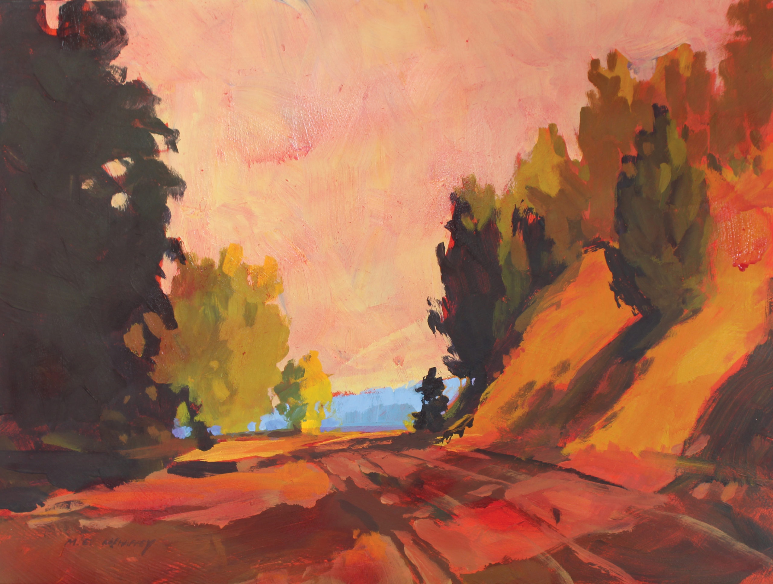
Nature changes its palette throughout the year, and this cyclical beauty offers rich inspiration for wall art. Spring brings fresh greens and pastel tones that feel hopeful and new. Summer’s vibrant yellows and deep blues capture the energy of full growth. Autumn introduces warm browns, oranges, and reds that evoke comfort and reflection. Winter’s cooler tones of grays, whites, and muted blues provide a sense of quiet contemplation. These seasonal shifts aren’t just about what’s visible in the landscape – they represent different emotional states that we can tap into through our art choices. A winter scene might feature soft grays and deep purples to create a cozy feeling, while a spring landscape could use bright yellows and fresh greens to energize a space. The key is matching the emotional tone of the season to the mood you want to create in your room.
Earth Tones and Natural Materials
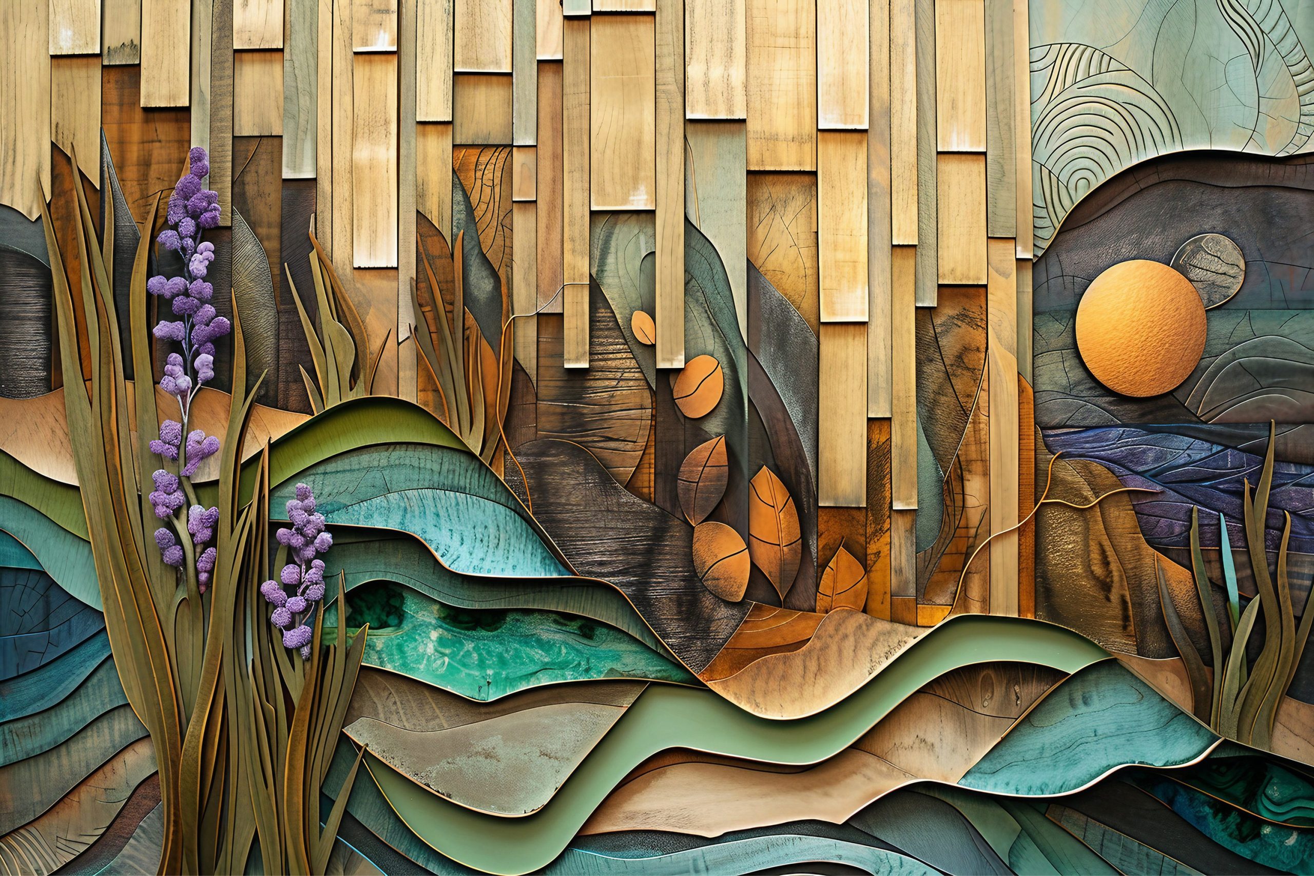
One of the strongest elements in nature-inspired art is the use of earth tones. These include browns, tans, ochres, and various shades of beige that appear everywhere in the natural world. Rocks, soil, tree bark, and dried grass all contribute to this foundation color palette. When artists incorporate these tones into their work, they create a sense of grounding and stability. Earth tones also work incredibly well with organic textures and materials like wood, stone, or woven fabrics. Consider how a painting featuring weathered wooden docks against a blue sky creates a sense of permanence and connection to the land. These natural materials often have subtle variations in their color that make them particularly interesting for artists to work with. The beauty lies in their imperfections – a slightly darker shade of brown here, a hint of green there – these small details create depth and realism that resonates with viewers on a subconscious level.
Water and Sky Color Dynamics
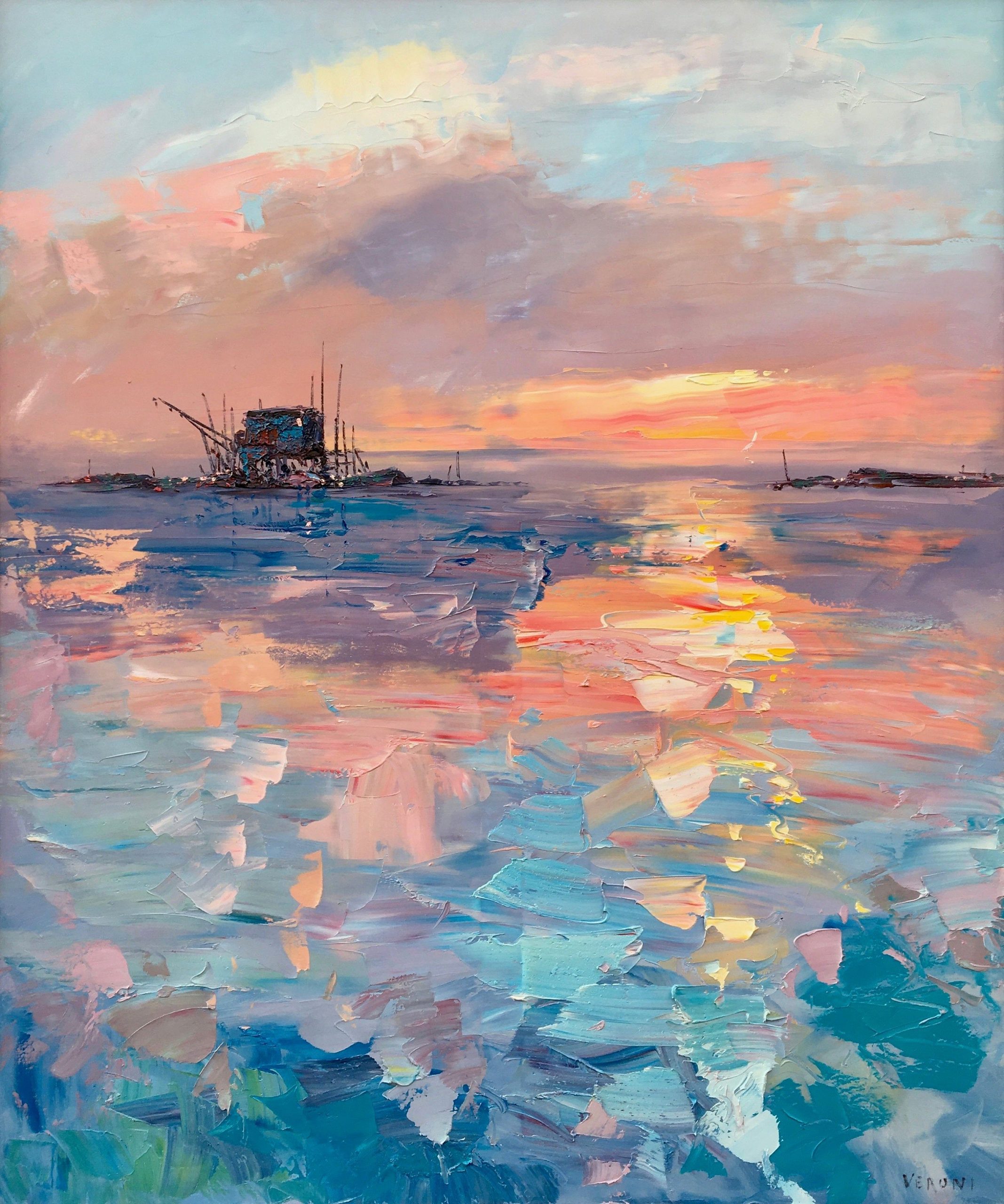
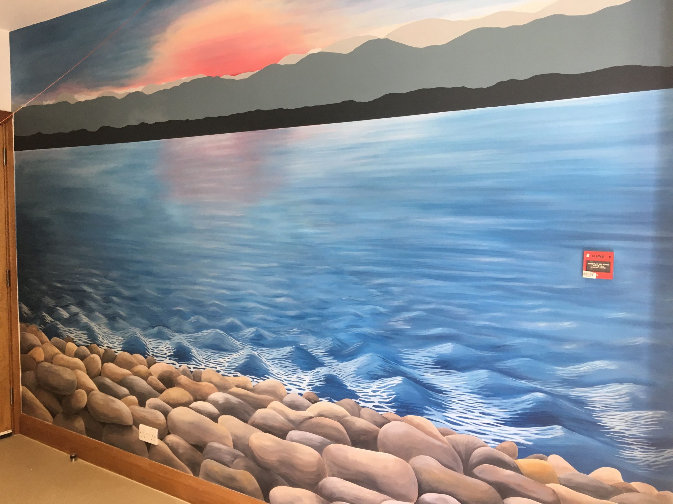
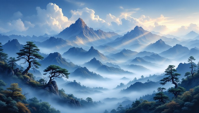
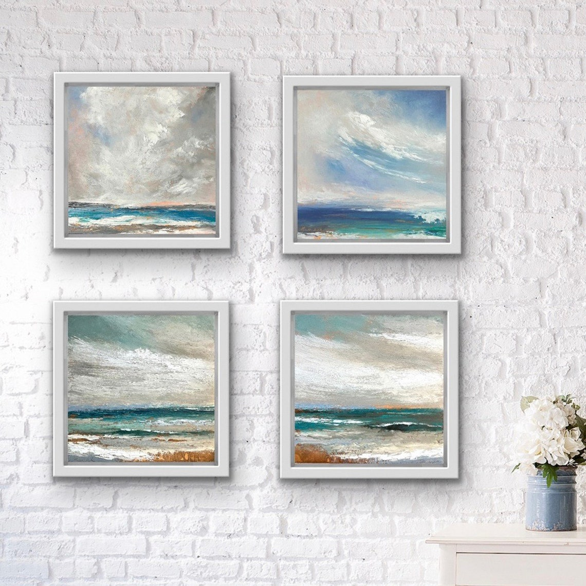
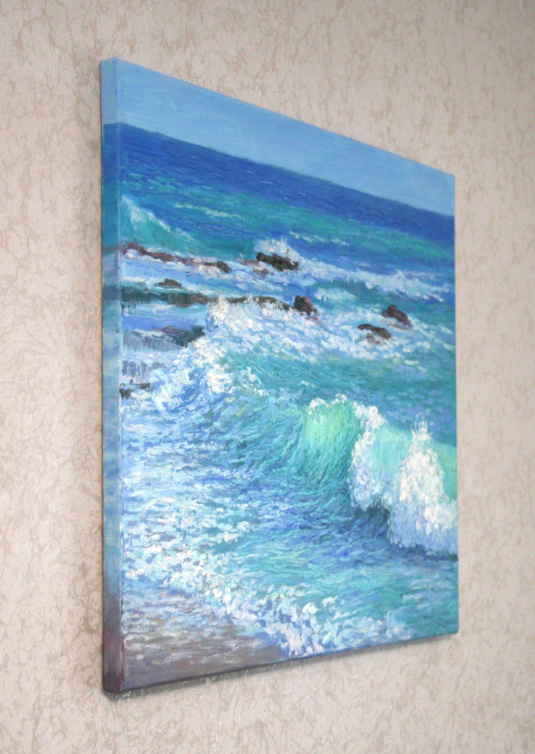
Water and sky offer some of the most complex and mesmerizing color relationships in nature. These elements rarely exist in pure colors – instead, they blend and shift based on lighting conditions, time of day, and atmospheric factors. A morning sky might start with deep blues and gradually lighten to soft pinks and oranges. Ocean surfaces can reflect everything around them, from the sky above to the sand below. When creating wall art inspired by these elements, consider how light affects color perception. The same blue can appear completely different under direct sunlight versus overcast conditions. Artists often use color temperature variations to show these effects – warmer tones near the horizon and cooler tones higher up. This creates a sense of depth and movement that makes static images feel alive. The interplay between light and water creates optical illusions that artists can mimic to make their work more engaging and dynamic.
Plant Life and Color Variations
Plants offer an incredible range of color possibilities that can inspire any wall art collection. From the deep emerald of forest floors to the bright chartreuse of spring shoots, vegetation provides endless variations within each hue family. The way light hits leaves creates subtle gradients that change throughout the day. Some plants appear almost black in shadow, while others shimmer with golden highlights. Artists working with plant subjects often focus on these subtle transitions rather than trying to match exact colors. The key is capturing the essence of how plants behave under different conditions. A simple oak tree might appear dark and mysterious in early morning light, then bright and vibrant during midday sun. Understanding these shifts helps artists create more believable and emotionally resonant pieces. The interplay between light and leaf structure also creates fascinating patterns and textures that add complexity to compositions.
Practical Application for Home Decorators
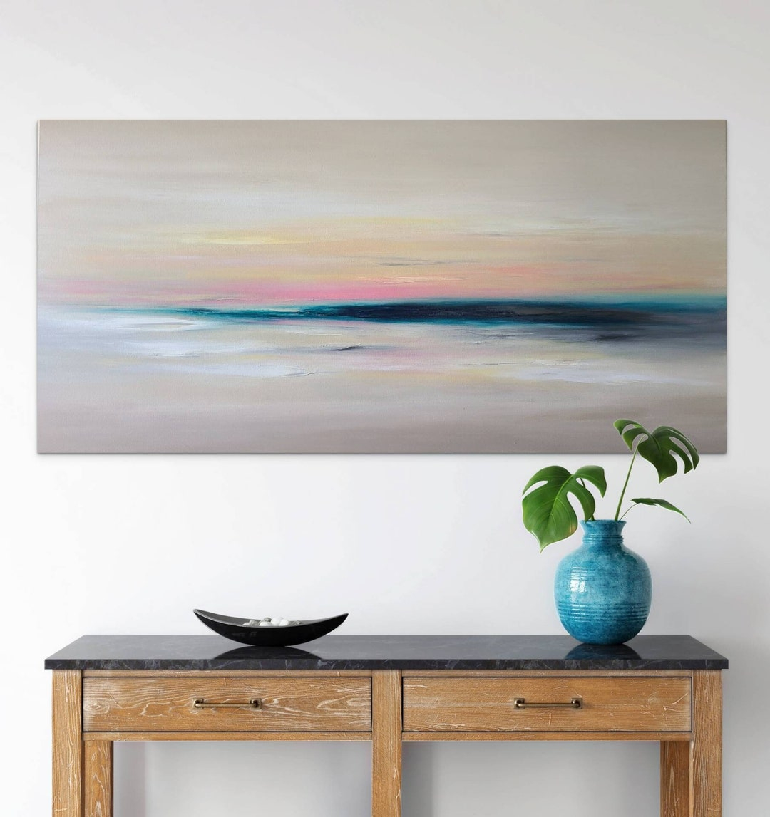
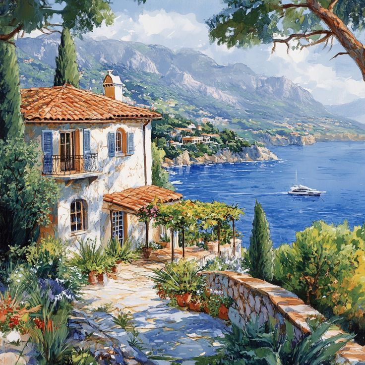
Now that we understand the theory behind nature-inspired color choices, how do we actually apply this knowledge to our homes? Start by observing the existing color scheme in your room. If you have warm wood tones, consider adding art with earthy browns and golden yellows. For cooler rooms with white or light gray walls, try pieces featuring deep blues and greens that complement rather than compete with the background. Consider the amount of natural light in your space – south-facing rooms can handle deeper, richer colors, while north-facing areas benefit from lighter, more vibrant tones. Don’t be afraid to mix different nature-inspired elements in one piece – perhaps a mountain scene that includes both blue skies and green forests. The goal isn’t to copy nature exactly, but to capture its underlying principles of harmony and balance. Remember that art should enhance your existing decor rather than overwhelm it. Sometimes a single statement piece with carefully chosen colors can tie an entire room together beautifully.
Creating visual harmony through color theory in nature-inspired wall art isn’t just about making things look pretty – it’s about crafting experiences that resonate with our deepest connections to the natural world. When we understand how colors work together, we gain the ability to transform our living spaces into environments that support our well-being while expressing our personal style. Whether you’re choosing a single piece for your living room or building an entire gallery wall, the principles remain the same: observe nature’s patterns, understand how colors interact, and trust your instincts about what feels right. The beauty of nature-inspired art lies in its ability to remind us of our place within the larger ecosystem, bringing a sense of calm and continuity to our modern lives. So next time you’re looking at wall art, pay attention to the colors and how they make you feel. You might discover that the most powerful pieces aren’t necessarily the most expensive or technically perfect, but those that speak to something deeper within you.
[sps_html tag=”img” src=”https://cdn.theartssection.com/wp-content/uploads/2025/12/abstract-nature-inspired-landscape-wall-art-print-surreal-woodgrain-for-creating-balance-in-nature-inspired-seascape-wall-art-through-color-and-form-scaled.jpg” alt=”Abstract Nature-Inspired Landscape Wall Art Print, Surreal Woodgrain … for Creating Balance in Nature-Inspired Seascape Wall Art Through Color and Form” style=”width: 100%; height: auto;”]
[sps_html tag=”img” src=”https://cdn.theartssection.com/wp-content/uploads/2025/12/large-original-seascape-wall-art-abstract-beach-painting-24-etsy-in-composition-of-nature-beautiful-seascape-landscape-wall-art-1-panel.jpg” alt=”Large Original Seascape Wall Art Abstract Beach Painting 24 - Etsy in "Composition Of Nature Beautiful Seascape" Landscape Wall Art, 1 Panel” style=”width: 100%; height: auto;”]
[sps_html tag=”img” src=”https://cdn.theartssection.com/wp-content/uploads/2025/12/canvas-wall-art-seascapes-at-malik-garcia-blog-within-creating-balance-in-nature-inspired-seascape-wall-art-through-color-and-form-scaled.jpg” alt=”Canvas Wall Art Seascapes At Malik Garcia Blog within Creating Balance in Nature-Inspired Seascape Wall Art Through Color and Form” style=”width: 100%; height: auto;”]
[sps_html tag=”img” src=”https://cdn.theartssection.com/wp-content/uploads/2025/12/seascape-painting-original-coastal-wall-art-beach-artwork-etsy-with-regard-to-creating-balance-in-nature-inspired-seascape-wall-art-through-color-and-form-scaled.jpg” alt=”Seascape Painting Original Coastal Wall Art Beach Artwork | Etsy with regard to Creating Balance in Nature-Inspired Seascape Wall Art Through Color and Form” style=”width: 100%; height: auto;”]
[sps_html tag=”img” src=”https://cdn.theartssection.com/wp-content/uploads/2025/12/seascape-hand-painted-wall-mural-by-hannahpaints-com-seascape-wall-in-composition-of-nature-beautiful-seascape-landscape-wall-art-1-panel-scaled.jpg” alt=”Seascape. Hand-Painted Wall Mural By Hannahpaints.com | Seascape, Wall … in "Composition Of Nature Beautiful Seascape" Landscape Wall Art, 1 Panel” style=”width: 100%; height: auto;”]