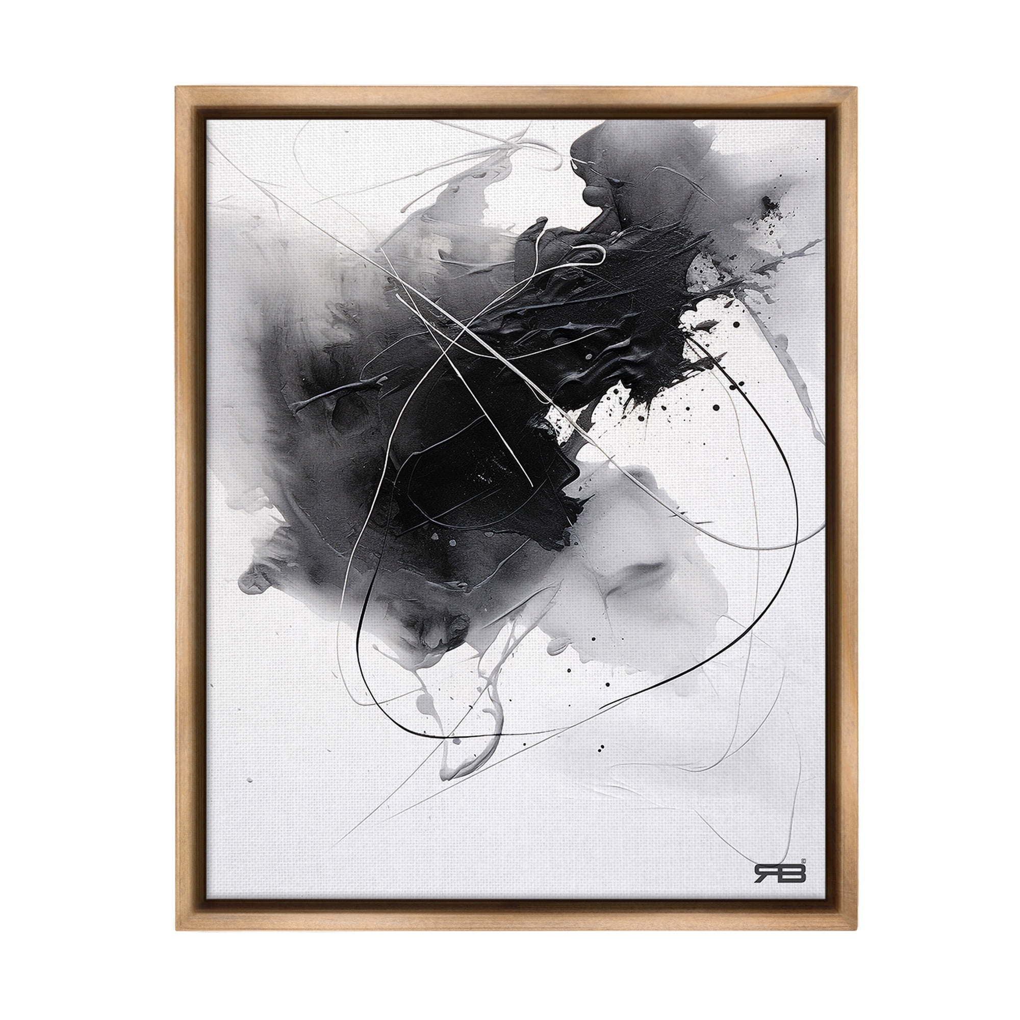
There’s something deeply mesmerizing about abstract paper art that seems to float against a dark canvas. It’s like watching a silent conversation between light and shadow, where every cut, fold, and layer tells its own story. But what happens when you want to create something truly balanced? When the darkness isn’t just background, but an active participant in your composition?
When we think about abstract art, we often picture vibrant colors and bold strokes. But there’s a whole other world that emerges when you work with abstract paper art against dark backgrounds. This isn’t just about contrast—it’s about creating a sense of equilibrium, a visual rhythm that draws the eye and holds attention. The challenge lies in making your paper elements feel grounded while they seem to defy gravity. It’s like trying to build a bridge between two worlds: the tangible and the ethereal.
Understanding the Foundation of Dark Backdrop Art
Working with dark backgrounds requires a different mindset than traditional art-making. You’re essentially painting with negative space, where the absence of color becomes as important as the presence of it. Think of it like being a conductor of shadows rather than light. The dark backdrop doesn’t just provide contrast—it becomes part of the narrative.
Consider how photographers use negative space to focus attention. In abstract paper art, this concept translates to using the darkness to highlight your paper elements. The deeper the darkness, the more your paper work needs to command attention. This means your compositions must be intentional about where they place their visual weight.
A common mistake beginners make is assuming that dark backgrounds automatically create drama. They do, but only if you’ve thought about how your paper elements interact with that darkness. The key is understanding that your artwork exists in a three-dimensional space, even if it’s flat on the wall.
The Power of Contrast and Visual Weight
Contrast in abstract paper art isn’t just about light versus dark—it’s about how different elements pull the eye around the composition. When you have a dark backdrop, your paper elements become the stars of the show, but they also need to know how to share the spotlight.
Visual weight comes in many forms. Thickness of paper, layering, texture, and size all contribute to how much an element appears to weigh. A single sheet of thick cardstock might weigh more visually than several layers of thin paper. This is where the magic happens—the interplay between what you see and what you feel.
Try this exercise: Place one large paper shape against a dark background. Now add several smaller shapes. Notice how the large shape naturally commands more attention. But what happens when you add texture or dimension to those smaller shapes? Suddenly, they might compete for attention.
The secret to balance is making sure no single element overwhelms the others. It’s like having a conversation where everyone gets a chance to speak, but someone still manages to be heard without shouting.
Color Theory in the Dark
Color theory takes on new meaning when working with dark backgrounds. You’re not just choosing colors—you’re choosing how they’ll appear in shadow. Warm tones like reds and oranges tend to pop more against dark backgrounds, while cool blues and greens might get lost unless you’re careful.
Think about how your paper colors will interact with the darkness. A bright yellow paper might seem to glow against black, but it could also look like a spotlight cutting through the night. That’s powerful, but it’s also very specific. Sometimes less is more, especially when you want to create subtle shifts in mood.
Experiment with different paper weights and finishes. Matte paper might blend into the darkness, while glossy paper creates highlights that dance across the surface. These choices affect not just how your colors appear, but how the viewer’s eye moves through the piece.
The beauty of working with dark backgrounds is that you can use color to guide the viewer’s attention. A small splash of red in an otherwise monochromatic piece can make people pause and wonder why that color caught their eye.
Composition Techniques for Visual Harmony
Composition becomes a dance when you’re working with dark backdrops. Your paper elements need to know how to move through space while maintaining their individual personalities.
The rule of thirds doesn’t always apply here. Sometimes you want to center something dramatic, sometimes you want to create tension by placing elements off-center in a way that feels unbalanced but still harmonious.
Try creating a series of abstract shapes that vary in size and complexity. Place them in a way that creates a visual journey. Start with a large, simple form that catches the eye, then lead the viewer’s gaze through smaller, more intricate elements. The dark background acts as a stage, and your paper creations are the performers.
Another effective technique is to use repetition with variation. Create several similar paper shapes, but vary their sizes, orientations, or textures. This gives the eye something familiar to follow while keeping the composition interesting. The darkness provides the consistency, and your paper work provides the variety.
Remember, balance isn’t about symmetry. It’s about creating visual equilibrium where each element contributes to the whole without dominating it.
Texture and Dimension in Darkness
This is where abstract paper art really starts to breathe. Texture adds life to flat surfaces, especially when contrasted with darkness. The way light reflects off textured paper can create unexpected depth and movement.
Think about how different paper types behave. Cardstock might create clean edges, while tissue paper can create soft, flowing forms. Textured papers add another layer of interest that works beautifully against dark backgrounds.
Layering is crucial here. You can create dimensional effects by cutting paper shapes and stacking them slightly offset from each other. Even small variations in placement can create the illusion of depth. The dark background enhances this effect because there’s nothing else competing for attention.
Consider how your paper elements catch and reflect light. Even in darkness, your paper can create highlights that draw attention. These aren’t necessarily bright spots—they might be subtle variations in texture that catch the light differently.
The key is thinking of your paper as both a flat element and a three-dimensional object. How does it feel when you hold it? How does it appear when placed against the dark backdrop? These questions will guide you toward more dynamic compositions.
Practical Tips for Achieving Balance
Here are some actionable strategies for creating balanced abstract paper art on dark backgrounds:
• Start with a plan. Sketch out your composition before cutting paper. This helps you visualize how elements will interact with the darkness.
• Pay attention to the relationship between positive and negative space. Every paper element creates a negative space around it that also needs consideration.
• Use the dark background as a tool, not just a setting. Let it influence how you position and size your paper elements.
• Test different paper weights and finishes. What looks good in your sketch might behave differently when you actually cut it.
• Step back frequently to see your work from a distance. This helps you understand how the overall composition reads.
• Consider how your piece will be viewed. Will it be seen in natural light or artificial? This affects how your paper elements will appear.
Don’t be afraid to make adjustments. Sometimes the most beautiful compositions come from unexpected changes. The dark background gives you room to experiment without feeling like you’re losing control of your vision.
Creating balance with abstract paper art on dark backdrops is both an art and a science. It requires understanding how light and shadow interact, how different materials behave, and how to guide the viewer’s eye through your composition. The darkness doesn’t just provide contrast—it becomes a partner in storytelling.
What makes this approach so compelling is that it forces you to be deliberate about every choice. There’s no hiding behind bright colors or busy patterns. Your paper work must stand on its own merit, and that’s exactly what makes it so powerful.
Remember, balance isn’t about perfection. It’s about creating harmony where everything feels like it belongs. Whether you’re working with deep blacks or rich midnight blues, the principles remain the same: thoughtful placement, intentional contrast, and respect for the relationship between your paper elements and their environment. The dark backdrop gives you the stage, but it’s your creativity that brings the performance to life.
[sps_html tag=”img” src=”https://cdn.theartssection.com/wp-content/uploads/2025/10/twisted-brown-paper-rolls-creating-abstract-shapes-on-a-white-regarding-abstract-paper-framed-art-paper-on-black-background-in-tan-frame.jpg” alt=”Twisted Brown Paper Rolls Creating Abstract Shapes On A White … regarding Abstract Paper Framed Art, Paper On Black Background In Tan Frame” style=”width: 100%; height: auto;”]
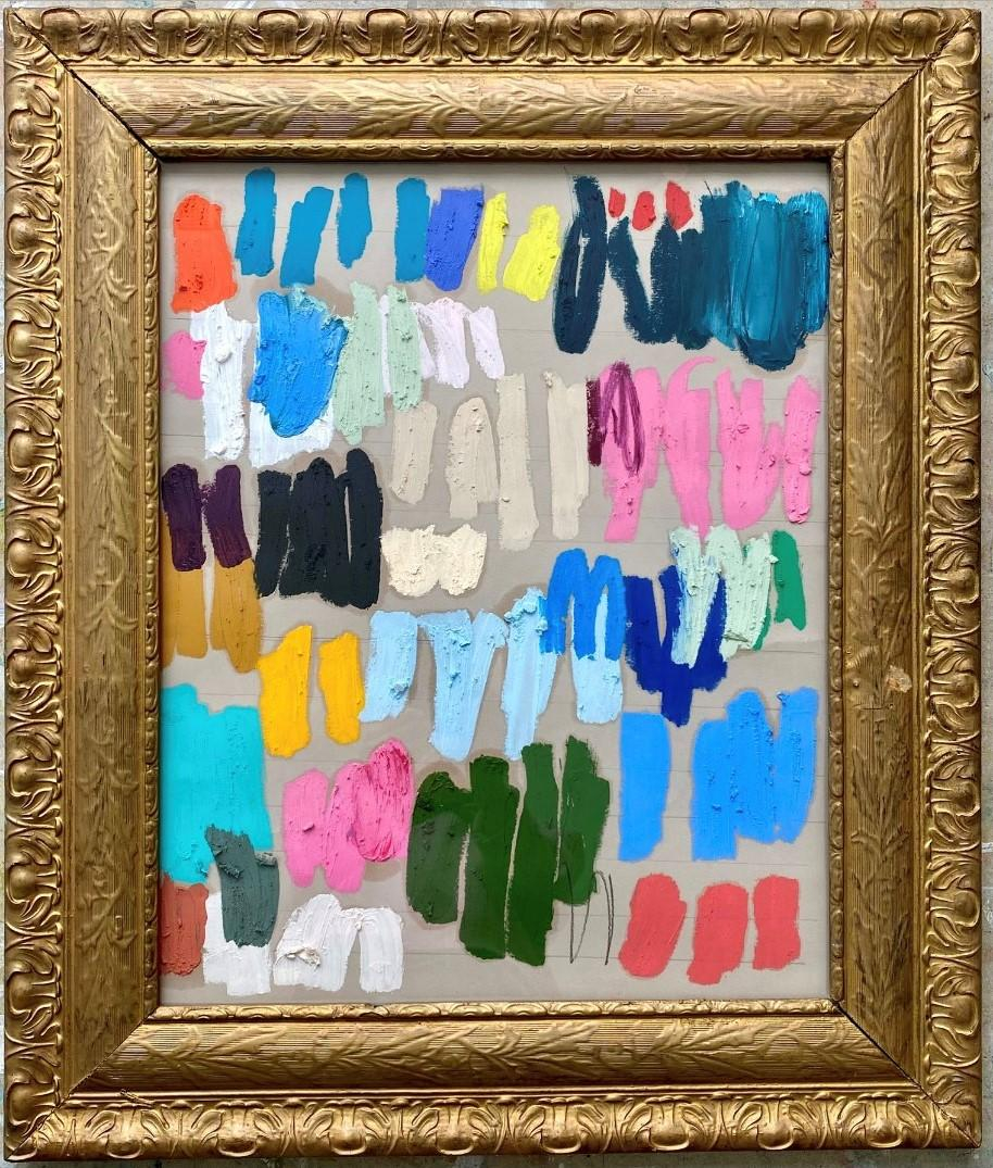
[sps_html tag=”img” src=”https://cdn.theartssection.com/wp-content/uploads/2025/10/colleen-leach-wishful-thinking-by-colleen-leach-framed-abstract-oil-intended-for-abstract-paper-framed-art-paper-on-black-background-in-tan-frame.jpg” alt=”Colleen Leach - Wishful Thinking By Colleen Leach, Framed Abstract Oil … intended for Abstract Paper Framed Art, Paper On Black Background In Tan Frame” style=”width: 100%; height: auto;”]
[sps_html tag=”img” src=”https://cdn.theartssection.com/wp-content/uploads/2025/10/brown-abstract-frame-design-abstract-twibbon-abstract-border-inside-abstract-paper-framed-art-paper-on-black-background-in-tan-frame.png” alt=”Brown Abstract Frame Design, Abstract Twibbon, Abstract Border … inside Abstract Paper Framed Art, Paper On Black Background In Tan Frame” style=”width: 100%; height: auto;”]
[sps_html tag=”img” src=”https://cdn.theartssection.com/wp-content/uploads/2025/10/tan-abstract-background-vector-art-icons-and-graphics-for-free-download-for-the-psychology-behind-tan-frame-abstract-paper-displays.jpg” alt=”Tan Abstract Background Vector Art, Icons, And Graphics For Free Download for The Psychology Behind Tan Frame Abstract Paper Displays” style=”width: 100%; height: auto;”]
[sps_html tag=”img” src=”https://cdn.theartssection.com/wp-content/uploads/2025/10/stupell-industries-contemporary-watercolor-smear-abstract-painting-throughout-abstract-paper-framed-art-paper-on-black-background-in-tan-frame.jpeg” alt=”Stupell Industries Contemporary Watercolor Smear Abstract Painting … throughout Abstract Paper Framed Art, Paper On Black Background In Tan Frame” style=”width: 100%; height: auto;”]