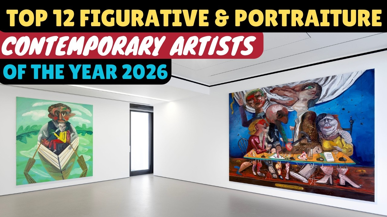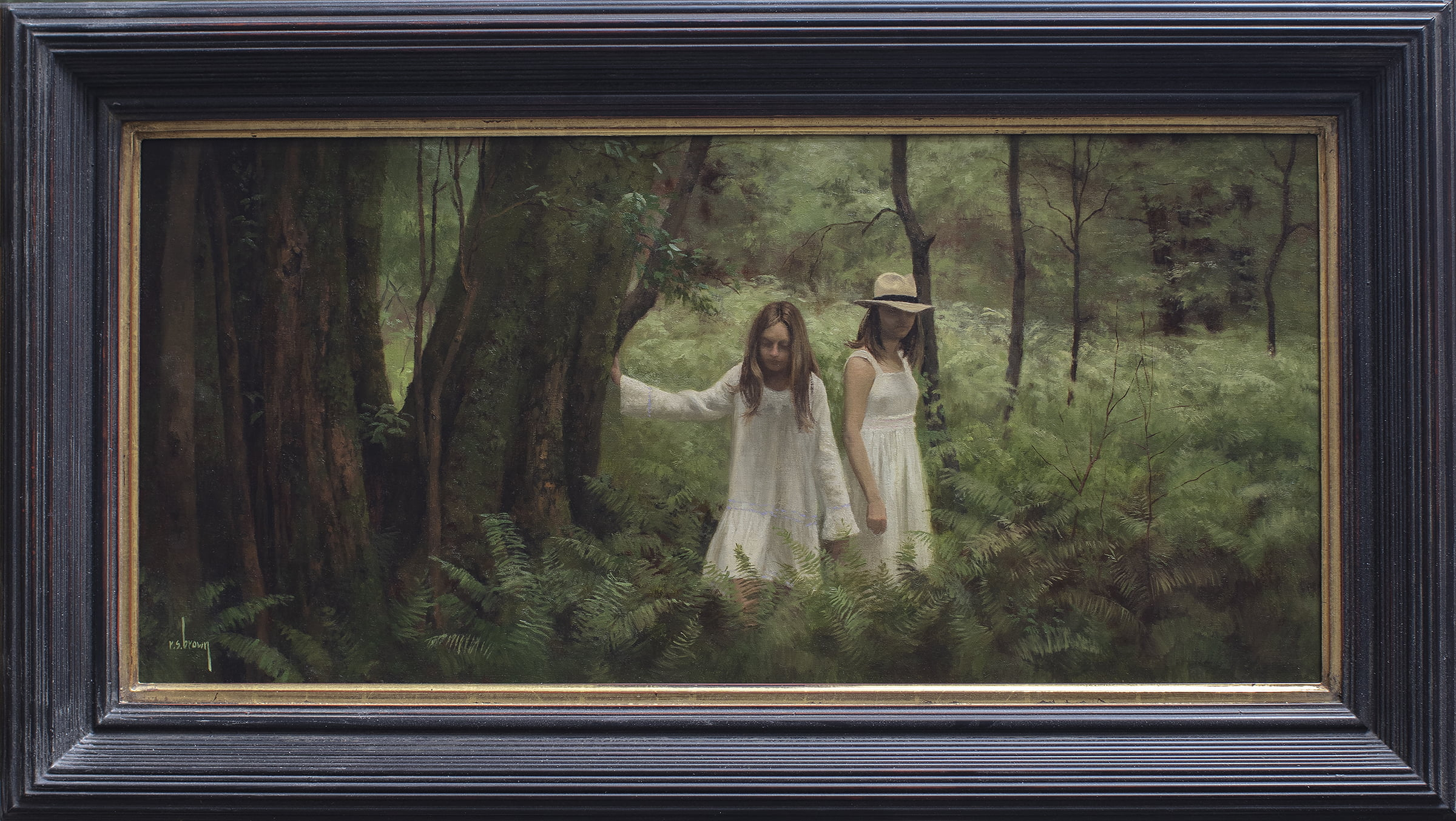

Have you ever walked into a quiet gallery and felt completely pulled in by a single painting. It happens all the time. Lately, there is a major trend taking over the art world in 2026, and it is all about drama. Artists are moving away from boring, plain white backgrounds and are diving deep into stormy, enigmatic grays. But they aren’t just making gloomy art; they are slapping bright, electric colors right in the middle of that darkness.
It is a total vibe. The contrast creates this crazy tension that makes it almost impossible to look away. Why does this specific mix of colors hit us so hard in the chest. Let’s break down how creators are using this clever trick to build massive statement pieces that stop people right in their tracks.
The Emotional Weights of Stormy Grays
Gray gets a bad reputation for being boring or sad, but artists know better. Dark charcoal, deep slate, and misty ash carry a lot of secret emotional weight. When an artist covers a large canvas in a desaturated, moody gray tone, they are instantly setting a serious, quiet mood. It feels like a rainy afternoon or a mysterious shadow.
This heavy background serves as a sophisticated anchor. Instead of feeling empty like a blank white canvas, a dark gray backdrop feels thick and full of secrets. It forces the viewer to slow down, take a deep breath, and really prepare for what else the painting has to show them. It is all about building anticipation.
The Shock Treatment of Vibrant Tones
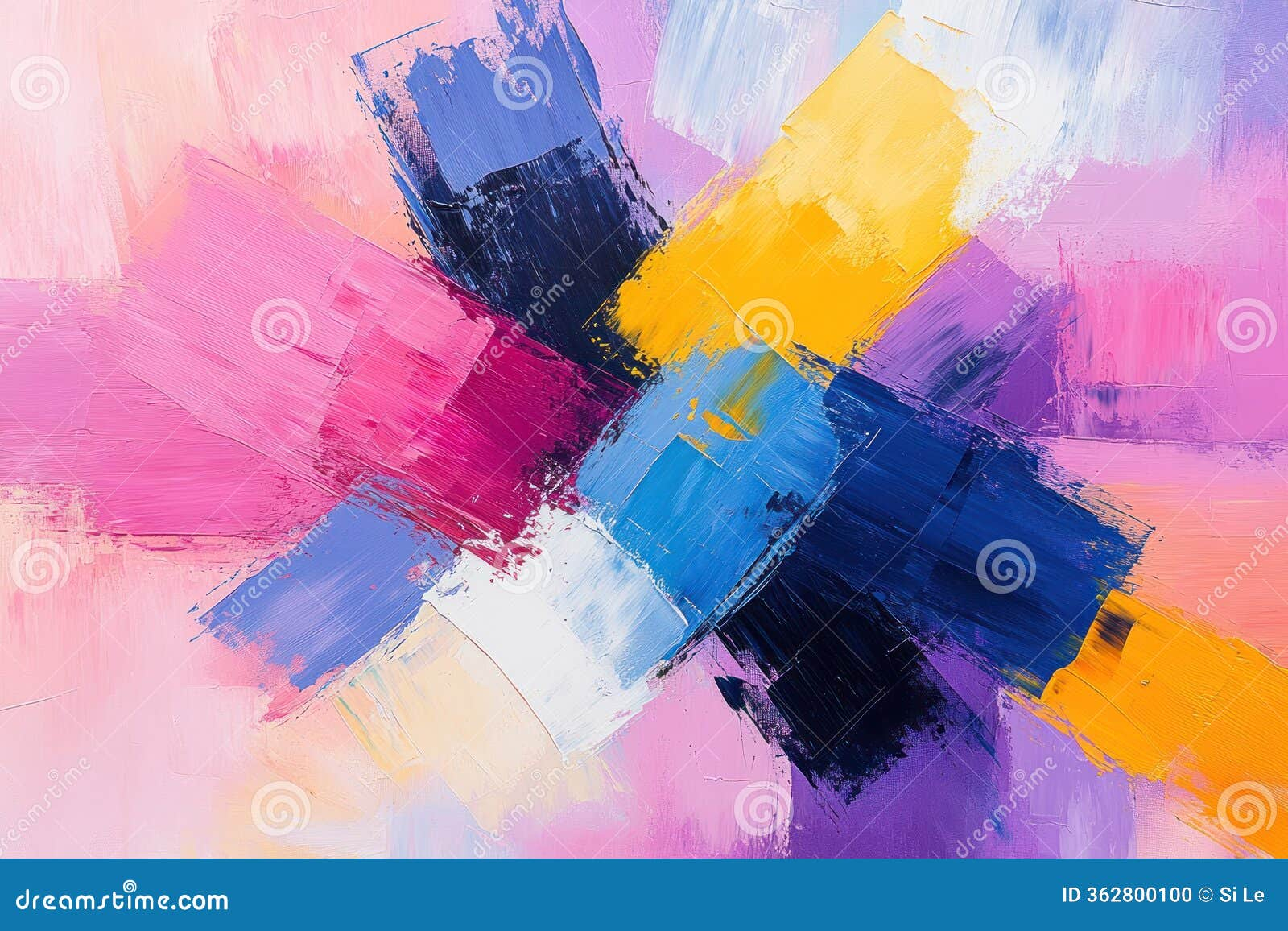
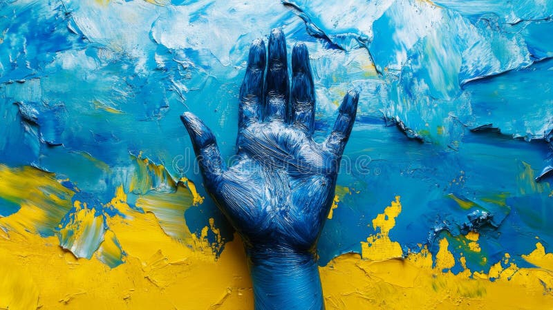
Now, imagine staring into that deep, misty gray space, and suddenly, boom. There is a streak of fiery neon orange, a slash of electric mustard yellow, or a glowing blob of hot pink. It feels like a lightning bolt cutting through a midnight sky.
+------------------------------------------+
|                                          |
|               MOODY GRAY                 |
|           (Sets the quiet mood)          |
|                                          |
|                  VS                      |
|                                          |
|              VIBRANT POP                 |
|         (Creates the shock factor)       |
|                                          |
+------------------------------------------+
These bright splashes of color act as an absolute shock to our visual system. Because the gray surroundings are so quiet, the vibrant colors look even brighter than they actually are. Artists use these intense colors to guide your eyes exactly where they want them to go. It is like a loud shout in a perfectly silent room.
Finding the Perfect Balance
You might think putting super bright colors on a dark background would just look messy, but it is actually a delicate balancing act. If there is too much bright color, the painting becomes chaotic and loses its mystery. If there is too much gray, it risks looking dull.
- The 80/20 Rule: Many modern statement pieces use about 80% moody tones and only 20% vibrant accents to keep the drama high.
- Texture Play: Stacking thick, rough-edged blocks of rust or gold oil paint over smooth gray layers adds an extra layer of cool depth.
- Undertones Matter: A charcoal gray with a secret purple or blue undertone makes a warm-colored couch or a bright painting pop even harder.
The magic happens when the two opposites stop fighting and start working together to tell a story.
Why This Trend is Exploding Right Now
Walk into any major exhibition this year and you will see this style everywhere. People are tired of sterile, completely minimalist spaces that feel like hospitals. We want feeling! We want excitement.
These moody statement pieces bring a ton of modern elegance while still feeling incredibly inviting and cozy. They give our eyes something complex to figure out. In a world where everything online is constantly flashing at us, these paintings offer a different kind of intensity—one that lets us sit with our thoughts while still enjoying a brilliant burst of energy.
Real Gallery Examples to Look For
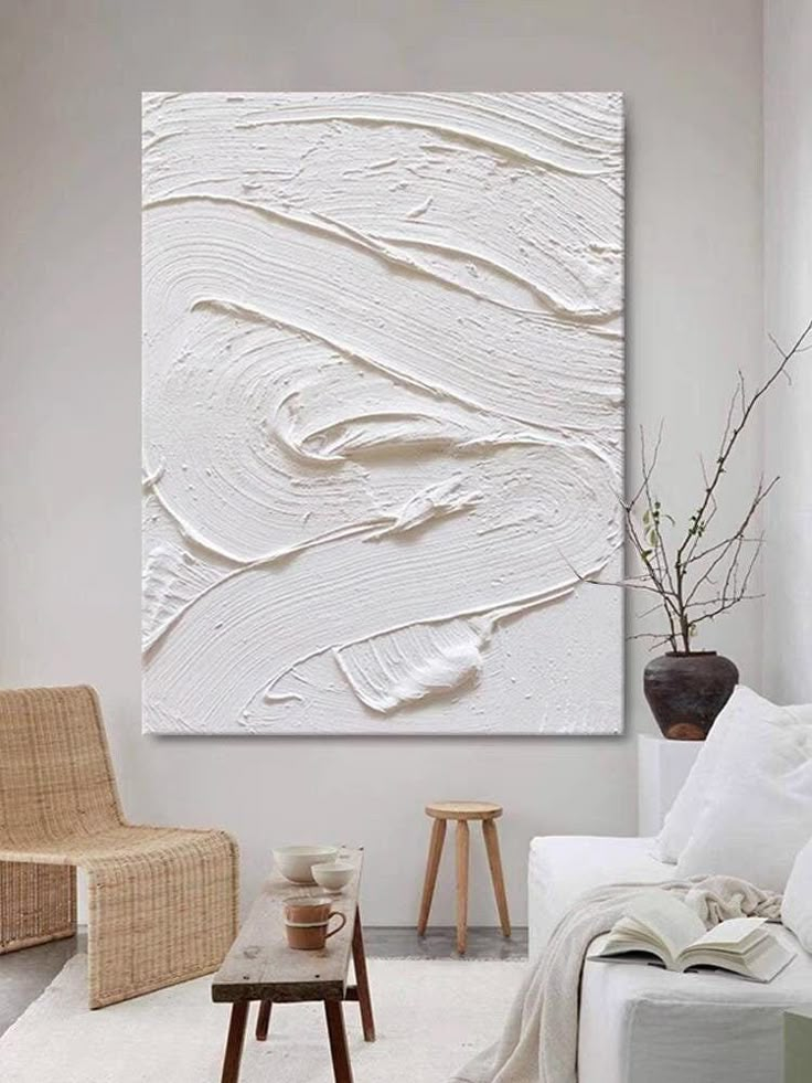
So, what does this actually look like in person. Lately, oil painters are making waves by creating textured neutral block abstractions. They stack rough rectangles of grays, off-whites, and deep russet tones to build gorgeous geometric focus points.
Another popular style features huge, blurry landscapes where the sky is a heavy, dark charcoal, but a tiny, glowing neon line represents a distant city or a setting sun. The contrast makes the tiny light source look incredibly powerful and hopeful, almost like it is fighting against the darkness.
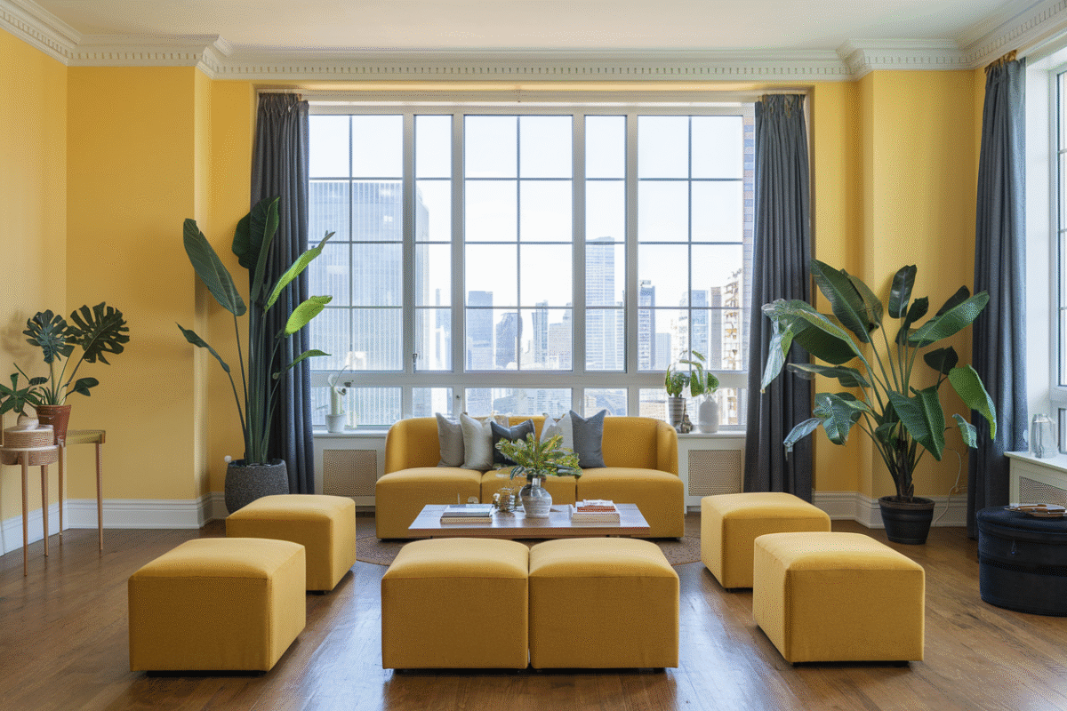
You don’t have to just look at these pieces in a museum; you can bring this awesome energy into your own room. If you have a dark, moody wall color, adding art with vibrant accessories like a bright yellow frame or a hot pink streak can completely change the room.
- Start with small accents like printed cushions or a bright lampshade near your art.
- Let the dark walls ground the space, then use the colorful art to inject pops of light.
- Don’t be afraid of heavy colors; they make spaces feel like a cozy cave rather than a dark dungeon.
It is all about experimenting and finding what makes you feel good when you walk into the space.
When you mix the quiet power of moody grays with the wild energy of vibrant tones, something beautiful happens. It captures the true balance of life—the quiet, thoughtful moments mixed together with sudden bursts of pure joy and excitement. No wonder these statement pieces are capturing everyone’s attention right now.
The next time you visit an art gallery, keep your eyes open for these stormy, colorful creations. Notice how the colors interact and how they make you feel. You might just find yourself falling in love with the beautiful tension of darkness and bright light.