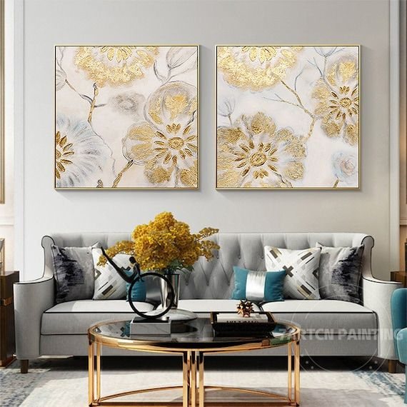
There’s something magical about how a single canvas can transform a room into a peaceful sanctuary. Floral Serenity II canvas wall art captures this magic through its masterful blend of artistic elements. What makes this particular piece so captivating? It’s not just about the pretty flowers, though they certainly are stunning. It’s the careful orchestration of colors, shapes, textures, and compositions that creates that sense of calm and harmony we all crave.
When you first lay eyes on Floral Serenity II canvas wall art, you might think it’s simply another beautiful floral painting. But if you look closer, you’ll notice there’s more going on beneath the surface. This isn’t just about flowers blooming in a garden – it’s about how artists use visual language to communicate feelings, tell stories, and create emotional connections with viewers. The beauty of this artwork lies in how each artistic element works together to form a complete experience. Think of it like a conversation where every brushstroke and color choice has something important to say. The way light falls across petals, how shadows play with stems, and even the subtle variations in texture all contribute to the overall feeling of serenity that this piece evokes. It’s this attention to detail that separates truly impactful art from mere decoration.
Color Theory in Floral Serenity II
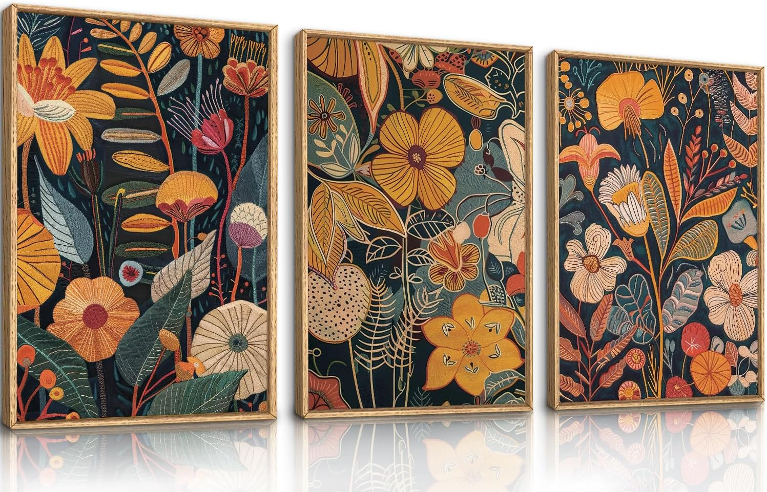
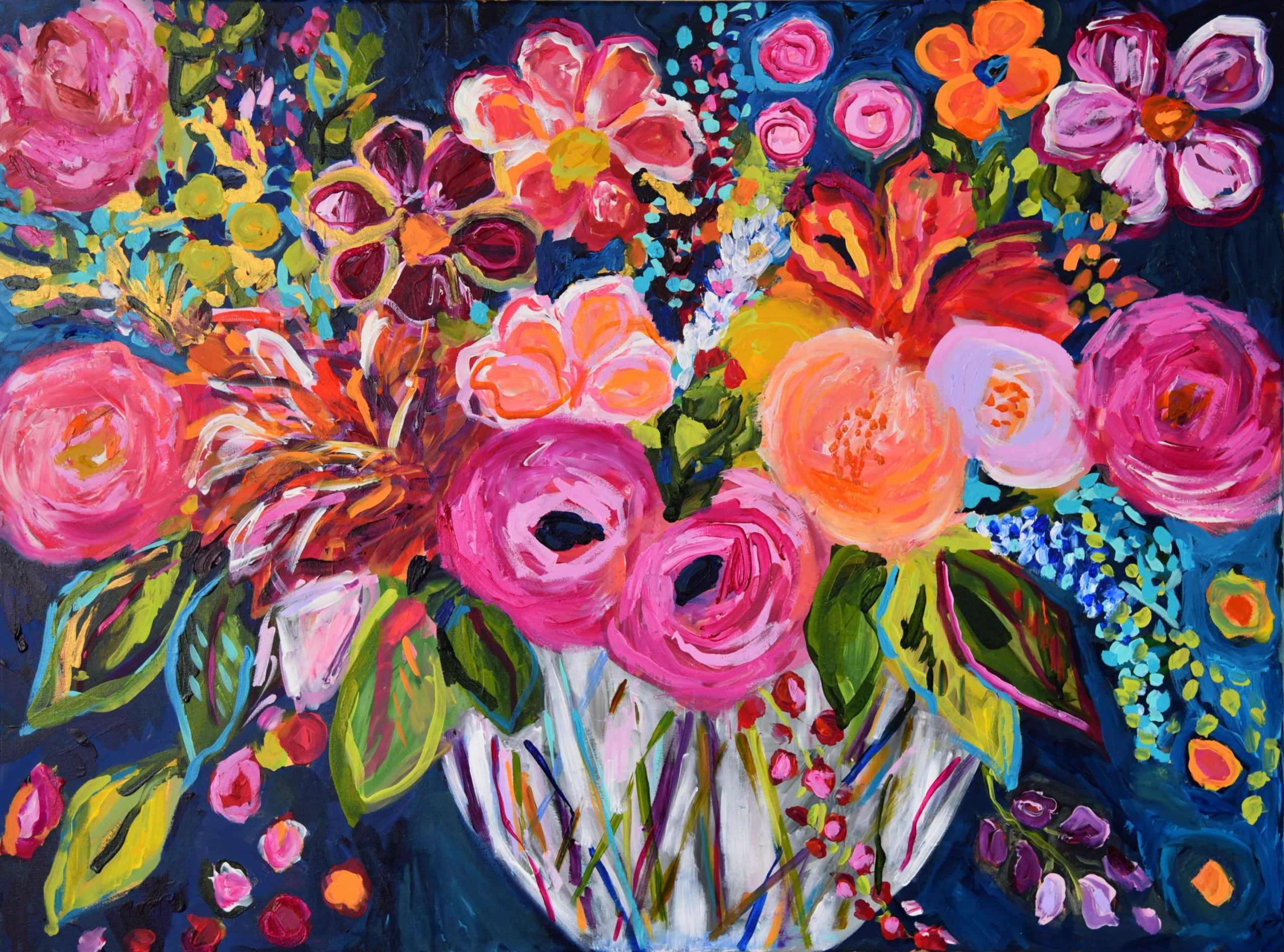
Colors in Floral Serenity II work like musical notes in a symphony. The artist carefully selects hues that create harmony rather than discord. Soft pastels dominate the palette, with gentle lavenders, buttery yellows, and muted pinks forming the foundation. These aren’t harsh or jarring tones – they’re the kind of colors that make you want to breathe deeper and relax. The way these colors blend together shows a deep understanding of color temperature and how different shades affect our moods. Warm tones like golden yellows suggest comfort and sunshine, while cool blues and purples bring a sense of tranquility and peace. Notice how the artist uses complementary colors strategically – when you see a touch of blue near a yellow flower, it doesn’t clash but instead makes both colors pop in a pleasing way. This careful balance prevents the piece from becoming overwhelming, keeping that serene quality intact. Even the subtle variations in color saturation add depth and dimension, making the flowers appear almost three-dimensional.
Composition and Balance
What makes a composition feel right? In Floral Serenity II, the answer lies in how elements are arranged. The artist employs what’s called the rule of thirds – not perfectly, but enough to create visual interest without feeling rigid. Flowers are positioned thoughtfully, some larger and more dominant, others smaller and supporting. This creates a natural flow that guides your eye around the canvas. The concept of negative space plays a huge role here too. Rather than filling every inch with blooms, there are areas of open space that allow the eye to rest and breathe. This isn’t accidental – it’s deliberate design thinking. The composition feels like a gentle breeze moving through a garden, not a chaotic storm. There’s a rhythm to how the flowers are placed, creating a sense of movement even though the scene is static. Vertical lines from stems and branches lead the eye upward, while horizontal elements provide stability. This interplay between different directions creates visual tension that resolves into harmony.
Texture and Brushwork
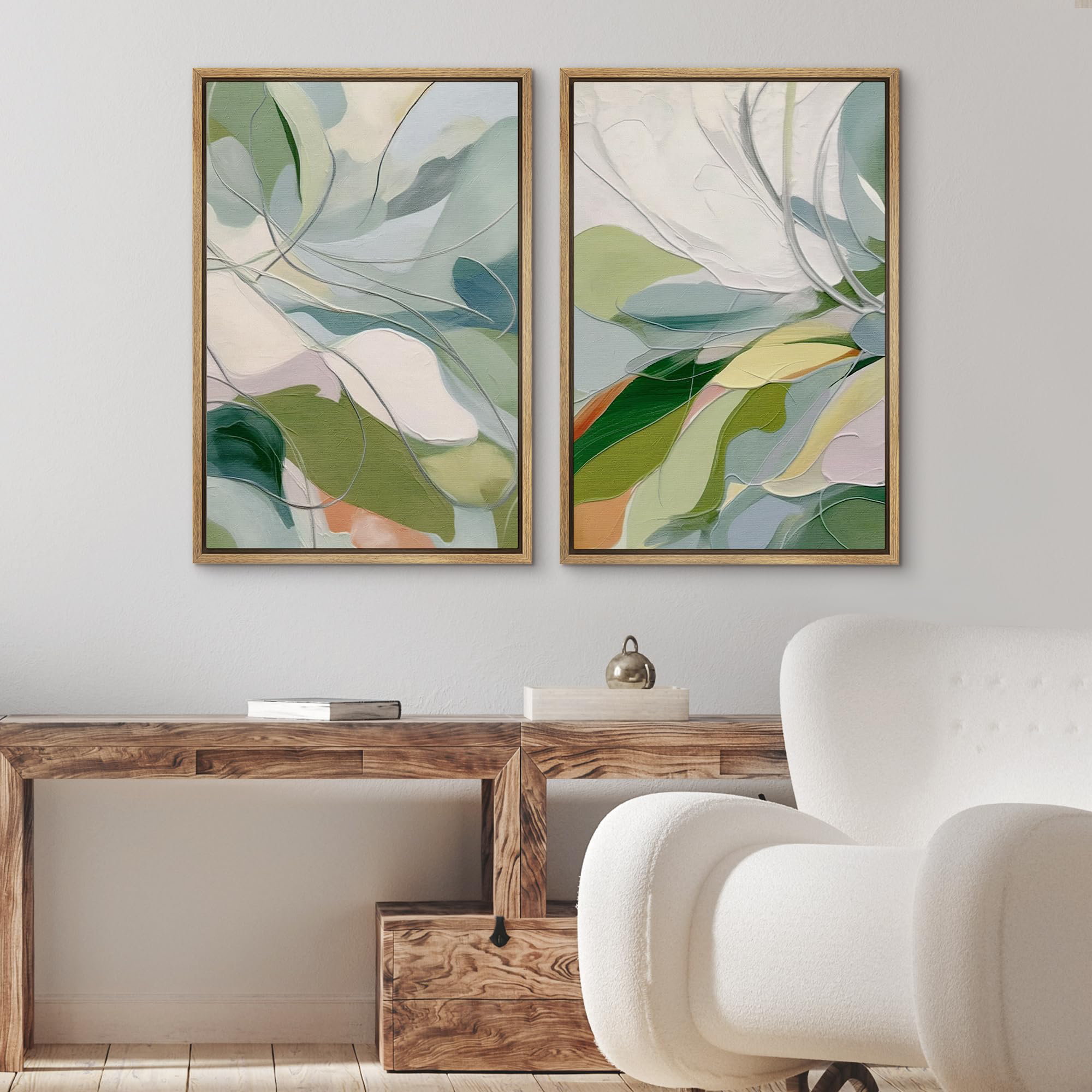
If you could touch this canvas, you’d feel the difference between smooth and rough, soft and firm. The texture in Floral Serenity II isn’t just visual – it’s tactile. The artist uses various brush techniques to create different surface qualities. Some areas show thick, impasto strokes that give the impression of depth and physical presence. Others are more delicate, almost like whispering air against petals. The way paint is applied to different parts of the flowers shows a mastery of technique. Petals might have smooth transitions, while leaves could have more defined edges and texture. You can almost imagine the artist’s hand moving across the canvas, each stroke purposeful. The brushstrokes themselves become part of the message – they’re not hidden or uniform, but rather expressive and alive. This approach gives the artwork a sense of movement and vitality that makes it feel fresh and contemporary. The contrast between smooth and textured areas adds complexity and keeps viewers engaged.
Form and Shape Language
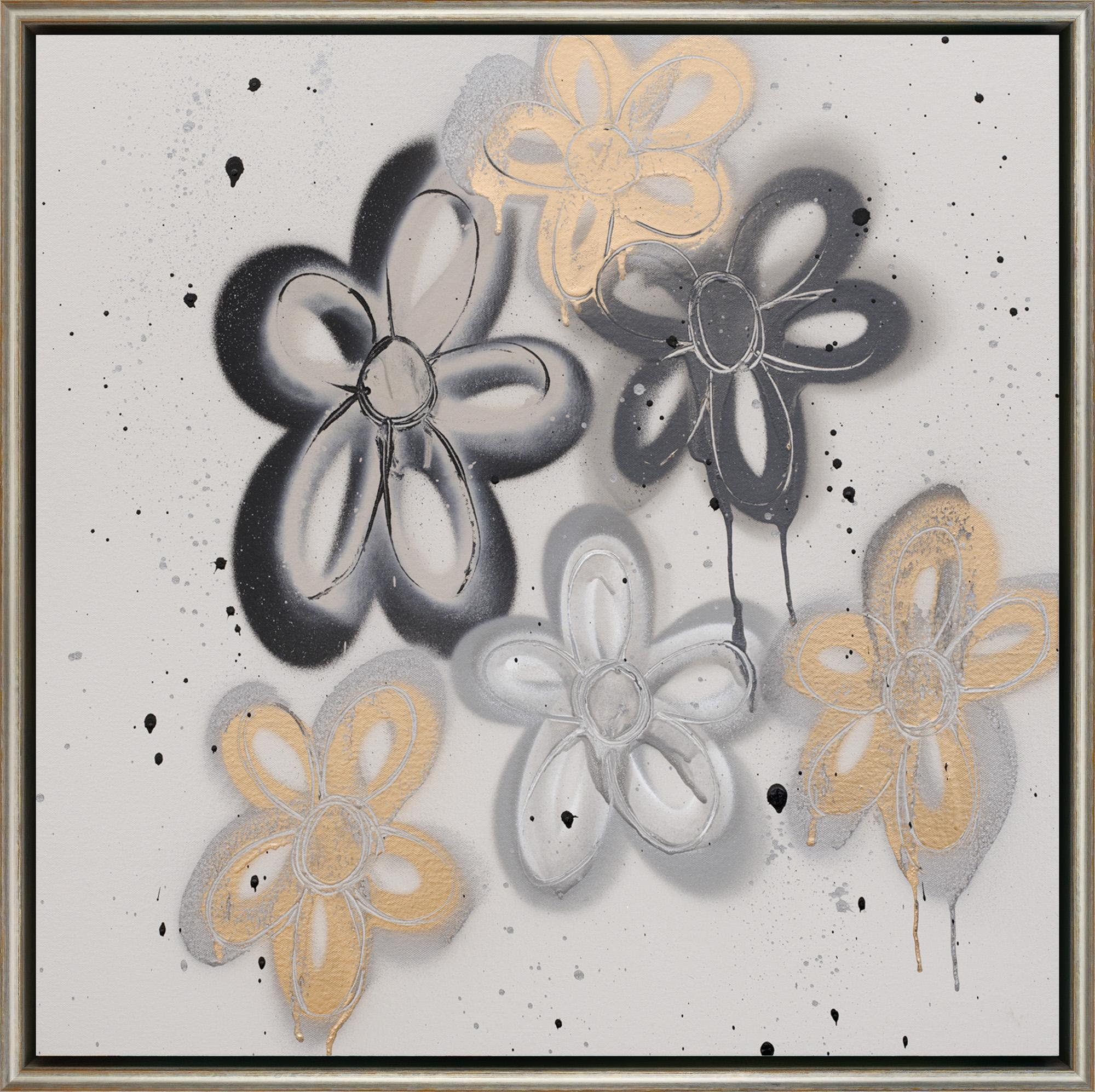
Every flower in this piece has its own personality through shape and form. Roses might have rounded, full forms, while daisies show clean, geometric lines. The artist uses these differences to create visual variety and interest. Organic shapes – the flowing curves of petals – contrast beautifully with more structured forms – like the straight lines of stems and leaves. This combination helps the eye move naturally through the composition. The artist also pays attention to how shapes relate to one another. A large bloom might partially overlap with a smaller one, creating layers and depth. These overlapping relationships help establish spatial relationships within the painting. The way forms interact with light and shadow adds another dimension to their character. Sometimes a shape appears to float, while other times it seems grounded and solid. This dynamic quality makes the entire scene feel alive and breathing.
Light and Shadow Dynamics
Light in Floral Serenity II isn’t just a technical element – it’s an emotional one. The artist treats light as a character in the story, casting shadows that speak to the mood. There’s no harsh direct sunlight here – instead, there’s soft, diffused light that seems to come from somewhere above and slightly off-center. This lighting creates natural shadows that enhance the three-dimensionality of the flowers. The way shadows fall across petals shows understanding of how light behaves in nature. Some areas glow with highlights, suggesting the sun’s warmth, while others recede into gentle darkness. This interplay between bright and dark areas creates a sense of depth that draws viewers in. The artist also uses light to guide attention – brighter areas tend to draw focus, while darker ones provide resting points. The result is a painting that feels like it’s glowing from within, not just sitting flat on the wall.
Emotional Resonance Through Visual Language
Beyond the technical aspects, Floral Serenity II speaks to something deeper inside us. It taps into our connection with nature and our need for calm spaces. The emotional impact comes from how all these visual elements work together to create a feeling rather than just a picture. When you look at this piece, you might feel a sense of peace, nostalgia, or joy – and these emotions aren’t forced but emerge naturally from the visual experience. The artist understands that art communicates before words do. Every color choice, every brushstroke, every composition decision contributes to that emotional response. This is why the same painting can mean different things to different people – it’s open to interpretation and personal connection. The serenity isn’t just in the subject matter but in how everything comes together to create a complete sensory experience. It’s the difference between seeing flowers and experiencing their beauty in a way that touches your soul.
Floral Serenity II canvas wall art demonstrates how powerful artistic elements can be when they work in harmony. It’s not enough to simply paint pretty flowers – true artistry involves understanding how color, form, light, and composition combine to create meaning and emotion. This piece reminds us that great art isn’t just decoration; it’s a conversation between creator and viewer. Every time you look at it, you might notice something new – a subtle shift in shadow, a different relationship between shapes, or perhaps a fresh feeling of calm. The beauty of Floral Serenity II lies not just in its finished appearance but in the thoughtful process behind it. It’s a testament to how intentional choices in artistic elements can transform a simple scene into something that speaks to our deepest needs for peace and beauty. Whether you’re an art enthusiast or someone who simply appreciates lovely things, this piece offers a reminder that the most meaningful art often comes from the smallest details.
[sps_html tag=”img” src=”https://cdn.theartssection.com/wp-content/uploads/2025/12/erik-gonzales-ventricle-at-1stdibs-erik-gonzales-artist-in-floral-serenity-ii-flower-abstract-silver-shagreen-wrapped-canvas-wall-art.jpg” alt=”Erik Gonzales - Ventricle At 1Stdibs | Erik Gonzales Artist in "Floral Serenity Ii" Flower Abstract Silver Shagreen Wrapped Canvas Wall Art” style=”width: 100%; height: auto;”]
[sps_html tag=”img” src=”https://cdn.theartssection.com/wp-content/uploads/2025/12/wall26-green-calm-relax-abstract-floral-botanical-framed-canvas-with-floral-serenity-ii-flower-abstract-silver-shagreen-wrapped-canvas-wall-art.jpg” alt=”Wall26 Green Calm Relax Abstract Floral Botanical - Framed Canvas … with "Floral Serenity Ii" Flower Abstract Silver Shagreen Wrapped Canvas Wall Art” style=”width: 100%; height: auto;”]
[sps_html tag=”img” src=”https://cdn.theartssection.com/wp-content/uploads/2025/12/abstract-flowers-fine-art-print-bloom-series-by-carolyn-shultz-throughout-floral-serenity-ii-flower-abstract-silver-shagreen-wrapped-canvas-wall-art-scaled.jpg” alt=”Abstract Flowers Fine Art Print - Bloom Series By Carolyn Shultz throughout "Floral Serenity Ii" Flower Abstract Silver Shagreen Wrapped Canvas Wall Art” style=”width: 100%; height: auto;”]
[sps_html tag=”img” src=”https://cdn.theartssection.com/wp-content/uploads/2025/12/set-of-2-gold-silver-abstract-flower-wall-art-framed-wall-art-original-inside-exploring-abstract-floral-design-in-contemporary-wall-art.jpg” alt=”Set Of 2 Gold Silver Abstract Flower Wall Art Framed Wall Art Original … inside Exploring Abstract Floral Design in Contemporary Wall Art” style=”width: 100%; height: auto;”]
[sps_html tag=”img” src=”https://cdn.theartssection.com/wp-content/uploads/2025/12/amazon-com-fwiexa-burnt-orange-floral-framed-wall-art-set-of-3-mid-for-exploring-abstract-floral-design-in-contemporary-wall-art.jpg” alt=”Amazon.com: Fwiexa Burnt Orange Floral Framed Wall Art Set Of 3, Mid … for Exploring Abstract Floral Design in Contemporary Wall Art” style=”width: 100%; height: auto;”]