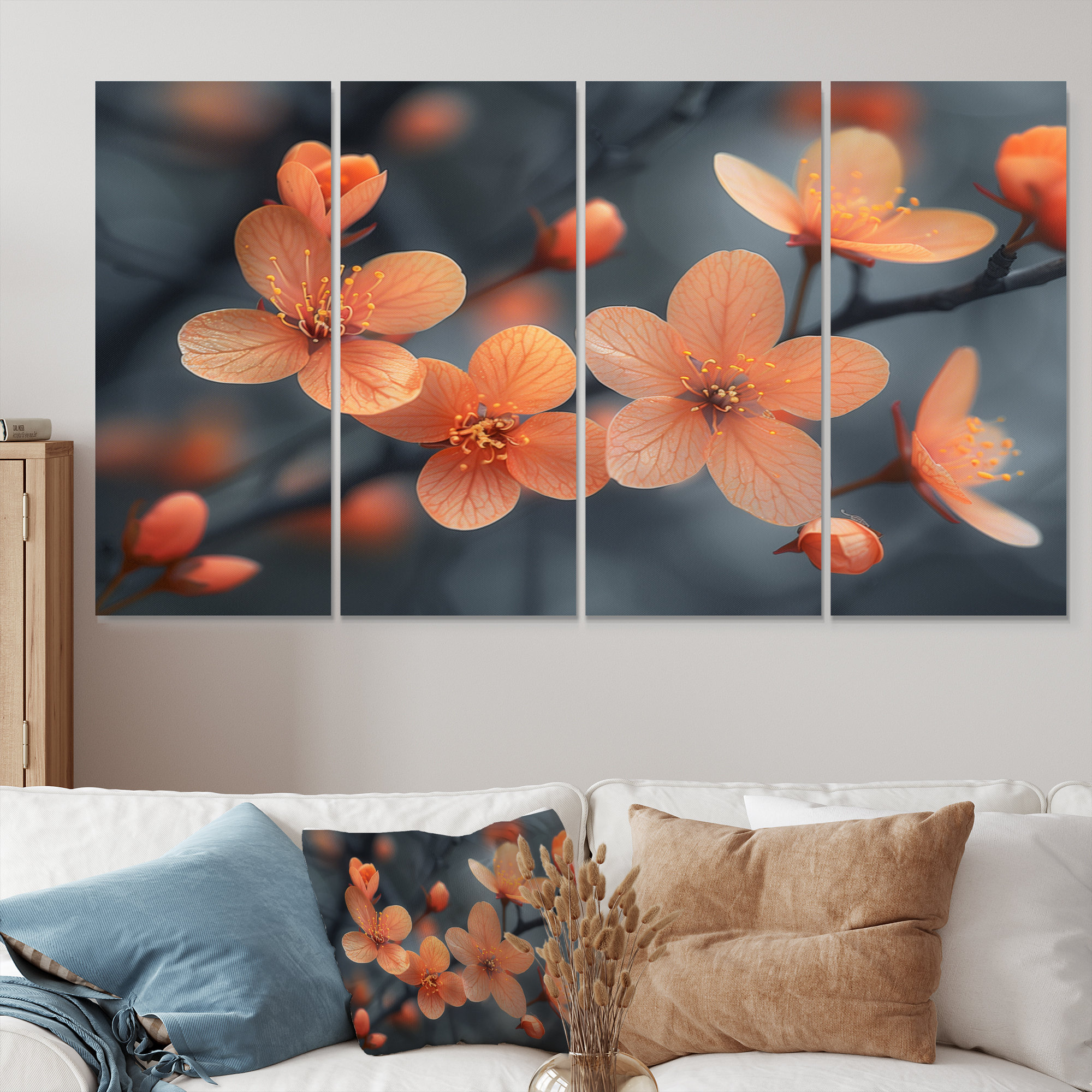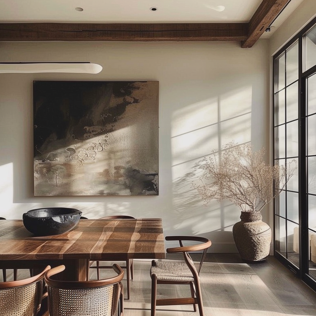
Have you ever stared at a stunning piece of wall art and wondered how it got that perfect texture? It’s not just ink hitting fabric. There is a whole world of careful work happening behind the scenes. In 2026, creating a beautiful canvas print is really a mix of high-tech machinery and human touch. It is a story of how a simple digital file turns into something you want to hang in your home for years.
When we talk about canvas prints, we are talking about more than just a picture on a wall. It is about bringing life into a room. You might be looking to display a cherished family moment or a piece of cool graphic design. Understanding the effort that goes into these pieces makes them feel way more special. Let’s look at how these items go from a computer screen to a finished piece of art hanging in your living room.
The Secret Life of Fabric and Weave
The foundation of any great print is the material itself. It is not just any cloth. The best prints use a sturdy blend of cotton and polyester. Think of it like the canvas a painter uses—it needs to hold the ink without soaking it up too fast or letting it bleed. A weight of around 360 grams per square meter is the gold standard right now in 2026. It feels thick, substantial, and ready for action.
If the fabric is too thin, it will look flimsy and cheap. You want that tight, woven texture that hides the individual threads. When you see a really nice print, the surface looks smooth and professional. That heavy weight means it won’t buckle easily and it will stand up to the test of time. It’s the difference between a poster and a piece of art.
Why Ink Chemistry Matters More Than You Think
You might think all ink is the same, but that is definitely not the case. Professional shops are using archival, pigment-based inks. These are the heavy hitters of the art world. They are designed to stay vibrant and not fade for decades. It is science meeting art. Cheap dye inks might look okay for a few months, but they start to look dull once the sunlight hits them.
Modern printers use high-end tech to spray these tiny droplets with amazing precision. Some shops even use UV-cured ink that hardens instantly. This makes the surface scratch-resistant and keeps the colors sitting right on top of the fabric. This method is great for keeping details sharp and colors really popping, which is exactly what you want for a centerpiece.
The Wooden Frame: Keeping It All Together
What is holding that fabric tight? It is the stretcher frame, and it is honestly the most important part you never see. If the wood is not top-notch, the whole piece can warp. That is why the best makers use kiln-dried pine or fir. By drying the wood in a special oven, they pull out the moisture so the frame stays straight forever.
A bad frame will twist or bow after a few months, and suddenly your art looks crooked on the wall. No one wants that. A solid, well-joined frame keeps the canvas taut and square. On bigger pieces, you might even find extra support bars in the back. It is simple engineering but essential for keeping your art looking flat and perfect year after year.
The Magic of the Gallery Wrap
We have all seen those prints where the image seems to fold around the sides. That is called a gallery wrap, and it creates a really clean, modern look. The printer has to be smart about how they set up the file. They need extra image space at the edges so nothing important—like someone’s face—gets lost in the fold.
There are a few ways to handle those edges. Some people prefer to have the photo continue around the sides for a seamless effect. Others might choose a solid black or white edge to frame the image nicely. It is a design choice, and it shows just how much care goes into making sure every inch of the canvas looks finished and intentional.
Making Sure the Colors Are True
Ever notice how a picture looks different on your phone compared to how it prints? That is where color calibration comes in. It is a fancy way of saying that the shop makes sure their printer is talking to their computer correctly. They want the blue of the sky to look like a blue sky, not a weird purple.
It takes a trained eye and some smart software to get this right. They test and tweak their machines constantly to keep everything consistent. When a company cares about this part, you know they are doing things the right way. It is the bridge between the digital world and the physical object you hold in your hands.
Why Quality Control is the Unsung Hero
At the very end of the line, a human being has to look at the print. Machines can do a lot, but they can’t always tell if a piece looks "right." A real person checks for scratches, color balance, and how tight the fabric is on the frame. This human touch is what separates a mass-produced item from a carefully crafted piece of work.
They make sure the staples are in the right spot and the bracket for hanging is secure. It is the little stuff that makes a huge difference. When you unwrap your art, you are seeing the result of all these little quality checks. It gives you peace of mind knowing that someone cared enough to make sure it was ready for your wall.
Understanding the craftsmanship behind these prints really changes how you look at your walls. It is a mix of high-tech printing, sturdy materials, and good old-fashioned care. Whether it is the archival inks that keep your memories bright or the kiln-dried wood that keeps everything square, every part has a job to do.
Next time you see a canvas print, take a closer look at the edges and the texture of the fabric. You are seeing a lot of specialized effort. It is amazing how much thought goes into something that becomes a natural part of our home decor. Choosing a quality piece means you get to enjoy that art for a long, long time.